
Everyone says it: “Samsung makes the best displays for smartphones.” It’s widely regarded as truth and not many try to dispute it. Even fewer try to (or even know how to) individually assess the display. The problem with this is the lack of verification from what is seen on publications (including our own) versus reality and the limited number of valid points of views and shortage of expertise on the matter. What many don’t know is that previous-generation Samsung Galaxy displays did have issues and even lagged behind the competition in certain categories such as color/white point calibration, gamma, and black clipping. They were not perfect displays — they were far from the best in terms of calibration, actually — and most display reviews gave them way more praise than they deserved. Many are also misinformed and claim their displays to be color-accurate when in their default oversaturated profile. However, a new generation of handsets gives emergence to new hope and expectations. The Galaxy S10 is Samsung’s latest endeavor in reeling in future technologies to the handsets of now, but besides its cutting-edge Infinity-O display, has its underlying panel characteristics actually improved, or has it just been facelifted?
Good
|
Bad
|
|
xda DISPLAY GRADE A |
Performance Summary
The front of the Galaxy S10 is plastered with what Samsung calls their “Infinity-O” display: a screen that covers nearly the entirety of the front of the handset, curving around the edges, with an “O” punched out of it to accommodate a front-facing camera. Next to the camera is the ambient light sensor and proximity sensor, which are cleverly hidden underneath the glass.
The panel has a native resolution of 3040×1440 pixels, but by default, the Samsung Galaxy S10 renders at 2280×1080 to save power. This comes with a glaring compromise since this default render resolution does not divide wholly into its native resolution, resulting in added blurriness in its upscaling. Consequently, the Samsung Galaxy S10 display at its default render resolution will not appear as sharp as a native 2280×1080-resolution panel of the same size. The Samsung Galaxy S10e, for example, appears sharper than the Galaxy S10 in its default 1080p render resolution, even if the Galaxy S10e were to be scaled up to the Galaxy S10’s size.
The display is the brightest OLED we have measured at all APLs, reaching nearly 900 nits for 50% APL, which is a good APL to consider the average display brightness (you can read the definition of APL below in the “Brightness” segment), when the phone detects bright light in auto brightness mode. This is about 100 nits higher than we measured for the Samsung Galaxy Note 9 and LG V40 ThinQ (appearing about 5% brighter) and about 200 nits higher than the iPhone XS (appearing about 10% brighter). The Samsung Galaxy S10’s display also lightens all colors when it detects sunlight, lowering the screen contrast, which improves the display’s legibility and color accuracy under sunlight.
Depending on the location, the default color mode on the Galaxy S10 may be set to the “Natural” profile for the U.S. and some of Europe, while primarily Asia will have it default to the “Vivid” profile (our Exynos unit came in “Vivid”). The “Natural” option is the color-accurate profile with a warmer tint, while the “Vivid” profile increases the saturation and contrast of the screen and has a cooler white point. The “Vivid” profile is identical to the “Adaptive” profile found on previous Galaxy phones, and it stretches colors out significantly, up to the native gamut of the Galaxy S10’s panel. It also has increased contrast and gets slightly brighter than the “Natural” profile. For sharing and editing content, the “Natural” profile should always be used to ensure that photos and videos will look similar across other displays, like iPhones, which share the same target color profile as the Galaxy S10’s “Natural” profile, not the “Vivid” profile like many have been misled to believe.
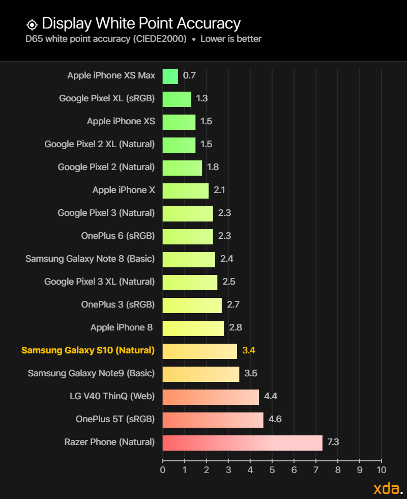
The “Natural” profile targets the sRGB color space by default and is also calibrated to target wide color spaces like P3 and Adobe RGB when app-supported color management is available for appropriate media. As usual, Samsung does a decent job with color accuracy with their standard reference profiles, but the Galaxy S10 continues Samsung’s warmer calibration trend that plagued their previous handsets, still placing it behind other displays like the iPhone X(S) and the Pixel 3 (XL) in color accuracy. Still, the color accuracy of the “Natural” profile is excellent and appears mostly perfect, though whites and pale tones will appear noticeably warm. The profile has a gamma of approximately 2.15, with light shadows and slightly darker mid-tones, but overall has excellent image reproduction and contrast. Video playback increases the on-screen contrast, darkening the shadows for a crunchier picture. However, even though this is the color-accurate profile, Samsung still stretches out and oversaturates the colors in its default launcher, which designers should consider and be wary about when viewing their icons on the Galaxy S10.
The viewing angles on the Samsung Galaxy S10, at a 30-degree angle, are the lowest we’ve measured so far. However, the numbers don’t tell the whole story. The shift is still non-uniform and sudden at acute angles, and still noticeably varies between shifting towards red and shifting towards cyan (technically it shifts away from the complementary). Additionally, the color shift increases further towards cyan past 30 degrees, which we did not measure. It is also always visible on the curved edges of the screen on lighter/white content. Because of these intricacies that are difficult to fully account for, our crown for best viewing angles still belongs to the LGD panel on the LG V40 ThinQ, with even the Pixel 3’s viewing angles also beating out the Galaxy S10’s.
Black smearing is identical to previous generation panels, while black clipping (black crush) has improved (lessened) with the Samsung Galaxy S10. The Galaxy S10, however, is still inferior to OnePlus’ latest handsets in black clipping, and outclassed by the iPhone X-series panels in both these categories. The lifted shadows of the Galaxy S10 in its “Natural” profile do help in reducing the perception of black crush, but it remains non-optimal for accurate shadow rendition.
Color Profiles
Samsung overhauled its Screen Mode options on the Galaxy S10, and instead of having the previous “Adaptive,” “Photo,” “Cinema,” and “Basic” screen modes, it has been simplified to just two options, “Vivid” and “Basic,” with the default option depending on the carrier/vendor from which the Galaxy S10 was purchased. Samsung says that “Natural” is default in Europe and in the U.S. while “Vivid” is default in Asia. This is the first time Samsung has pushed to make the color-accurate profile the default, which is significant since most users are likely accustomed to Samsung’s oversaturated profile that has been the default in all their previous OLEDs.
The “Vivid” profile is identical to the “Adaptive” profile on previous Galaxy devices, simply renamed to be more appropriate, and keeping the option to adjust the color temperature and the individual red/green/blue color balance sliders. There is no form of active color management in this profile, but it receives contrast and color modifications made by Samsung’s mDNIe (mobile Digital Natural Image engine) in some scenarios.
The “Natural” profile is what replaces the three reference color profiles (“Basic,” “Cinema,” and “Photo”) on the previous Galaxy devices. They’ve done this because Samsung finally implemented support for Android 8.0’s automatic color management on the Galaxy S10, which is a big step in the right direction for expanding its adoption across Android. Supported apps, which include Samsung’s own Gallery app, now properly displays content with embedded ICC profiles, a feature that Google’s own Photos app hasn’t fully rolled out yet. This support is what is needed for other Android devices to properly play back the Samsung Galaxy S10’s HDR10+ videos. Without proper color management support, the videos will play back in standard dynamic range.
Brightness


There are no surprises here — the Samsung Galaxy S10 has the brightest OLED in the business in its auto brightness mode.
But first, for those who are not completely familiar with average pixel levels (APL for short), please make sure to read our description of it above to be able to properly interpret the numbers for the luminance output of an OLED display.
A display’s luminance at maximum system brightness is lowest when the screen is filled completely with all white pixels, which is an APL of 100%. We measure at this condition to record the lower bound or worst-case value for the luminance of white on a screen. We recorded the Samsung Galaxy S10 to emit 723 nits at 100% APL. This is the brightest OLED display we’ve measured at this APL by a decent margin. At a more accommodating APL of 50%, the display luminance can go up to 893 nits, which is bright enough to be comfortably legible outdoors when not under direct sunlight. Higher brightness is still required to adequately withstand the contrast given off by direct sunlight.
DisplayMate’s review on the Samsung Galaxy S10 boasted a “Record Peak Brightness of 1,215 nits,” which is impressive, but not a proper figure to represent the typical peak brightness of the display. This figure represents the peak luminance at 1% APL, with barely any lit pixels on the screen, at which we measured 1,180 nits on our own Galaxy S10. Brightness figures at low APLs are primarily to gauge the intensity level of specular highlights in HDR content, and even then, the APL of most films fall around 15-20%, not 1%. However, at 10% APL, which is a very dark lower bound for HDR content, we measured the brightness at 1,068 nits, which is fantastic with not too much fall-off compared to 1% APL.
The Samsung Galaxy S10 is tied with the iPhone XS for the dimmest at 50% APL, capable of dropping down to 1.8 nits. This is about 20% lower than the Google Pixel 3, the Google Pixel 3 XL, and the LG V40 ThinQ at their lowest, which measured at 2.4 nits, 2.2 nits, and 2.3 nits, respectively.
Contrast and Gamma
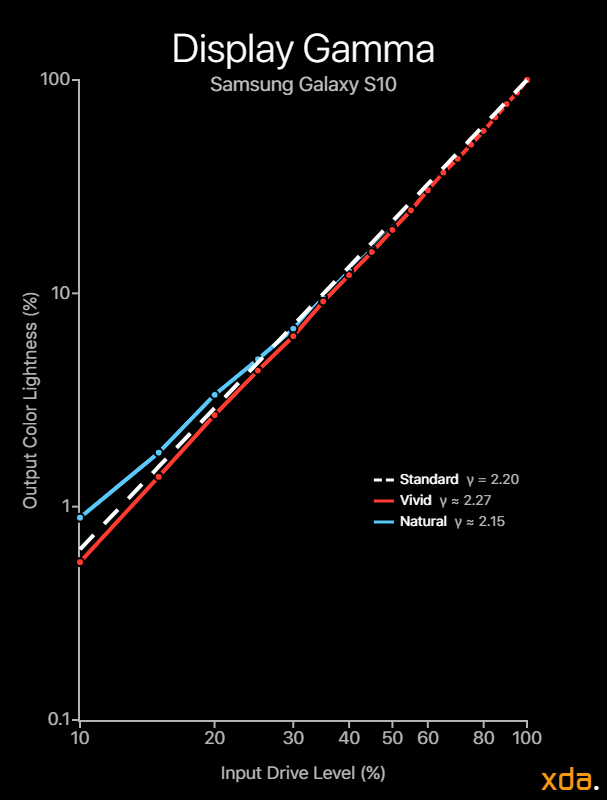
Starting from the Galaxy S9, Samsung has made great strides in their DDIC for improving the resulting display gamma in their panels. They’ve managed to tightly control the brightness differential response to APL so that their electro-optical transfer function is minimally impacted and remains close to its target. On the Samsung Galaxy Note 8, we measured a gamma range of 2.3 up to 2.6 in its “Basic” screen mode, which resulted in too dark of colors and too much contrast. With the Galaxy S10, Samsung managed to hit a fitted display gamma of 2.15 in its color-accurate “Natural” mode and 2.27 in its color-stretching “Vivid” mode, which is much closer to the industry standard target of 2.2.
The Samsung Galaxy S10 transfer function appears to be non-constant and piecewise, however. Instead of a straight power of 2.2, the S10 panel has lifted shadows that are lighter than the 2.2 standard and mid-tones that are slightly darker. The overall transfer function closely resembles that of the sRGB specification. However, the sRGB transfer function describes an encoding gamma, not a decoding gamma, that is meant to mirror the appearance as what would be seen on a CRT display, none of which even followed the sRGB transfer function spec for decoding.
As it stands, the current transfer function of the “Natural” mode on the Samsung Galaxy S10 isn’t ideal for high-fidelity SDR playback or streaming, especially in dark viewing environments, where a gamma power closer to 2.4 is desirable. However, this is considered during video playback on the Galaxy S10, where Samsung’s mDNIe increases the contrast on the display, un-lifting the shadows. With this adjustment, the resulting display gamma now increases to a straight gamma of about 2.25, which is much more appropriate for video.
The default lighter gamma of 2.15 throughout the rest of the OS is likely a design choice for viewing media in well-lit environments like in offices where lower (lighter) gammas are needed to combat the ambient lighting, which results in higher perceptual color accuracy in those environments. Furthermore, during High Brightness Mode, which is triggered when the ambient light sensor detects bright intense light like sunlight, Samsung’s mDNIe significantly reduces the screen contrast and lightens all color mixtures to improve sunlight legibility and perceived color accuracy.
Samsung also provides a “Video enhancer” option, which slightly increases color saturation in all directions (not stretching to a specific gamut), significantly increasing the brightness of the display (which allows videos to reach High Brightness Mode luminance levels), and re-lifting the un-lifted shadows.


One disappointment about the Samsung Galaxy S10 panel is the presence of color banding and aberration in the “Natural” profile, which shouldn’t be an issue on a flagship display, especially on its “color-accurate” mode. Granted, it is difficult to properly calibrate a wide color gamut panel to sRGB without banding, but others have been successful in doing so (iPhone XS, LG V40 ThinQ), and there is no excuse for an industry leader like Samsung to be having this issue. The Google Pixel 3 XL also has minor color banding in its “Natural” profile, but to a significantly lesser extent than the Samsung Galaxy S10. This is not the first occurrence though, as previous-generation Galaxy devices also observed banding in their calibrated reference profiles.
Lastly, the Samsung Galaxy S10 improves in its ability to display near-blacks, likely assisted by its improved gamma control and lifted shadows. We measured the Galaxy S10 display to clip blacks at drive levels below 1.0% at 10 nits, which is an improvement over its 2.7% on previous generations, but still behind the likes of OnePlus and Apple, whose latest OLED panels have measured to clip blacks below 0.4% and 0% (zero measured black clipping), respectively, at 10 nits.
Color Temperature
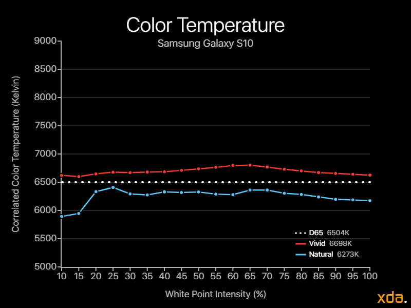
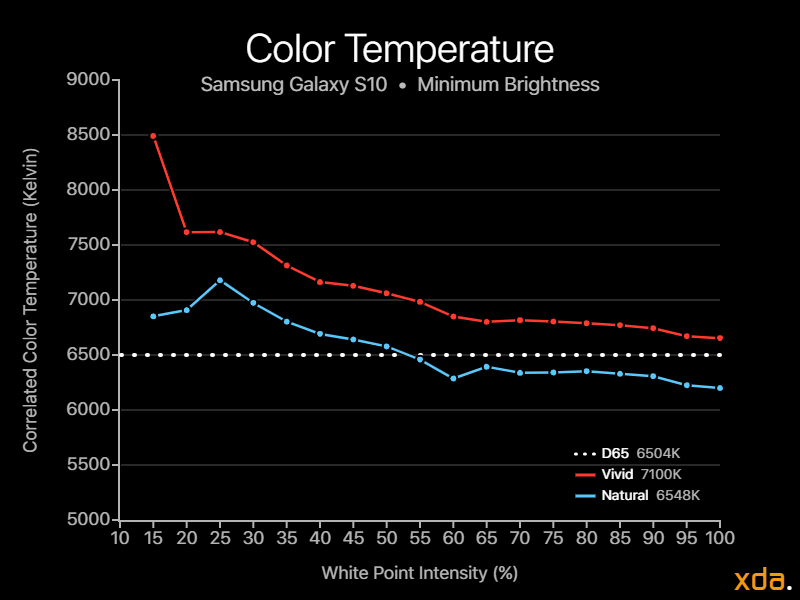
Continuing the trend of past generations, the Samsung Galaxy S10 display color temperature remains consistently too warm in its “Natural” profile, formerly the “Basic” profile, with a white point of 6172 K. This is a bigger deal now, though, since the “Natural” profile is the default color profile for Galaxy S10 users in the U.S. and parts of Europe, and many may be put off by the yellowish tint, which is often associated with something being aged or dirtied. This warm tint has been present in every single Samsung handset I’ve encountered since the Galaxy S8, and it is a major calibration issue that Samsung needs to improve, especially now that they’re pushing “Natural” as a default profile.
With respect to the drive variance, the Samsung Galaxy S10 has very little drive differential in its “Vivid” profile, as seen by its smooth and straight average color temperature curve. There is slight variance, however, in the “Natural” profile, with a noticeable spike towards a warmer tint at drive levels below 20% which isn’t present in the “Vivid” profile. When observing the color temperature chart at minimum brightness, both profiles trend upwards in color temperature as drive levels lower, steadily losing the red emitter and overcompensating with green, moving towards cyan before finally clipping black.
Color Accuracy
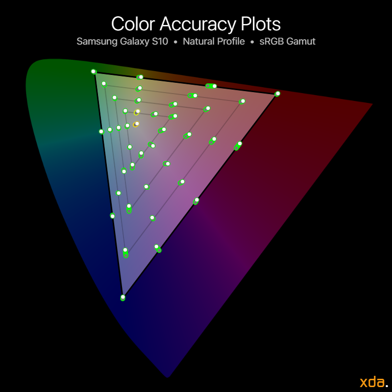
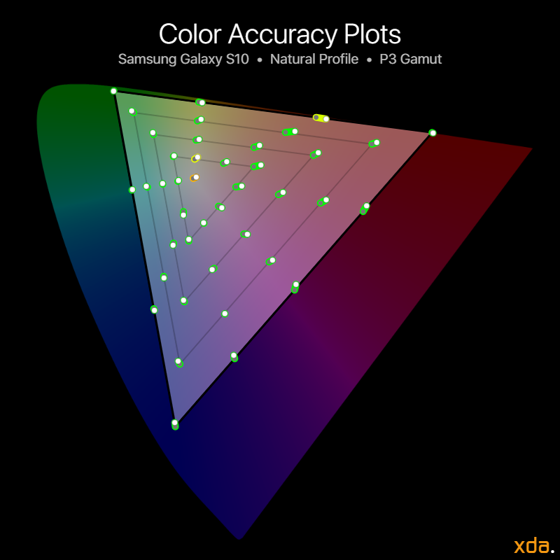
The Samsung Galaxy S10’s color accuracy plots show that its calibration is predominantly shifted towards red, though almost all of the color differences are unnoticeable except for white, lowly-saturated yellows, and highly-saturated red-yellows.
The “Natural” profile, which now supports Android’s color management, excellently reproduces both the standard RGB color space and the wide P3 color space, with an average ΔE of 1.2 for sRGB and an average ΔE of 1.1 for P3. The profile’s maximum errors are also very low and appear pretty accurate, with a maximum ΔE of 2.6 for 25% yellow for sRGB and a maximum ΔE of 2.8 for 25% yellow for P3.
The profile’s color accuracy combined with its standard gamma and support for automatic color management in its Gallery app allows the Samsung Galaxy S10 to reproduce most photos and SDR videos that are not white point-sensitive with professional high fidelity. However, the Samsung Galaxy S10, and any other Android for that matter, should still not be used to professionally edit color-sensitive photos or videos, since photo editor apps with working color management support are still non-existent on Android. This is still best left to Apple devices, including iPhones and iPads, or desktop workstations with a proper ICC color profile.

The “Vivid” profile, formerly the “Adaptive” profile, was the default color profile in previous Galaxy devices and remains the default on the Samsung Galaxy S10 in Asia and parts of Europe. The profile is not color-accurate by any standard and stretches colors out to appear more saturated while embracing a cooler white point. The gamut can be seen in the Color Gamuts diagram.
In this profile, the white point is just-slightly cold by default at 6624 K, and colors are heavily increased in saturation with an average ΔC (change in chrominance/saturation) of 13.6. The screen’s contrast is also increased compared to the “Natural” profile, jumping from the piecewise lower gamma of 2.15 to a punchier straight gamma of 2.27.
- Reds in the “Vivid” profile receive a straight increase in saturation with the same hue as sRGB red, with the red primary having a ΔC of 17.9.
- Greens are boosted the most in this profile, with a chromaticity boost ΔC of 26.2, and with greens being shifted towards sRGB cyan with ΔH = 8.1.
- Blues are the least modified, but still noticeably so. The blue primary has an increased chrominance ΔC of 6.8 slightly in the direction of sRGB cyan with ΔH = 1.2.
The “Vivid” profile should not be used at all for any color-accurate editing or viewing, or when editing photos to be shared with others.
Display Overview
Closing Remarks on the Samsung Galaxy S10 and Color Management
At this point, there’s just so much that Samsung has done well. The Samsung Galaxy S10’s display delivers on nearly every critical display panel characteristic, and the most important thing left is color management adoption throughout Android. When a display is this good, the nitpicky flaws come to greater attention. As I mentioned in the beginning, Samsung’s panels are not perfect, and the Galaxy S10, too, was revealed to have flaws throughout my review of it. From a purely display-geek and professional calibration-driven point-of-view, however, the iPhone XS is still the superior display package, with textbook ISF calibration at any white level with the least drive variance, superior shadow rendering/black clipping and subpixel response time control, and the company leader in color management support and understanding in colorimetry, receiving the higher A+ grade.
In regards to the Galaxy S10’s display resolution, from a “min/max” point-of-view, Samsung chose a non-ideal (terrible, actually) combination of panel resolution and default render resolution to maximize sharpness and minimize power consumption. It’s important to talk about this because default options make up how the phone is to be represented by the company to the public, and the option will be left alone by many. By deliberately selecting this rendering resolution as the default, it represents what Samsung thinks is the best user experience for its balance of sharpness and power consumption. This is an approach that sacrifices a more-ideal default experience (that doesn’t upscale by a non-integer factor) for the option of a higher resolution, which is included for those who require the extra pixel density, perhaps for VR or to accommodate their higher visual acuity. Ultimately, the balance is best found by tackling it with hardware, like how Apple does with their resolution-specific panels (with higher default PPIs than Samsungs’), but this removes the option for the even-higher resolutions that Samsung provides. Some may find the default option underwhelming while finding the higher resolution overkill, but with no intermediary options, some may find Apple’s approach to panel resolution superior.
Staying on the topic of default options, Samsung’s decision in changing the default color profile to the accurate color profile, even if only in certain regions, is a significant one, especially when knowing that many of their consumers enjoy the punchier colors of their “Adaptive” (now “Vivid”) profile. However, this is the step needed to push color management in Android into the hands of developers and consumers, allowing a greater range of tools in colorimetry and color quality, and allowing industrial strides to take place to deliver cutting-edge technologies like HDR10+ content to all.
This can now begin to be possible since Samsung, Android’s market leader, implemented Android’s automatic color management which was introduced in Android 8.0 Oreo. However, at the time of this writing, there is very little app support for Android’s color management, and only Samsung’s Gallery app on the Galaxy S10 is readily available to display photos and videos with embedded ICC color profiles, with Google’s Photos app only recently beginning to roll out support for it. A lot of its lack of support is due to Android’s fragmented nature and lack of push for color accuracy and color management, but there is also Google to blame for their relatively poor implementation and lack of documentation, resources, and attention to the subject compared to Apple, who advocate for use of wide color and color management in their interface guidelines. I previously wrote a rant about this in my previous Pixel 3 display review, so I’ll spare this one the rest of the details.
What Android needs is Samsung pushing color even further, driven by their innovation to allow HDR10+ content to be properly displayed on all devices, and perhaps later adopt wide color image capture and sharing. A future not just with hole punches, but where Android apps and users can enjoy all the vibrant colors, to unleash the full capabilities of our already-capable camera sensors and display panels. It might just start with the Galaxy S10, but hopefully, Samsung can work with Google, and — like its code name suggests — go even further Beyond.
Samsung Galaxy S10 ForumSamsung Galaxy S10e ForumSamsung Galaxy S10+ Forum
The post Samsung Galaxy S10 (Exynos) Display Review: Samsung Finally Embraces Color Accuracy, Becomes the Ambassador that Android Needs appeared first on xda-developers.




0 comments:
Post a Comment