Motorola, one of the oldest names in the mobile phone business, is going all out to reshape its shrinking smartphone brand. While the smartphone company, now owned by Lenovo, accounts for only 3% of the global market share, it has not deterred from its path of trying out new things to keep users engaged. The company is trying to do something radical once again with the Motorola One Vision, a smartphone which comes with a strikingly tall 21:9 Full HD+ display packed with an under-display fingerprint scanner. With the “CinemaView” display on the smartphone, Motorola aims to woo cinema buffs and the Netflix-bingers among us. Along with the distinctive display, the smartphone also comes with a 48MP primary camera on the back and some pretty solid low-light performance claims.
Motorola One Vision XDA Forums
The Motorola One Vision was just announced in India and is priced at ₹19,999 (~$290). While the smartphone isn’t exactly revolutionary, it does have a fresh design. With this new design philosophy, Motorola intends to carve its own niche instead of competing with the assortment of smartphones practically stocked and strategically priced. Whether the company achieves that success is something we will see once the smartphone goes on sale on June 27th. Meanwhile, I have some early impressions of the smartphone from the launch event.
| Specifications | Motorola One Vision |
|---|---|
| Dimensions and Weight | 160.1 x 71.2 x 8.7 mm; 180 g |
| Display | 6.3-inch Full HD+ (21:9, 1080×2520) LTPS IPS display with hole-punch camera; 82.5% screen-to-body ratio |
| SoC |
|
| RAM and Storage | 4GB + 128GB |
| MicroSD expandability | Yes, hybrid second SIM slot |
| Connectivity |
|
| Battery |
|
| USB | Type-C |
| 3.5mm headphone jack | Yes |
| Fingerprint Scanner | Rear-mounted |
| Rear Camera |
|
| Front Camera | 25MP, f/2.0, 0.9μm |
| Android Version | Android 9 Pie, Android One |
| Colors | Bronze, Sapphire |
Design & Display
The first word that comes to my mind while handling the Motorola One Vision is “lanky.” I’m sure Motorola did not intend to make this an unpleasant experience, but the odd aspect ratio will surely take some time getting used to for most users. Despite fitting snuggly in the palm, the One Vision cannot be used without a sense of hesitation. Once the apprehension settles, one can take the time to appreciate the design on the back. The smartphone is curved along the edges on the back, and this adds to the firm grip. It comes in two color variants – Bronze and Sapphire – and both have gradients that vary between the intended color and a much darker shade.

Under strong lighting, the lines beneath the laminating glass light up in an almost linear patch while the remaining area feels dimmer. This iridescent effect is really charming to look at and gives the Motorola One Vision a premium appearance despite its mid-range pricing. The glass back can, however, make the smartphone somewhat slippery and pick up smudges due to sweat. The case provided in the box can add some protection but is likely to rob the smartphone of its charming looks.
The dual camera setup is placed at the top left corner of the back while the capacitive fingerprint scanner with the distinguishable “M” logo sits in the center. Additionally, there’s an Android One logo on the lower part of the back.

Coming to the front, there’s the vast 6.3-inch punch hole display. This is an LTPS IPS panel with a resolution of 1080×2520. In spite of getting rid of the notch by opting for a hole punch for the selfie camera, the Motorola One Vision only has a screen-to-body ratio of around 82%. This is because of the thick bezels around the display and the chunky chin at the bottom, which seems pointless since it does not even have the tradition Motorola branding. The reason for this chin is the backlight LED bar is placed along the bottom of the display.
The company also says that it has opted for a laser cutting technique to make sure that light does not leak into the camera and the top left corner does not appear dimmer than the rest of the display. Overall, the display feels fairly bright, even under direct sunlight.


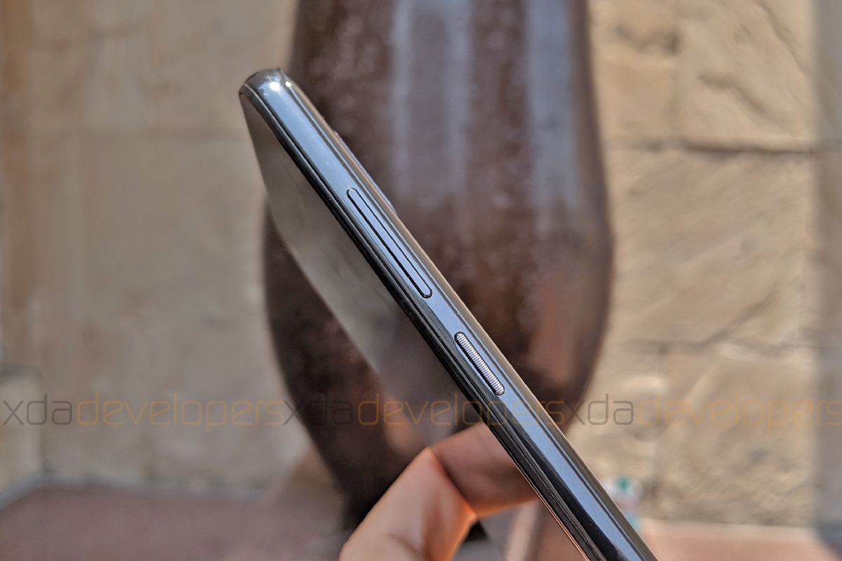
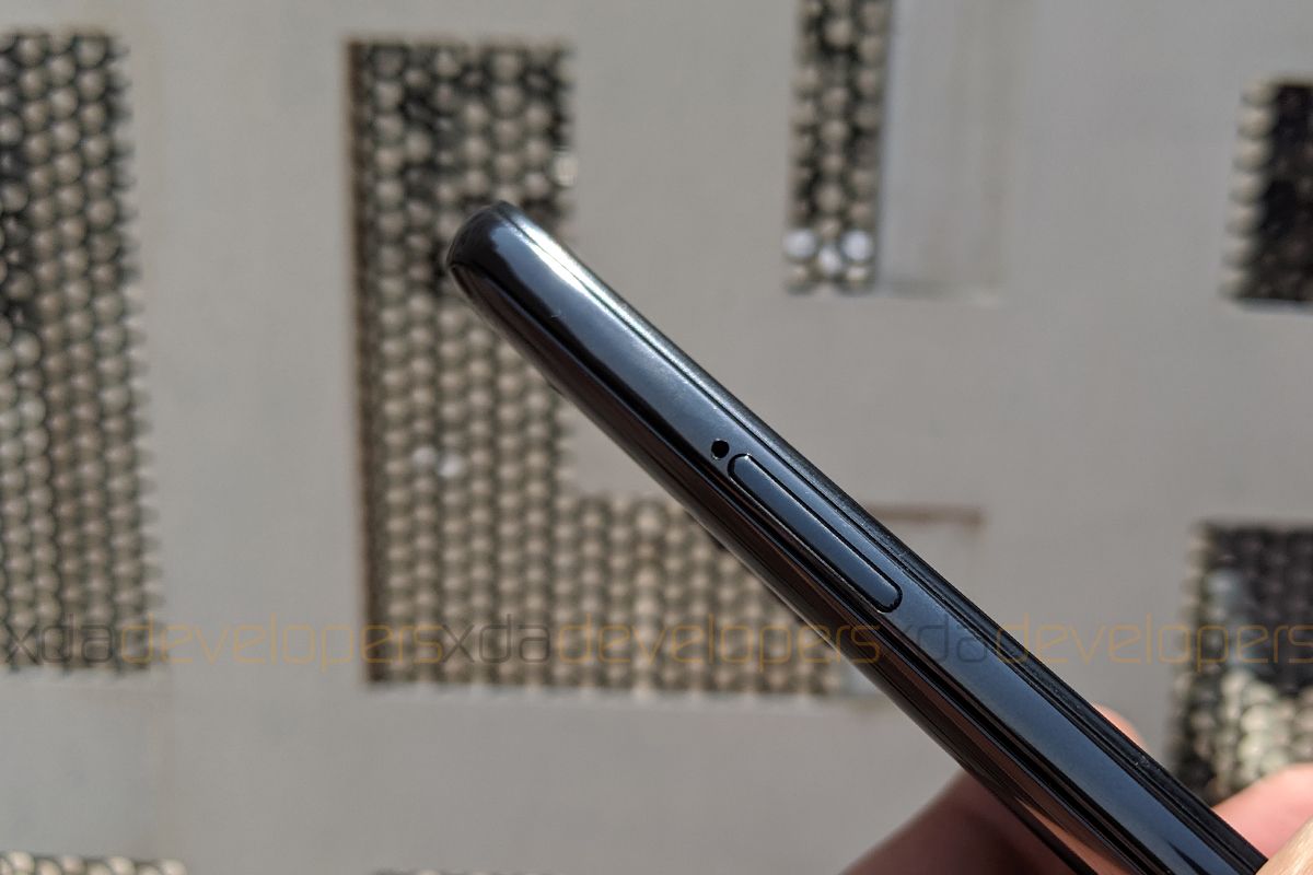
Wrapping the edges is a metal frame which houses the power button and the volume rocker on the right side and the hybrid SIM slot on the left. The power button has an indented texture on the top for better tactility. On the bottom of the Motorola One Vision, there’s a speaker grille alongside the USB type-C port and the primary microphone, while the top of the smartphone features the 3.5mm headphone jack and the secondary microphone.

Overall, the build of the Motorola One Vision feels both durable and premium. As for the display, Motorola talks about a Gorilla Glass protection over it but does not mention the exact version of the protective glass. In terms of heft, the smartphone feels significantly bulky, especially when held in landscape. If you can work around that without being troubled by the tall design, the One Vision actually definitely feels worthy of attention.
Camera
Besides the expansive and empowering display, the cameras on the Motorola One Vision also lend it its name. The primary sensor on the back is a 48MP Samsung ISOCELL GM1 with a pixel size of 0.8μm. This is hooked to a lens with f/1.7 aperture and the company says that this setup along with 4-in-1 pixel binning technology should provide for sufficient details in low light shots. Due to pixel binning, the smartphone clicks 12MP shots by default, but there is a provision to click to 48MP images in the Pro mode.
While this sensor is also available on the Chinese Redmi Note 7 (Redmi Note 7S in India), the slightly larger aperture should allow for more light. Additionally, the camera module features OIS for more stable pictures and videos, especially at night. Meanwhile, the 25MP selfie camera with an f/2.0 aperture on the front also supports 4-in-1 pixel binning which should allow for brighter selfies in low light. The camera offers live bokeh preview as well as beautification options.
From the few sample images that I clicked using the demo unit, the Motorola One Vision does seem to capture a substantial amount of detail both – outdoor as well as indoors with sufficient lighting. In the case of the outdoor landscape image, there appears to be decent saturation and contrast. These images were taken using the default modes in the Moto Camera app. In the case of portraits, there are yellow undertones in the images.
In terms of selfies, there is a considerable amount of smoothing while the amount of details is not on par with images from the rear camera. Further, there’s a perceptible reddish arc in selfies, but I’m not sure about the exact reason for this. While it could be easily mistaken for flair initially, it appears in all the selfies and is likely to be poor packing of the display panel. This could simply be a bad unit that I got on my hands, but it also means that the Motorola One Vision units may be susceptible to such failures. We’ll have to wait to see if there are more of such reports to have a better idea.

The Camera app on the smartphone is not much different from what we see on the Moto G7 series. When taking portrait images, the intensity of the live blur can be modified using buttons for different strengths. Overall, though, I found the camera UI clunky and hoped that it would have a better, cleaner layout.
Android One UI with slight modifications
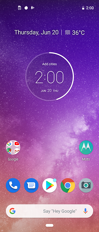
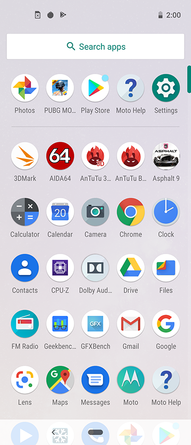
Since the Motorola One Power is part of the Android One program, it rocks a stock Android interface with only a few changes on top. These include Moto Display, Moto Actions, and single-button navigation gestures. Despite the tall display, there is a lot of padding between the icons on the home screen and app drawer. This may not be the primary concern for most average users, but for those of whom it is a concern, one might want to use a custom launcher to bypass the poor experience. But this surely feels like a lapse on Motorola’s part that deprives prospective users of a better experience.


Furthermore, due to the punch hole camera, the status bar has been uncomfortably thick. I have no option but to blame Motorola as the brand should have given more thought into optimizing the interface for the display. While we can certainly hope for things to get better with the Android Q update, which should arrive a month or two after the release for Pixel devices, there is no guarantee.
Motorola One Vision: A prospective insight
The Motorola One Vision may feel awkward to use but its tall display could be a spectacle from the future. Over time, smartphone displays have gotten taller and we can expect the trend to continue. Although 21:9 might seem ludicrous for now, we can’t deny the possibility of other smartphone companies outside of Sony, the first to market with this aspect ratio, exploring this avenue. It is also possible that Motorola is conditioning us for the upcoming vertically folding Motorola Razr device or series of smartphones. Nonetheless, it is too early to predict the future of smartphones now.

What we can clearly see is that the Motorola One Vision seems like a great device for entertainment, especially for watching movies and content on Netflix. However, if Motorola desires to lead the way for longer smartphones, it must strive to work harder on making the interface as palatable as the smartphone’s striking design.
Overall, the package seems very lucrative if you’re ready to be guinea pigs for this new tall display trend. The Motorola One Vision appears to be built on the philosophy of “form over function” but, if you want to play safe and want better performance for a similar price, the POCO F1 may seem like a more functional choice. Alternatively, if you like the hole punch design and wish for more convenient single-handed usage, you can want to check out the recently announced Samsung Galaxy M40.
The post Motorola One Vision Hands-on: Promising, But Not Revolutionary appeared first on xda-developers.


0 comments:
Post a Comment