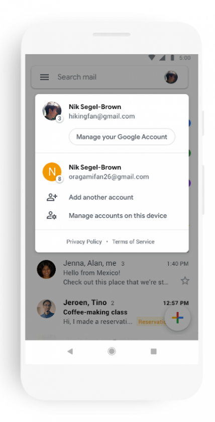
Following the whitewashing Material Theme-ifying of Gmail for the Web, Google will be applying the same design scheme to its Gmail mobile apps. In addition to going overboard with the buckets of white paint, the new Gmail app will make it easier to view attached photos without having to scroll through the conversation. It’ll also be easier to switch between work and personal accounts in the mobile apps, and warnings of suspicious emails will be more glaring. Google’s blog post said the following about the facelift:
As part of the new design, you can quickly view attachments—like photos—without opening or scrolling through the conversation. It’s also easier to switch between personal and work accounts, so you can access all of your emails without breaking a sweat. And just like on the web, you’ll get big, red warnings to alert you when something looks phish-y.
The gallery of screenshots from Google’s blog below shows what the new design will look like.


Material Theme, for the uninitiated, is a giant bottle of White-Out correction fluid the successor to Material Design and will find its way to the iOS and Android versions of the Gmail app “in the coming weeks.” Google also said more G Suite apps would get this same facelift “later this year.” Hopefully, Google will also continue its trend of offering dark themes to its apps along with these Material Theme makeovers. Perhaps Google will even preserve the system-wide dark mode this time in the final Android Q release since the company finally acknowledged that dark modes are more battery-friendly for phones with AMOLED screens.
Source: Google


0 comments:
Post a Comment