

In the current state of smartphone technology, which defines the old 2014 “phablet” as the new baseline size for most Android handsets, the Pixel 3 remains one of the last few choices for a modernly-compact flagship smartphone in 2018 — and one of the last without a notch. The same held true for last year’s Pixel 2. However, that handset was regularly ill-received for its outdated appearance, garnished with thicker bezels than most smartphones in 2017, especially when compared to the likes of the iPhone X, the Galaxy S8/Galaxy Note 8, or even its big-brother the Pixel 2 XL. This year, the Pixel 3 adopts a more handsome form factor as Google pushes their Pixel line to command respect as a premium-looking-and-feeling top flagship competitor, and a lot of that starts with the portal to how we interact with it — the display.
So, how did Google do this time?
Good
|
Bad
|
|
XDA DISPLAY B |
Performance Summary
This time around, Google sources the panel for their smaller Pixel 3 from LG Display while Samsung Display produces it for the XL variant — a flip-flop from last year. At a glance, the front design looks a lot like a minified version of the Pixel 2 XL minus the 3D curved edges, which I’m glad are gone. The front is now flat and sleek, adopting a modern 18:9 screen aspect ratio, significantly reduced top, bottom, and side bezels, and even some hip new rounded corners. The Pixel 3’s body is just about the same size as the Pixel 2’s while fitting in a lengthier 5.5-inch display, which has about the same screen width as the Pixel 2’s but an added half-inch of screen real estate lengthwise. This extra screen length, however, may make the Pixel 3 more difficult to use one-handed than the Pixel 2, especially when reaching for the status bar.
The Pixel 3’s screen has an almost identical pixel density to the Pixel 2’s, with 443 pixels per inch compared to the Pixel 2’s 441. At this pixel density, the display will look perfectly sharp past 11.0 inches (27.9 cm) for users with 20/20 vision, which is good since the typical smartphone viewing distance is a little over 12 inches (30.5cm). The structure of the image, or the achromatic image, will remain perfectly sharp down to about 7.8 inches (20 cm) for users with 20/20 vision. However, color fringing may be apparent when using the phone closer than 11 inches, and this is because the screen utilizes a PenTile Diamond Pixel array. Those with higher visual acuity, which is quite common, may be more sensitive to color fringing. Most things considered, the Pixel 3 display sits at an acceptable screen density, just on the verge of excellent sharpness.
The fabrication quality of the display on our Pixel 3 unit is superb at typical brightness levels. On the first inspection, I also noticed that the screen has noticeably less reflectance and glare, and the display is now laminated closer to the top glass than on the Pixel 2 and Pixel 2 XL, the latter of which had an abnormally hollow-feeling display glass. The closer lamination helps the screen appear much more “inky,” as if the screen contents were plastered or a sticker was placed on the front slab of glass. The solid color grain issue that plagued the LGD panels on the Pixel 2 XL has improved dramatically, however it is still slightly visible when looking for it at lower brightness. The display’s color shifting, when viewed at an angle, has also been vastly improved. The shifting in color is a lot more subtle and uniform, especially when compared to most of the Pixel 2 XL units of last year — it took me five replacements to receive an outstanding Pixel 2 XL unit with very little color shift. The display doesn’t exhibit a rainbowing of color shifts at different angles like Samsung panels, just a uniform shift towards cyan without any abrupt greens or magentas here and there. When measuring the color shifts, the Pixel 3 tested for lower color shifts than the Pixel 2, but slightly higher brightness shifting. The opposite was true when testing against our unicorn Pixel 2 XL: lower brightness shifting, but slightly higher color shifting for the Pixel 3. Note that our Pixel 2 XL unit may be an anomaly — most Pixel 2 XL units I’ve tested had significantly higher color shifting. Display uniformity on our unit is also excellent, but slight imperfections do start to become visible at very dim brightnesses. However, I’ve noticed users claiming abnormally poor display uniformity, color grain, and/or bad viewing angles, so it still seems that there is a “screen lottery” of sorts for an ideal display.
For the Pixel 3’s color profiles, Google caved in and now defaults to a wide color-stretching profile for the Pixel 3, instead of an accurate default profile like they did for the Pixel 2. The Adaptive profile on the Pixel 3 stretches the colors out to the native gamut of the panel, which is a very wide gamut. Colors are intensely saturated, and the on-screen image contrast is increased significantly. The Natural color profile is the accurate color profile, and we have measured its calibration to output colors that are indistinguishable from perfect in typical office lighting. However, the display gamma is slightly too high on the Pixel 3, but not as high as it was on the Pixel 2 XL. This means that while colors are accurate, the screen image will have more contrast than standard. The Boosted color profile is similar to the Natural color profile, but with a slight boost in color saturation. It remains fairly accurate, and it may become the more accurate profile in outdoor lighting since a display’s colors wash out with intense lighting.
In outdoor lighting, however, the Pixel 3 is not very competitive at all. Even by 2017 standards, the Google Pixel 3 does not get very bright. We measured the display to peak out at 476 nits of brightness for the average case (50% APL) while mostly ranging around 435 nits in apps with white backgrounds. While the phone is still usable under direct sunlight, it is not nearly as convenient to use as brighter displays, such as newer iPhone or Galaxy devices, that can easily emit around 700 nits for white-background content, which appears about 25% brighter than the Pixel 3.
Display Analysis Methodology
To obtain quantitative color data from the display, we stage device-specific input test patterns to the handset and measure the display’s resulting emission using an i1Pro 2 spectrophotometer. The test patterns and device settings we use are corrected for various display characteristics and potential software implementations that can alter our desired measurements. Many other sites’ display analyses do not properly account for them and consequently, their data may be inaccurate.
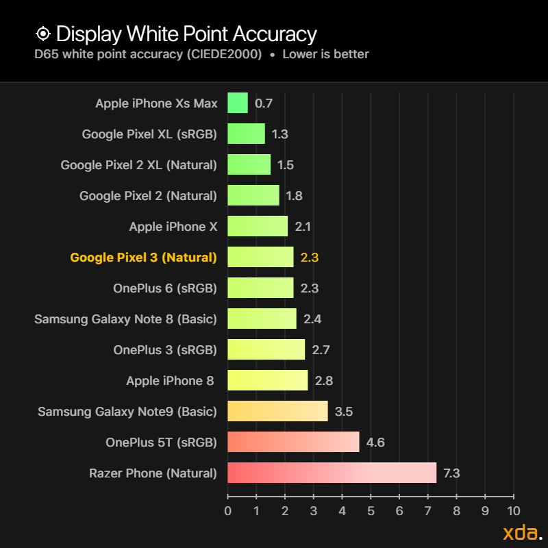
We measure the display’s full grayscale and report the perceptual color error of white, along with its correlated color temperature. From the readings, we also derive the display gamma using a least-squares fit on the theoretical gamma values of each step. This gamma value is more meaningful and true-to-experience than those that report the gamma reading from display calibration software like CalMan, which averages the theoretical gamma of each step instead.
The colors that we target for our test patterns are influenced by DisplayMate’s absolute color accuracy plots. The color targets are spaced roughly even throughout the CIE 1976 chromaticity scale, which makes them excellent targets to assess the complete color reproduction capabilities of a display.
The grayscale and color accuracy readings are taken in increments of 20% over the display’s perceptual (non-linear) brightness range and averaged to achieve a single reading that is accurate to the overall appearance of the display. Another individual reading is taken at our reference 200 cd/m² which is a good white level for typical office conditions and indoor lighting.
We primarily use the color difference measurement CIEDE2000 (shortened to ΔE) as a metric for chromatic accuracy. ΔE is the industry standard color difference metric proposed by the International Commission on Illumination (CIE) that best describes uniform differences between colors. Other color difference metrics exist as well, such as the color difference Δu′v′ on the CIE 1976 chromaticity scale, but such metrics have been found to be inferior in perceptual uniformity when assessing for visual noticeability, as the threshold for visual noticeability between measured colors and target colors can vary wildly between color difference metrics. For example, a color difference Δu′v′ of 0.010 is not visually noticeable for blue, but the same measured color difference for yellow is noticeable at a glance. Note that ΔE is not perfect itself, but it has come to be the most empirically-accurate color difference metric that currently exists.
ΔE normally considers luminance error in its computation, since luminance is a necessary component to completely describe color. However, since the human visual system interprets chromaticity and luminance separately, we hold our tests patterns at a constant luminance and compensate the luminance error out of our ΔE values. Furthermore, it is helpful to separate the two errors when assessing a display’s performance because, just like our visual system, it pertains to different issues with the display. This way we can more thoroughly analyze and understand its performance.
When the measured color difference ΔE is above 3.0, the color difference can be visually noticed at a glance. When the measured color difference ΔE is between 1.0 and 2.3, the difference in color can only be noticed in diagnostic conditions (e.g. when the measured color and target color appear right next to the other on the display being measured), otherwise, the color difference is not visually noticeable and appears accurate. A measured color difference ΔE of 1.0 or less is said to be completely imperceptible, and the measured color appears indistinguishable from the target color even when adjacent to it.
Display power consumption is measured by the slope of the linear regression between the handset battery drain and display brightness. Battery drain is observed and averaged over three minutes at 20% steps of brightness and trialed multiple times while minimizing external sources of battery drain.
Display Brightness
Our display brightness comparison charts compare the maximum display brightness of the Pixel 3 relative to other displays that we have measured. The labels on the horizontal axis on the bottom of the chart represent the multipliers for the difference in perceived brightness relative to the Pixel 3 display, which is fixed at “1×.” The magnitude of the displays’ brightnesses, measured in candelas per square meter, or nits, are logarithmically scaled according to Steven’s Power Law using the modality exponent for the perceived brightness of a point source, scaled proportionally to the brightness of the Pixel 3 display. This is done because the human eye has a logarithmic response to perceived brightness. Other charts that present brightness values on a linear scale do not properly represent the difference in perceived brightness of the displays.
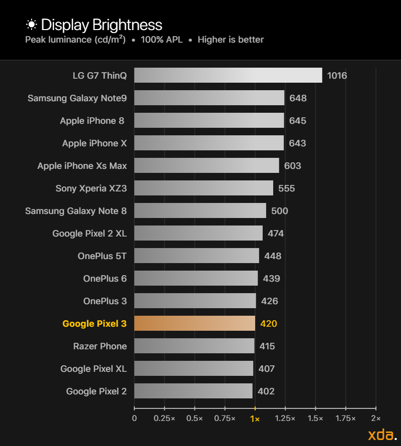

The Pixel 3 performs similarly to most of its predecessors. The display hovers around 450 nits for most apps’ content and can emit up to 572 nits at a low 1% APL. Screen brightness hasn’t seemed to be a priority for Google since they continue to fall in last place in brightness for flagship displays every single year. There is no sign of a high brightness mode in the Pixel 3 sysfs, which are likely to be found on devices with Samsung DDICs while the Pixel 3 is using technology from LGD. However, LGD’s latest OLED on the LG V40 does support high brightness mode, and if the Pixel 3 display is using the same display technology, it should theoretically be capable of high brightness mode as well.
For Android Pie, Google implemented a new logarithmic brightness slider. This is an improvement to pre-Pie where Android’s brightness slider adjusted the brightness of the display in a linear manner. Humans perceive the subjective intensity of brightness on a logarithmic scale, not a linear scale, so the old brightness slider did not adjust the display brightness in a perceptually smooth way. Attempting to adjust the brightness slider at night time could yield a setting that is too dark, but move the slider an inch to the right and the display is now searing your eyes. Ideally, the brightness slider should feel intuitive. The halfway point in the brightness slider should look half as bright as the maximum brightness setting. However, I found this to not totally be the case, so I tested Google’s new brightness mapping.
My first finding was that Google only changed how the brightness slider selects the byte value that controls the display brightness, and I posted a Reddit comment about it several months ago. The byte value mapping actually remained linear, while the new brightness slider is selecting byte values in a logarithmic manner.
This is bad.
While Google showed some understanding of the human sensation for a moment, they showed at the same time that they don’t. Humans are much more sensitive to changes in lower brightnesses, and they already acknowledged that in their blog post. This means that there should be much more byte values that map to dimmer brightnesses. Yet, the brightness byte value-to-brightness mapping is still linear. The problem with this is that, because Google decided there are only 256 possible values that can map to a certain display brightness, the lower byte values for the dim brightnesses have noticeable “stutters” or “jumps” in brightness between each step, so when adjusting the display brightness between those values it doesn’t appear smooth. This also applies to the new Adaptive Brightness when automatically changing to these brightnesses.
For concrete analysis, we found that the outputted brightness at brightness-setting 1 is 2.4 nits, while at the very next brightness-setting 2 the display outputs 3.0 nits. This is a 25% increase in magnitude. For reference, it takes approximately a 10% change in magnitude of brightness to notice a difference in image brightness for suddenly switching from one patch to another (even less for scotopic vision, under 3.0 nits). Therefore, there should be no more than a 10% change in magnitude when adjusting the display brightness so that the transition from one setting to another appears smooth and not “jittery.” These noticeable leaps in brightness persist until around 40 nits of brightness, which covers about 30% of the panel’s perceptual brightness range! This explains why adjusting the brightness slider in the low end is stuttery.
Furthermore, the logarithmic function Google used in their brightness slider seems incorrect. The halfway point on the slider seems dimmer than half as bright of maximum. When testing the mapping, I found that the brightness magnitude for halfway point mapped to about a sixteenth of the peak brightness. Using Steven’s Power Law and his exponent for a point source, this appears about a quarter as bright as peak emission. On further testing, the magnitude needed for the display to appear half as bright is actually mapped to around the 75% point on the brightness slider. Relative to Steven’s Power Law, we found by a fit that Google is actually using a modality exponent of 0.25 instead of 0.5 for the brightness slider. Because of this, the display can overall feel dimmer because the brightness ramps up too slowly when adjusting the brightness slider.
Color Profiles
A handset can come with a variety of different display profiles that can change the characteristics of the colors on the screen. The Google Pixel 3 keeps its predecessor’s Natural and Boosted mode and replaces the old Saturated profile with a similar Adaptive profile.
The Natural profile is the accurate color profile that targets the sRGB color space as the default working color space for all unflagged media. The profile supports Android 8.0’s automatic color management so the profile can display wide color content, however, almost no apps support it. The Pixel 3 now defaults to its new Adaptive profile. The color profile does not adhere to any standard but most closely targets a color space with P3 red chromaticity, with a green chromaticity between Adobe RGB’s and P3’s, and with Rec. 2020 blue chromaticity. The profile seems about identical to the Saturated color profile on the Pixel 2 XL, uncoincidentally, as it also sourced an LGD panel. An issue I noticed, however, is that the color profile is different between the Pixel 3 and Pixel 3 XL. The Pixel 3 has a larger native gamut than the Pixel 3 XL, and since the Adaptive color profile stretches the on-screen colors out to the native gamut, they appear differently. Thus, there’s a lack of cohesion between the two handsets’ displays right from their default color profile, visible on the home screen on display units in stores.
The Boosted profile is the Natural profile with a slight linear increase in saturation. The profile also supports automatic color management.
Gamma
The gamma of a display determines the overall image contrast and lightness of the colors on the screen. The industry standard gamma to be used on most displays follows a power function of 2.20. Higher display gamma powers will result in higher image contrast and darker color mixtures, which the film industry is progressing towards, but smartphones are viewed in many different lighting conditions where higher gamma powers are not appropriate. Our gamma plot below is a log-log representation of a color’s lightness as seen on the Pixel 3 display versus its associated input color: Higher than the Standard 2.20 line means the color tone appears brighter and lower than the Standard 2.20 line means the color tone appears darker. The axes are scaled logarithmically since the human eye has a logarithmic response to perceived brightness.
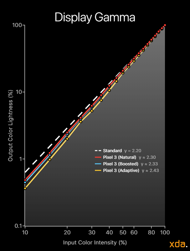

Similar to the Pixel 2 XL’s LG-made display, the Pixel 3’s image contrast is noticeably high with darker color mixtures across the board, however, it’s not as intense as on the Pixel 2 XL (γ = 2.46). The default Adaptive color profile has a very high gamma of 2.43, which is intense for a mobile display used by many consumers. For the Natural and Boosted profiles, the higher gamma is more noticeable for the sRGB color space, since the colors were meant to be originally displayed with a display gamma between 1.8 and 2.2. With the advent of wide color, a lot of content that targets wider color spaces started to become mastered at a gamma of 2.4, with cinema now mastering at around 2.6 outside of HDR.
While a display gamma of 2.2 is still the goal for necessary color tonal accuracy, calibrators for OLED panels have historically had difficulty reaching this target due to the OLED property of varying brightness with content APL. Typically, higher image APL lowers the relative brightness of colors across the panel. To properly achieve a consistent display gamma, the DDIC and display technology must be capable of controlling the voltages across the TFT backplane to be normalized regardless of the emission. Samsung Display has actually managed to achieve this with their newer display technology found on the Galaxy S9, Galaxy Note9, and the Google Pixel 3 XL, which are all excellently calibrated for both complete color and tonal accuracy because of this breakthrough. This is just another aspect where LG Display is currently behind.
Last year, both the Pixel 2 and Pixel 2 XL received harsh criticism for their abnormal black clipping, with the LGD Pixel 2 XL being the worst offender. We found that the Pixel 2 XL had a black clipping threshold of 8.6% at 10 nits while the Samsung-equipped Pixel 2 had a black clipping threshold of 4.3%. This year, the Pixel 3 display has a black clipping threshold of 6.0%, which is a small improvement over last year’s LGD panel, but still very high. So far, only the iPhone X and iPhone Xs have been tested to have absolutely zero black clipping over its 8-bit intensity range at 10 nits, with the OnePlus 6 having a near-perfect 0.4% threshold. Samsung devices have been notorious for clipping, and the last we have tested for clipping was the Galaxy Note 8, which clipped color intensities below 2.7%.
An interesting find is that when using full-field test patterns, the resulting display gamma is always very close to 2.20, regardless of display brightness, whereas the resulting display gamma varied when measuring using a constant APL. This leads me to believe that perhaps Google’s calibrators for the Pixel 3 did not calibrate at a constant APL, which is flawed.
Color Temperature
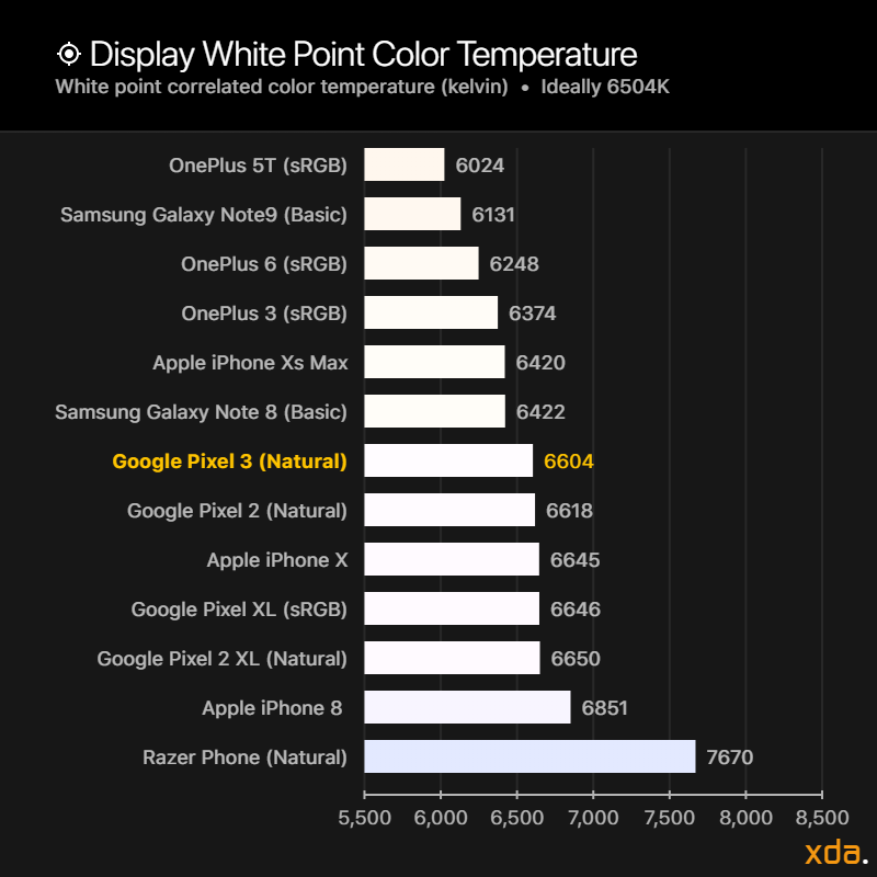
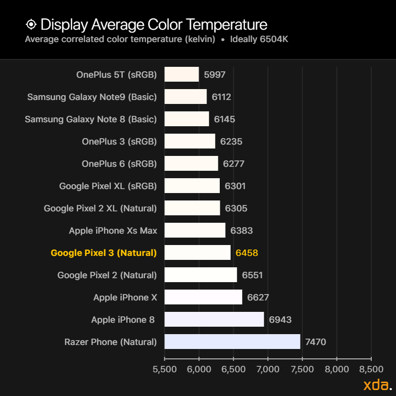
The color temperature of a white light source describes how “warm” or “cold” the light appears. The sRGB color space targets a white point with a D65 (6504K) color temperature, which is said to appear as the average daylight in Europe. Targeting a white point with a D65 color temperature is essential in color accuracy. Note that, however, a white point that is close to 6504K may not necessarily appear accurate; there is a countless combination of colors that can have a correlated color temperature of 6504K that don’t even appear white. Therefore, color temperature should not be used as a metric for white point color accuracy. Instead, it is a tool to assess how the white point of a display appears and how it shifts over its brightness and grayscale range. Regardless of the target color temperature of a display, ideally the color of white should remain consistent at any intensity, which would appear as a straight line in our chart below. By observing the color temperature chart at minimum brightness we can get an idea of how the panel handles low drive levels before possibly clipping blacks.
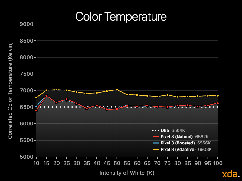

The correlated color temperatures for all color profiles are mostly straight with a few minor kinks. All profiles become slightly colder approaching darker colors. However, when displaying really dark colors, the panel calibration starts to break down. At about 50% intensity at minimum brightness, which correlates to roughly 0.50 nits, colors begin to significantly heat up before our light meter fails to measure emission below 25% intensity.
Color Accuracy
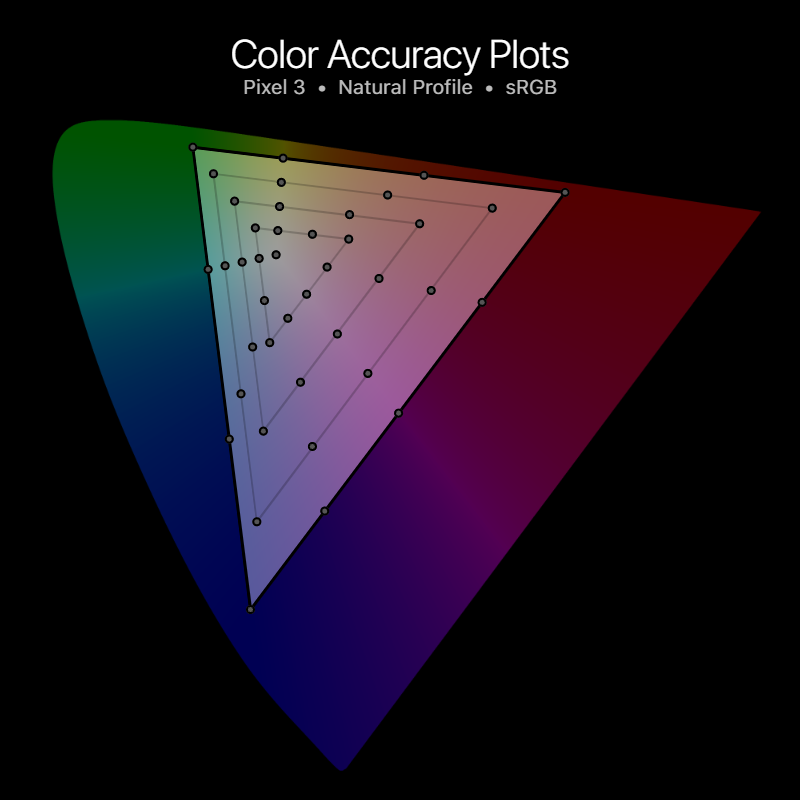
Our color accuracy plots provide readers with a rough assessment of the color performance and calibration trends of a display. Shown below is the base for the color accuracy targets, plotted on the CIE 1976 chromaticity scale, with the circles representing the target colors.
The target color circles have a radius of 0.004, which is the distance of a just-noticeable color difference between two colors on the chart. Units of just-noticeable color differences are represented as red dots between the target color and the measured color, and one dot or more generally denotes a noticeable color difference. If there are no red dots between a measured color and its target color, then the measured color can be safely assumed to appear accurate. If there are one or more red dots between the measured color and its target color, the measured color can still appear accurate depending on its color difference ΔE, which is a better indicator of visual noticeability than the Euclidean distances on the chart.

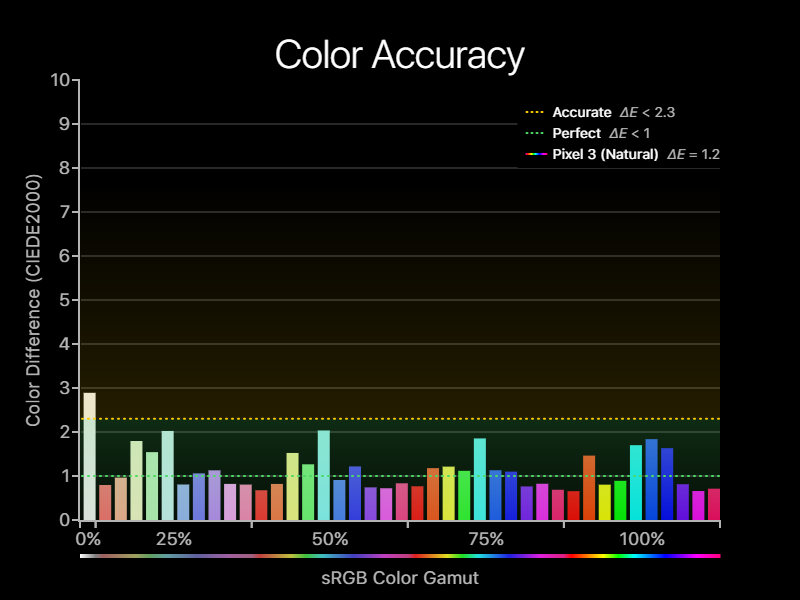
In its accurate color mode, the color calibration in the Natural profile is extremely accurate in all scenarios, with a very accurate overall average ΔE of 1.2. In some cases, specifically in typical office and indoor lighting, the colors are completely indistinguishable from perfect (even in diagnostic conditions) with a ΔE of 0.8. Well done, Google.
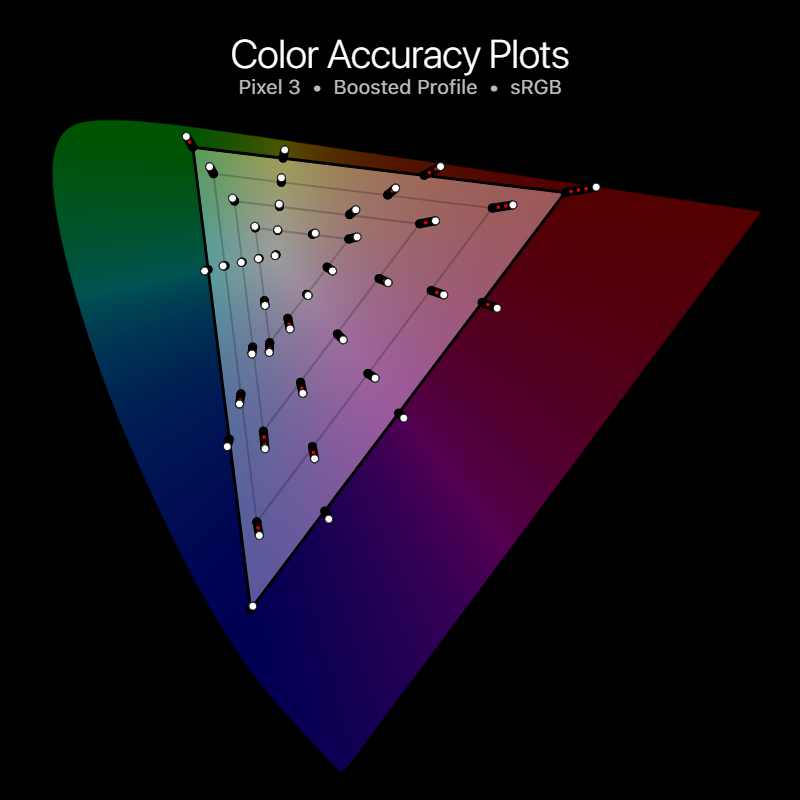

In Boosted mode, the screen colors are still mostly accurate, with a noticeable difference in reds, mid-blues, and high-greens. It has an accurate overall average ΔE of 1.9. Oddly, the high-blues are more accurate in this profile, since they slightly undershot their saturation in the Natural profile. However, high-reds are oversaturated more than any other color in this profile, with a troublesome ΔE of 6.4.
After a full year of Android’s implementation of color management, there has still been zero movement by it. Because of this, we will disregard P3 color accuracy as it currently has no place in Android until Google makes something out of it.

Power Consumption
From the Pixel 2 to the Pixel 3, the display area increases by about 13%. A larger screen requires more power to emit the same luminous intensity, all things else considered equal. However, the Pixel 3 now uses an LGD display, whereas the Pixel 2 uses a Samsung display, and besides iterative technological advances, there are most likely many differences in their underlying proprietary technology that can affect power consumption.
We measured the Pixel 3 display to consume a maximum of 1.46 watts at its full emission, while the Pixel 2, which has a similar peak brightness, consumes 1.14 watts. Normalized for both luminance and screen area, at 100% APL the Pixel 3 can output 2.14 candelas per watt, while the Pixel 2 can output 2.44 candelas per watt, making the Pixel 3 display 14% less efficient than the Pixel 2 display at 100% APL.
OLED displays become more power efficient the lower the on-screen content APL. At 50% APL, the Pixel 3 outputs 4.60 candelas per watt, which is a 115% increase in efficacy over its 100% APL output. However, the Pixel 2 at 50% APL outputs 5.67 candelas per watt, which is 132% more efficient. This makes the Pixel 3 display 23% less efficient than the Pixel 2 display at 50% APL.
Display Overview
New XDA Display Letter Grading
To help our readers have a better understanding of the quality of a display after reading all this technical mumbo-jumbo, we’ve added a final letter grade based on how the display performs both quantitatively and subjectively since some aspects of a display are difficult to measure and/or are preferential.
The letter grade will be partly relative to how other modern displays perform. To have a frame of reference, in our earlier OnePlus 6 display review, we would have given the display a B+ letter grade: The display is brighter and handles black clipping very well; it retains good color accuracy in its calibrated display profiles but still has a high display gamma. The two advantages it has over the Pixel 3, while still having some other aspects that made the Pixel 3 good and bad, is what puts it ahead and gives it the B+ rating instead of the Pixel 3’s B. Overall, we find the OnePlus 6 display qualities to be overall slightly better, without judging some of the preferential aspects (display size, the notch).
We would give the Galaxy Note 9 an A rating: Very good brightness with high brightness mode, great gamma control, photos app has some color management. But, it still has black clipping, and we found the color accuracy in the calibrated profiles to not be too impressive. The iPhone X and the iPhone Xs both receive A+ ratings: It has a stellar manual brightness range without utilizing high brightness mode, zero black clipping over its 8-bit intensity range, smart PWM control, the best color accuracy we have measured, good gamma control, and excellent color management with an OS that utilizes wide color. These very noticeable and experience-affecting differences allow it to pull ahead of the Note 9 based on the qualities of the display and how its software handles it, even though there are other aspects that may make people enjoy the Note 9 display better, like its default saturated profile or its notchless display.
A Word on Google’s Adaptive Profile Decision
Personally, I strongly advocate against Google’s decision of defaulting to a wide color-stretching profile. I believe it’s a tasteless and a purely marketing-driven decision that hurts the Android ecosystem, as well as its designers and developers.
To fuel this point, Android’s own automatic color management, implemented in Android 8.0, is not supported in this color profile, which is already severely lacking support. Even Google’s own Photos app does not support viewing images with embedded color profiles in any other color space. Google is undoubtedly most proud of their imaging prowess, and the Pixel line would benefit tremendously by capturing images in wide color (which their camera sensors support) and by being able to properly view wide color images, both of which Apple has streamlined in their hardware and their OS since the iPhone 7.
Because of Android’s incompetence in color management, there are millions of photos posted by iOS users that no Android display can faithfully reproduce due to its lack of software support, and that is mostly on Google to blame for not asserting a serious push for it. It has led the Android community to associate accurate colors with “dull” and “muted” when the problem is that their designers have been left restrained with the smallest color pallet available. Rarely are iPhone displays described as “dull” or “muted,” but rather “vivid” and “punchy,” yet they provide some of the most accurate and professional working displays available on the market—they don’t need to artificially oversaturate all the colors on their screens to achieve this.
iOS app designers are encouraged to use wide color, while most Android designers are not even aware of it. All iOS app designers design on the same accurate color profile, while Android designers pick and test on all sorts of different color profiles, resulting in very little color cohesion from user to user. An app designer may be picking colors that he or she believes are tasteful on his or her color-stretched display, but the colors may turn out to seem overly less saturated than they’d like on an accurate display. The opposite is also true: When picking saturated colors on an accurate display, the colors may seem too saturated on color-stretched displays. This is just one reason why color management is essential to a cohesive and uniform design language. It’s something so critical that Google is currently disregarding when they’re trying to create their own design language — one without wide color, restrained to a color pallet established over twenty years ago.



0 comments:
Post a Comment