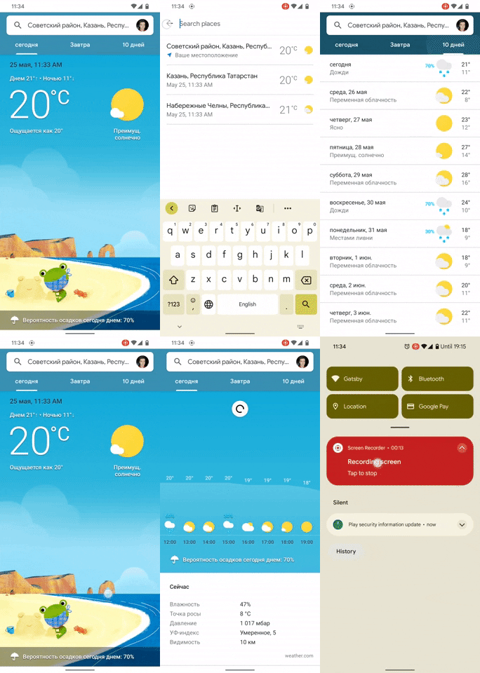
The Google Weather page in the Google App is getting a minor design refresh, but it doesn’t follow the new Material You design language that Google recently showcased at I/O 2021. Instead, the updated page follows the older Material Theme guidelines.
Users on Telegram’s GooglePixels group recently spotted the redesigned Google Weather page and shared the following screenshots. As you can see, the updated Google Weather page has a new Search bar with a profile picture in the right corner. You can tap on it to quickly change your account, select the temperature unit, or access other settings. For the unaware, the current layout has a hamburger menu icon in the left corner of the Search bar that houses the Account and Temperature settings.


Along with the new menu layout, the background on the Google Weather page has also received a minor refresh. While it still shows a frog in different scenes based on the weather and time of day, it now has a different art style. The GIF attached below further reveals that the redesign doesn’t affect the ‘Tomorrow’ and ’10 Days’ tabs. Swiping up on the ‘Today’ tab still shows additional weather info in the current layout.

The updated design seems to be rolling out via a server-side update, as it isn’t available on most of our devices, even on the latest Google App beta release (12.20.6.29). At the moment, we’re not sure when the redesigned Google Weather page will reach more users. We’ll update this post as soon as the wider rollout begins.
As mentioned earlier, the updated Google Weather page follows Google’s older Material Theme design language. This is quite surprising, as Google just announced a newer version of its design language, called Material You, at I/O this month. Therefore, it’s possible that Google may release yet another redesign for the Google Weather page in the coming months.
The post Google Weather gets a Material Theme design refresh appeared first on xda-developers.


0 comments:
Post a Comment