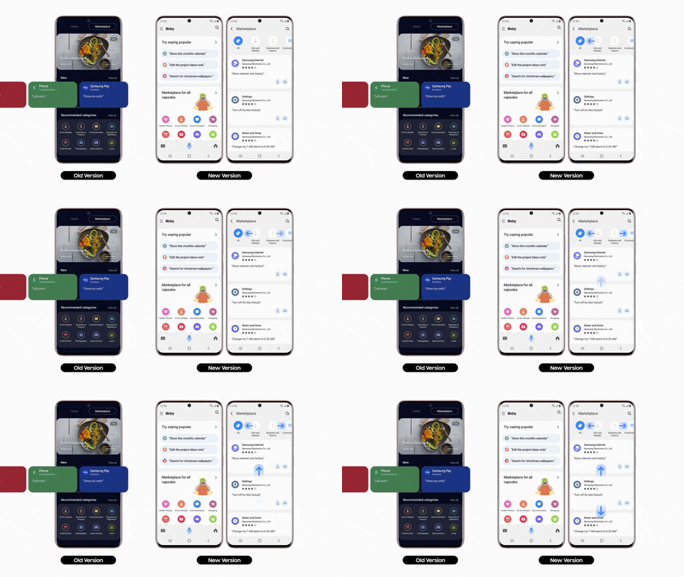
Samsung started rolling out a major update for its AI assistant Bixby a few weeks ago, bringing a complete design refresh and a new icon for the voice assistant. However, the updated UI wasn’t available for all users at the time, and we weren’t able to access it even after sideloading the update on our devices. It seems like the update is finally ready for primetime, as Samsung has now officially disclosed all the changes included in the update.
According to a recent report from Sammobile, the update brings a completely new UI for Bixby Home, and it’s no longer split between the two Home and All Capsules categories. Instead, the updated UI gives users all the information related to the virtual assistant in a single home screen.

Along with the updated home screen, Bixby Voice has also received a significant UI refresh. When summoned, Bixby Voice now occupies only a small portion towards the bottom of the display, instead of taking up the entire screen. This was a major pain point for many users, and we’re glad that Samsung has finally addressed it in the latest update.

Furthermore, the update includes new functionality for the voice assistant, and it now works in DeX mode. Thanks to this, Samsung DeX users will be able to issue voice commands to control various aspects of the desktop UI. This change adds to another recent Bixby update, which brought better integration between smartphones and smart TVs. It seems like Samsung is doubling down on expanding Bixby support to its entire ecosystem of smart devices, and we can’t wait to see what other handy integrations the company has in store for us.
What’s your take on the new Bixby update? Are these changes compelling enough to make you switch to Samsung’s virtual assistant? Let us know in the comments section below.
The post Samsung updates the Bixby Home UI and brings Bixby to DeX appeared first on xda-developers.


0 comments:
Post a Comment