
Surprising absolutely no one, OnePlus finally decided to hop on the high-end fleet of premium-priced smartphones. But what do they have to show for it? The most specs and features packed on a smartphone screen to date.
Though by now, we should all know that hardware and their specs on-paper are only part of the overall quality and experience. There are subtle nuances of panel characteristics, screen calibration, and software implementations that can all change how your content is seen. The budget-friendly OnePlus handsets of the past could afford a few omissions and shortcomings due to their price. And for the price, OnePlus phones have generally had decent displays. Now, the OnePlus 8 Pro is priced sternly in the premium category, and there is minimal room for faults; anything that can be nitpicked should be nitpicked.
OnePlus 8 Pro Display Review Highlights
Pros
- Super smooth and sharp 120Hz high refresh rate at 1440p
- Among the brightest in smartphone displays
- Pushing the envelope in display technology
Cons
- Mediocre shadow rendering, gray tinting, and black crush at lower brightness
- Higher likelihood of receiving a panel with uniformity issues
- Oversaturated red color tones in calibrated display modes
- Renders shadows in HDR/PQ too bright
“Premium flagship” components
In regards to the whole device, the OnePlus 8 Pro is very well-built. Every component included is high-end, and nothing of major significance has been omitted from the handset. Though while higher quality parts increase headroom, it should be noted that they often require greater care and maintenance to integrate to their full potential.
The panel in the OnePlus 8 Pro is sourced from Samsung Display, but this time around OnePlus doesn’t seem to settle for anything but Samsung’s best. The OnePlus 8 Pro has a tall 6.78-inch screen that runs at QHD+ (3168×1440, 513 pixels per inch) resolution with a high 120 Hz refresh rate. Unlike the Samsung Galaxy S20, the OnePlus 8 Pro is capable of rendering 120 Hz at its full QHD+ resolution. In terms of color volume, the OnePlus 8 Pro gets as bright and as wide as Samsung’s own flagship, the Galaxy S20. Furthermore, the OnePlus 8 Pro has a native 10-bit display panel, which fills in more of its color volume. It should theoretically allow for smoother color gradients and finer shadow details.
The display in the OnePlus 8 Pro is an ambitious endeavor in creating the best possible display experience on a smartphone. I had no reservations in the effort OnePlus was putting into the display. However, over the last few months, many customers of the OnePlus 8 Pro have faced some abnormalities with their OLED displays. These abnormalities involve screen uniformity issues, black crush, and a darkened row along the front-facing camera. I’m facing these same issues with my own unit, as well as with a replacement unit that I’ve received, but I found the quality control on mine to be acceptable. However, after seeing abundant quality control reports from other users, perhaps that was the price they had to pay to afford using Samsung’s latest and greatest panels. We reached out to OnePlus for a statement on the dark row problem, to which all we were told was that “under some low-light settings, an extremely slight brightness difference may potentially be observed. This will not impact the performance of the device.” Unfortunately, it doesn’t tell us anything we don’t already know, and it leaves us commentless on the dark row problem.
Color profiles
The OnePlus 8 Pro retains the two universal Android color profiles: the sRGB-conforming Natural profile and the punchier Vivid profile, which is based on Display P3 with a cooler white point. OnePlus also has three more profiles under the “Advanced” option, allowing the user to manually switch between sRGB, Display P3, and the native gamut of the display while giving the user the option to adjust the white point.
Compared to the sRGB color space, the Vivid gamut is up to 49% larger, with about 23% larger reds tinted towards orange, and 33% larger greens. AMOLED Wide Gamut is up to 55% larger than sRGB, with 26% larger reds tinted towards orange, 36% larger greens, and 18% larger blues sharply tinted towards cyan.
Software Display Features
On the software side, OnePlus added three display features to the OnePlus 8 Pro:
- Comfort tone: Automatically adjusts the white balance of the screen to adapt to the color of the surrounding ambient light (5000 K–7400 K).
- Vibrant color effect: Processes standard video into 10-bit HDR in real-time with local contrast enhancements and sharpness filtering. Applied only in certain apps.
- Motion graphics smoothing: Processes the motion and frame rate of videos in real-time to eliminate judder. Applied only in certain apps in fullscreen.
Display features can be a tricky subject to review with objectivity. Most of the time, companies pack in subjective adjustments to picture saturation, contrast, or sharpness that skews the artistic intent of the content. However, adjustments do exist that can actually improve the representation of the content’s original color grading. These adjustments typically involve adapting the on-screen content to the viewing environment, since the viewing environment plays a critical role in how the content is perceived. This is the basis for Comfort tone and a point of topic for the other two features.
Comfort tone is akin to Apple’s True Tone, and it’s a feature that I consider to be a staple in modern display systems when integrated seamlessly. It’s analogous to auto-brightness for screen white balance, but just like auto-brightness, its usefulness lies in how effective and seamlessly it works for the user. Unfortunately, I’ve always found OnePlus’ auto-brightness to be among the worst at adapting to my preference — I end up needing to tweak the brightness multiple times a day, and sometimes it just completely under- or over-shoots. On the other hand, Comfort tone does adapt the screen white balance on my OnePlus 8 Pro decently, except for one caveat: It does not apply to the lockscreen, and it needs to re-apply and transition every time the device is unlocked. This is also the case with Night mode, which is especially jarring at night when the OnePlus 8 Pro’s screen initially blasts you with blue light. It introduces inconsistency in what should be helpful display features.
Vibrant color effect and Motion graphics smoothing are both features that ultimately fall in the “subjective adjustments” category by OnePlus’ implementation, but both have assets worth talking about that can play a role in improving content playback fidelity. As it turns out, the perceived contrast and motion of content also changes as a result of the viewing environment, so adaptation is needed to compensate for different viewing environments. The tone mapping and local contrast enhancements in the Vibrant color effect are said to be able to adapt to the ambient light, and motion post-processing can be helpful in eliminating artifact judder introduced in high contrast scenes.

Vibrant color effect (bottom) can skew critical color tones, such as flesh tones (left) and skies (right). Video sources: Mark Rober, “Building the Perfect Squirrel Proof Bird Feeder“; Tom Scott, “This Video Has X Views“
As is typical of almost all picture “enhancements”, the Vibrant color effect can skew color tones. Small changes to critical memory colors, such as flesh tones and sky shades, are more likely to be noticed. This can be seen in the comparison above, giving Mark Rober an involuntary sunburn all over his face and tinting Tom’s sky backdrop to an uncanny neon-cyan (the photo doesn’t capture it to the full extent). We’re told that there’s supposed to be flesh tone protection on the OnePlus 8 Pro, but it doesn’t seem to be effective for this feature.
Motion graphics smoothing, also called motion estimation/motion compensation (MEMC), works like motion interpolation found in many TV sets. It scales the frame rate of content up to 60 FPS, and there’s also an experimental setting to scale it up to 120 FPS at the cost of capping the OnePlus 8 Pro’s screen resolution to 1080p. Like with most motion post-processing, it is often inconsistent; simple motion, such as translating/rotating objects and panning shots, appear much smoother than the rest of the motion in the scene. Many may oppose motion interpolation since it can cause motion to look unnatural, but when given tuning options, it can be a helpful tool to smooth out videos with visible choppiness (which depends on the screen brightness and the viewing environment). Unfortunately, no tuning options are provided on the OnePlus 8 Pro.
OnePlus collaborated with a company called Pixelworks, who specializes in video and image processing, for these features. Inside the OnePlus 8 Pro is Pixelworks’ visual processor, the Iris 5, which handles the HDR upscaling and the motion processing. Two MIPI lanes feed the Iris 5 chip, which are used to send over the video stream and the Android UI surface over separate lanes. The Iris 5 processes the video stream independently and then sends a composited frame with the UI to the display. We have published a separate article that covers what else Pixelworks and their Iris 5 chip can do. For the OnePlus 8 Pro, Pixelworks is also responsible for factory display color calibration and the DC Dimming feature.
Methodology for gathering data
To obtain quantitative color data from the display, I stage device-specific input test patterns to the handset and measure the display’s resulting emission using an X-Rite i1Display Pro metered by an X-Rite i1Pro 2 spectrophotometer in its high-resolution 3.3nm mode. The test patterns and device settings I use are corrected for various display characteristics and potential software implementations that may alter our desired measurements. My measurements are typically done with display-related options disabled unless mentioned otherwise.
I use constant power patterns (sometimes called equal-energy patterns), correlating to an average pixel level of about 42%, to measure the transfer function and grayscale precision. It’s important to measure emissive displays not just with constant average pixel level, but with constant power patterns since the output is dependent on the current and voltage being delivered to it. Additionally, a constant average pixel level does not inherently mean constant power; the patterns I use satisfy both. I use a higher average pixel level closer to 50% to capture a midpoint between both the lower pixel levels and the many apps and webpages with white backgrounds that are higher in pixel level.
I use the latest color difference metric ΔETP (ITU-R BT.2124), which is an overall better measure for color differences than ΔE00 that is used in my earlier reviews and is still currently being used in many other sites’ display reviews. Those that are still using ΔE00 for color error reporting are encouraged to use ΔEITP, as will be detailed in a session from the Society of Motion Picture and Television Engineers (SMPTE) and Portrait Displays (owner of CalMan).
ΔEITP normally considers luminance (intensity) error in its computation, since luminance is a necessary component to completely describe color. However, since the human visual system interprets chromaticity and luminance separately, I hold our test patterns at a constant luminance and do not include the luminance (I/intensity) error in our ΔE values. Furthermore, it is helpful to separate the two errors when assessing a display’s performance because, just like with our visual system, they pertain to different issues with the display. This way, we can more thoroughly analyze and understand the performance of a display.
Our color targets are based on the ICTCP/ITP color space, which is more perceptually-uniform than the CIE 1976 UCS with improved hue-linearity. Our targets are spaced out roughly even throughout the ITP color space at a reference 100 cd/m2 white level, and colors at 100%, 75%, 50%, and 25% saturation. Colors are measured at 73% stimulus, which corresponds to about 50% of max luminance assuming a gamma power of 2.20.
Contrast, grayscale, and color accuracy are tested throughout the display’s brightness range. The brightness increments are spaced evenly between the maximum display brightness and the minimum display brightness in PQ-space. Charts and graphs are also plotted in PQ-space (if applicable) for proper representation of the actual perception of data.
ΔETP values are roughly 3× the magnitude of ΔE00 values for the same color. The metric assumes the most critically-adapted viewing condition for the observer, and a measured ΔETP color difference value of 1.0 denotes a just-noticeable-difference for the color, and a value less than 1.0 signifies that the measured color is indistinguishable from perfect. For our reviews, a ΔETP value of less than 3.0 is an acceptable level of accuracy for a reference display (suggested from ITU-R BT.2124 Annex 4.2), and a ΔETP value greater than 8.0 is noticeable at a glance (tested empirically, and the value (8.0) also nicely lines up with roughly a 10% change in luminance, which is generally the change in percentage needed to notice a difference in brightness at a glance).
HDR test patterns are tested against ITU-R BT.2100 using the Perceptual Quantizer (ST 2084). HDR sRGB and P3 patterns are spaced out evenly with sRGB/P3 primaries, an HDR reference level white of 203 cd/m2 (ITU-R BT.2408), and a PQ signal level of 58% for all its patterns. All HDR patterns are tested at an HDR-average 20% APL with a 20% display size window.
Brightness
 As mentioned, the panel in the OnePlus 8 Pro is among the brightest in the smartphone market. The brightest smartphone OLEDs to date come from Samsung Display’s newer generation of panels, and they all have the same fullscreen white output of about 750–800 nits. One other key aspect that helps improve the OnePlus 8 Pro’s legibility is that it reduces its screen contrast (to a system gamma of about 1.5) in bright conditions, which lightens color tones.
It’s essential to know that the brightness of OLED displays is heavily dependent on the amount and the intensities of lit pixels. A full screen of white is the most power-demanding image an OLED panel can display, and it’s where power management circuitry typically limits OLED brightness the most. It’s also common for displays to boost the brightness signal when the screen is emitting fewer and/or darker pixels in high-brightness situations. Most Android phones also only reach their peak brightnesses with automatic brightness enabled and when the ambient light sensors detect plenty of light. For these reasons, it’s important for our readers to know the context and conditions of display brightness measurements that they read online — a display brightness figure of 1,400 nits associated with only a few lit pixels on a screen does not properly characterize the typical brightness of a display.
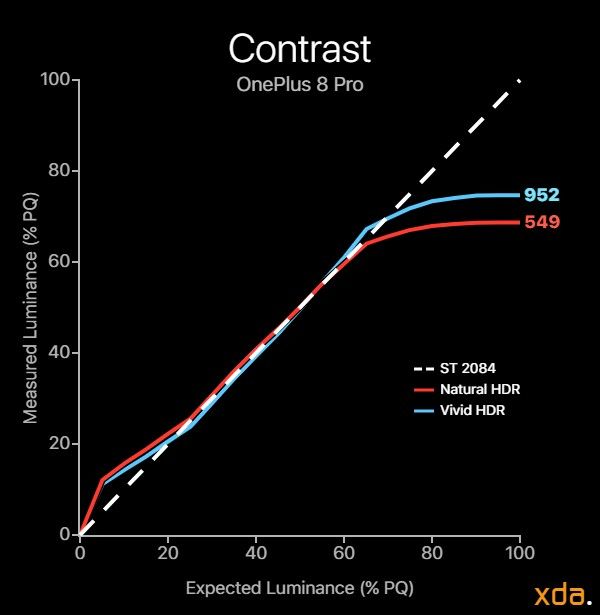
With that being said, perhaps the most relevant use-case for low pixel-level brightness figures lies in HDR playback. HDR content relies on intense specular highlights for small regions of the screen, and the expected headroom for highlights is usually gauged from measuring a display’s peak brightness at 20% APL (corresponding to a screen of which 20% is lit white and the rest black). Doing so with HDR patterns, I ran into an oddity with the OnePlus 8 Pro: For the Vivid profile, I measured a 20% APL HDR peak brightness of about 910 nits, while the Natural profile only measured about 550 nits. This is a significant margin, and while I have an idea why this is the case, it means that HDR content should be viewed on the Vivid profile to experience the panel’s full HDR potential.
On a related note, the Vivid color profile also has notably higher peak brightness output than the Natural profile for standard content at low-to-medium pixel levels. While they have about the same fullscreen white brightness (791 nits vs 768 nits), the Vivid profile outputs 971 nits at 50% APL while the Natural profile only outputs 732 nits. This shouldn’t be too surprising since the Vivid profile is meant to be the punchier option, but it’s a significant difference that’s higher than the discrepancy found on other phones’ color profiles. These brightness figures only apply with the OnePlus 8 Pro’s automatic brightness when it detects a lot of light. With the manual brightness range, it only reaches 483 nits (Natural)/491 nits (Vivid) for full-screen white, or 470 nits (Natural)/574 nits (Vivid) for 50% APL.
But why does such a large brightness delta between the profiles exist? The Natural profile applies countermeasures to equalize the display brightness by reducing the brightness at lower pixel levels. So instead of the typical OLED behavior where white level increases at lower pixel levels, the Natural profile aims to keep the brightness consistent regardless of pixel level. This equalization is needed to properly calibrate the transfer function (contrast) of the display, and it’s why the Natural profile has better-calibrated contrast than the Vivid profile (as revealed in the next section). However, the OnePlus 8 Pro does slightly overshoot this equalization, and the profile slightly decreases in brightness at lower pixel levels, but not to a notable extent.

OxygenOS 10.5.8 (left) OxygenOS 10.5.2 (right)
At the low end, the OnePlus 8 Pro can only dim to 4.5 nits. This is significantly higher than most other OLED phones (and including some LCDs), which can usually go below 2 nits. The OnePlus 8 Pro’s Night Mode does have an option to further reduce the brightness, which, when maxed, can get the OnePlus 8 Pro down to 3.0 nits. With the Night Mode color temperature set to its warmest, it can go down even further to 2.4 nits, which still isn’t as dim as the competition. It’s interesting to note that, at the beginning of my time reviewing this display, the minimum base brightness of the OnePlus 8 Pro used to be 2.9 nits, but an update to OxygenOS version 10.5.8 increased it to 4.5 nits. The update improved dark gray tinting and black clipping beyond the result of just simply raising the minimum brightness.
Contrast and Tone Mapping
When it comes to the appearance of most content, it’s commonly argued that its contrast (the grayscale component) is more important than the nuance of color (the chroma component). That’s not to undermine color in any way, but an image’s contrast makes up its structure and has a large contribution to the mood of a scene. For the design of app or web interfaces, contrast plays a critical role in user experience (UX) and accessibility, and a display needs to be able to properly render tonal details for maximum legibility.
Sometimes referred to as display gamma, or more correctly as the transfer function, the tone mapping of a display is responsible for how light and/or how saturated all color tones look on the screen. It directly affects image contrast, and for this reason (and many others), its importance cannot be overstated; I would much rather use a display with substandard color accuracy than one with irregularities in contrast.
On that note, most mobile displays today have calibrated display modes that are surprisingly color-accurate. However, almost all OLEDs still have issues in their gamma calibration, specifically in the darker near-black tones. It’s a natural issue for emissive display types, but more display calibrators should start making progress in improving the dark problem areas — OnePlus included.

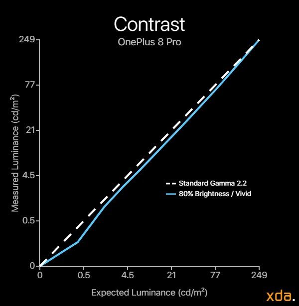
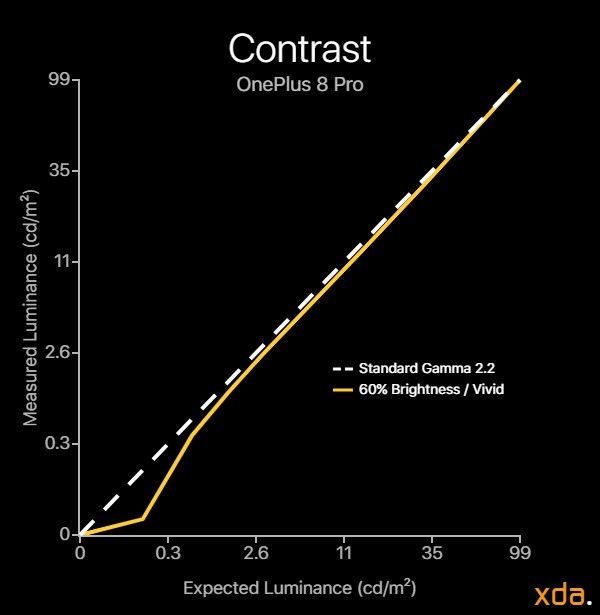
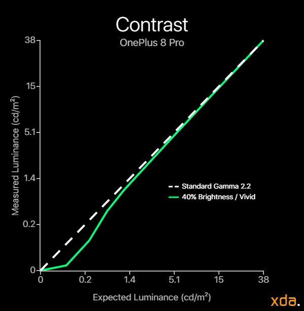
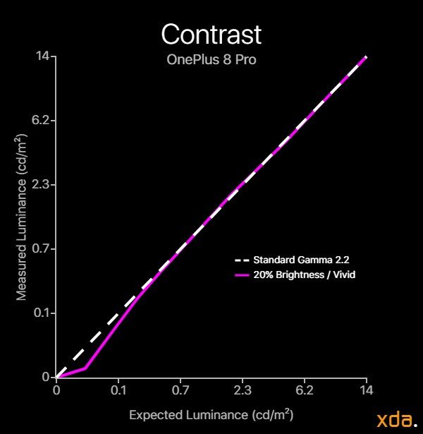
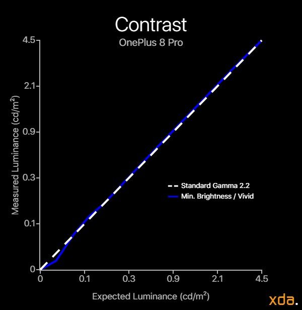

The calibration of the Vivid color profile clearly has higher contrast than the sRGB standard, although internally it still targets a gamma of 2.20, the same as sRGB/Natural. The reason why the Vivid profile appears to have more contrast is actually due to a “miscalibration” caused by a lack of brightness compensation for pixel level (talked about in the Brightness section). I put miscalibration in quotes since it’s a side-effect from the lack of brightness equalization that OEMs have just decided to keep for punchier profiles. Without a brightness-equalized calibration, the resulting gamma drifts higher (increasing contrast) at higher APL and display brightness. To see the Vivid profile with equalized brightness, you can select the Display P3 option under the Advanced display options, and adjust the white balance to match.
Visually, the Vivid profile has an approximated gamma power of about 2.45 at maximum manual brightness, normalizing towards 2.20 at lower brightness. This is actually the opposite of what a display should do, if compensating for our eye’s contrast sensitivity function. In general, displays should maintain a consistent contrast, independent of brightness, unless compensating for the contrast sensitivity function or the Bartleson-Breneman effect. Though, if you’ve been paying attention to the contrast charts, there’s a much more prevalent issue with the OnePlus 8 Pro that affects both profiles, which I’ll cover in a bit.

Natural Contrast chart (Combined); 42% APL
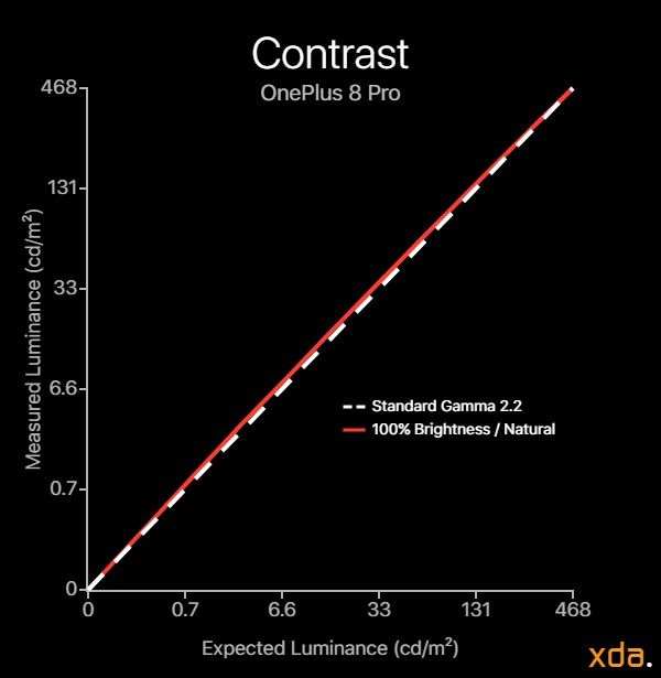
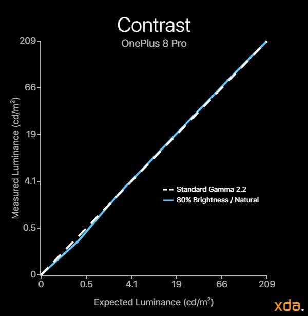

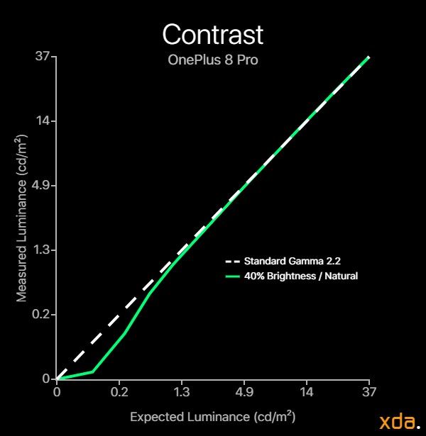
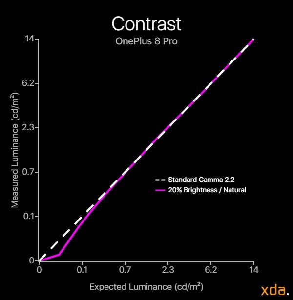

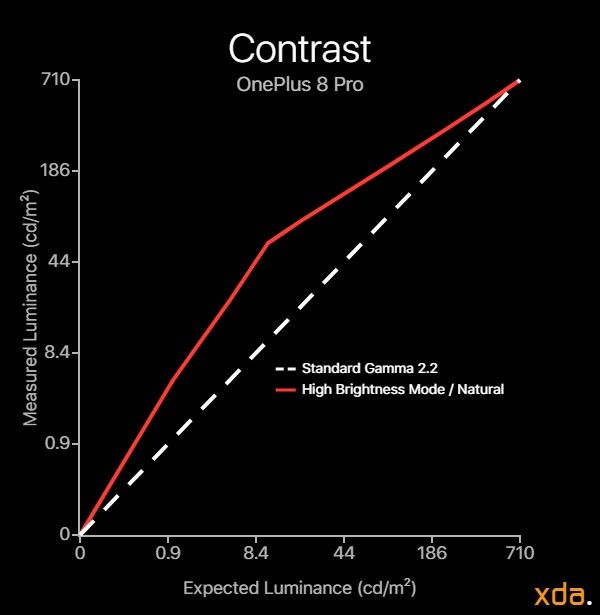
The Natural color profile aims to accurately represent the sRGB color standard, so it should closely track a gamma power of 2.20. It mostly does; the upper 50% luminance tones track 2.20 independent of display brightness, except for at 100% brightness where it’s slightly lighter at ~2.15. Though, as I alluded to earlier, there are problems.
Both the Natural and Vivid profiles exhibit kinks in the darker color tones at 60% display brightness and below, showing the most irregularities at around 40% brightness. It gives off a strong impression of black crush, even though the shades that the display actually clips are quite normal. This poses problems for dark scenes and interfaces since much of the detail and separation becomes lost to blotchiness due to the apparent crushing. This is perhaps the most disappointing aspect of the OnePlus 8 Pro, especially since their previous displays did not have this issue. (Note: I’m aware the OnePlus 7T reportedly had this issue, but I did not receive a unit to review). There was an OxygenOS update that improved black clipping, which slightly helped for the very lowest shades near-black, but it still remains for the rest of the lower 30% luminance tones.
Furthermore, it should be noted that the Lightness slider in OnePlus’ Night mode feature acts as a semi-transparent black overlay that increases in opacity as the Lightness slider is set darker. This exacerbates the shadow kinks, compressing the luminance range, and pushing more of the mid-tones into the problematic shadow range. Theoretically, a 10-bit panel like the one in the OnePlus 8 Pro should help to reduce roundoff error and contouring/banding, but it’s ineffective with these underlying tone mapping issues.
On a positive note, I’m glad to see that upon activating the OnePlus 8 Pro’s high brightness mode, which is activated under sunlight, the system gamma is reduced to about ~1.5 to improve the legibility of darker color tones. Samsung is the only other OEM that I know of that also does this; it’s an important implementation to make a display appear brighter (and actually more “correct”) under strong ambient lighting.
Just to test, I also measured the Natural profile at its 60 Hz refresh rate mode to quantify the calibration differences. If the variance is significant enough, flickering may be visible when the device switches between the two refresh rates, such as when playing a video on YouTube (to save power). From my impressions using the OnePlus 8 Pro, I did notice flickering whenever the phone switched modes. Upon measuring, the difference is exactly as I’ve observed: The 60 Hz display mode is calibrated much lighter, with less contrast and bumped shadows, although still with some shadow kinks. Thus, refresh rate switching can yield a noticeable flicker in picture quality whenever it occurs. This flickering lead to controversy in the display of the Pixel 4 and 4 XL, but it’s common for displays to differ in calibration at different refresh rates; this was present in the OnePlus 7 Pro as well, but it was less noticeable since OnePlus is not as aggressive as Google in switching refresh rates.
HDR content is where contrast performance is most critical. Evaluating the OnePlus 8 Pro against the standard HDR PQ transfer function reveals that it has flawed behavior here as well. While it reproduces mid-tones excellently, it renders shadow details far too bright, greatly constraining its contrast and washing out scenes. For HDR highlights, the peak brightness on the OnePlus 8 Pro depends on which color profile is being used. The Natural profile peaks at about 550 nits at 100% PQ, which is about the minimum standard peak brightness for HDR on OLEDs. The Vivid profile can peak much higher at about 900–950 nits at 100% PQ, which makes it the preferred profile for viewing HDR content. I cover why I believe this happens in the previous Brightness section, but this difference shouldn’t be existing for an absolute transfer function.
One more significant issue is that the OnePlus 8 Pro (as well as every other Android device) doesn’t properly respond to HDR max-luminance metadata and always tone maps to 10,000 nits. Most HDR content is mastered at 1,000 nits, not 10,000 nits. A thousand nits correspond to about 75% PQ, at which, regardless of HDR metadata, the Vivid profile only outputs 730 nits. This means it’s losing about 200 nits of available headroom for highlights. Together with its washed-out shadows, this greatly limits the OnePlus 8 Pro’s dynamic range in HDR, and overall its performance is quite substandard. It’s a shame that the OnePlus 8 Pro’s 10-bit panel, which benefits shadows the most, cannot be used to its full potential.
White Balance and Grayscale Precision
A problematic transfer function inevitably leads to issues in other areas of the display. Besides faulty contrast, the display’s grayscale typically takes on a tint from an imbalance. While humans can adapt to a display of nearly any white point, sudden variances in the apparent white point will always be jarring.
From our grayscale plots, it’s evident that the OnePlus 8 Pro’s grayscale precision suffers. It’s notably variant at low-to-medium brightness, sharply tinting towards magenta and purple for darker tones. This is true for both Natural and Vivid profiles (though only Natural is shown). When I first received my OnePlus 8 Pro, it also had a nasty tint towards green near minimum brightness, but OxygenOS 10.5.8 addressed this issue by simply raising the minimum brightness up to the point where it doesn’t happen — a mediocre patch that sacrifices about 6% of the panel’s lower manual PQ-brightness range as a consequence of not handling it during the factory calibration.
I also added in the plots for the 60 Hz display mode in the case of when the OnePlus 8 Pro switches refresh rates. From the contrast plots, we saw that it had noticeable differences in terms of tone luminosity, but now we also see there are slight differences in color tint. The 60 Hz display mode is actually cooler than the 120 Hz display mode, but it has stronger variance in its tinting.
In terms of color temperature, the Natural profile’s white point runs just a tad warm at about 6300 K–6350 K, but its color error is decently accurate, averaging about ΔETP = 2.0. Additionally, its color temperature can be adjusted in the settings to be cooler or warmer. The Vivid profile runs much cooler at an average correlated white point color temperature of 6900 K. The Comfort tone feature can also adapt the white point to the color temperature of the ambient lighting, ranging from 5000 K to 7400 K.


In HDR playback, the OnePlus 8 Pro’s grayscale consistency isn’t terrible, but it’s nowhere near remarkable. Both profiles average about a noticeable difference in grayscale, but with more variance than a critical observer would like. Here again, the Vivid profile performs better for HDR, with tighter color calibration. Though, remember that both profiles still have lifted shadows, and, as seen from the plots, are tinted green/yellow.
Color Accuracy
For a while now, chromatic accuracy has been a non-issue for most flagships. And, in general, color accuracy outside of white isn’t typically my top priority in a display, just as long as colors aren’t excessively hue-shifted. OnePlus has been quite good with color accuracy in their previous devices, so I didn’t have doubts that the OnePlus 8 Pro would perform at least just as fine.


OnePlus 8 Pro (left) / iPhone 11 Pro (right)
…But perhaps my optimism was naive. Even before performing formal measurements for the Natural profile, I noticed that red color tones were darker and more saturated than standard. Once measured, it was clear that all red mixtures were oversaturated (the excess is shown in the plots in gray outside the gamut) and slightly hue-shifted towards magenta-red (aka pink) throughout the display’s entire luminance range. On average, max-saturation reds exhibit a color error ΔETP of about 13, which, even by the new (and more rigorous) DeltaE ITP standard, is remarkably high for any calibrated color profile. Errors in red are especially offensive since their contribution appears in the color of human skin, which we are especially sensitive to noticing errors in.
There are other display reviews published that show accurate color difference figures for red (and the whole gamut), so my results left me confounded on what to report. At first I believed that I may have had a defective display, so I received a replacement. The replacement was no better, and neither was it in tone mapping, nor in display uniformity. This repetition of issues signaled that they would be apparent on other units as well, but which ones? I contacted other reviewers with the OnePlus 8 Pro, including ones that have reviewed its display (and ones that also own the i1Pro2 measuring apparatus). What I’ve found suggested that the International variant of the OnePlus 8 Pro (IN2023) does not have the miscalibrated reds, but the US variant (IN2025) and the Indian variant (IN2021) do. All seem to have uniformity and tone mapping issues. I’ve contacted at least three owners for each variant to come to this conclusion.
The rest of the spectrum looks great. Green mixtures are spot-on (besides orange), and blues show only minor issues at low brightness. 50% gray is excellent throughout the brightness range, but dismally plagued by the issues in tone mapping at lower intensities. The luminance contribution for colors is also excellent for colors besides high-saturation reds and oranges.


Checking out the wider Display P3 color space, it continues to show the same oversaturation in red mixtures, while the rest still seems fine. The green and blue primaries have no major issues, but a miscalibration of any of the primaries should impact the white point, which is not apparent here. This mirrored behavior between the sRGB and P3 color spaces suggests that the issue lies past the color management system, but I have no idea how this could have happened. I especially don’t know how this could be a problem of specific OnePlus 8 Pro variants.
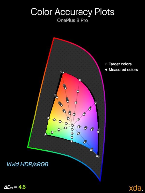
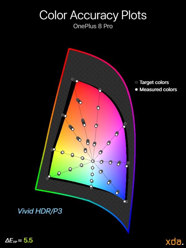
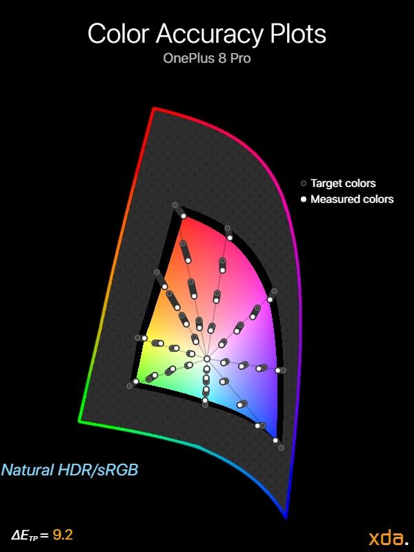

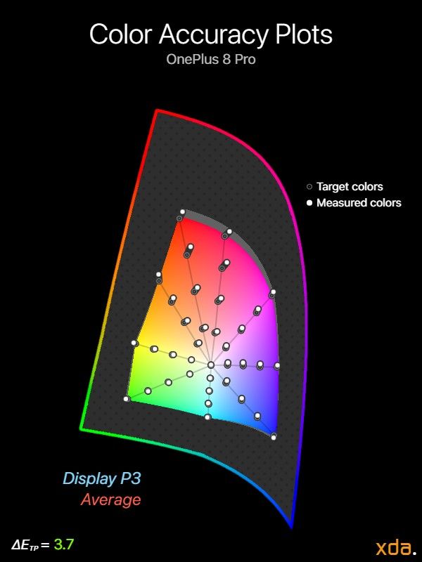
The contrast, grayscale, and brightness measurements in my previous sections showed that the Vivid profile performed much better for HDR content than the Natural profile. However, measuring the profiles’ color accuracies definitively show that the Natural color profile is clearly not tuned to render HDR content. The gamut of the Natural profile is heavily constrained, in both sRGB and P3, when playing HDR content. Just for reader’s assurance, my measurements are done with any setting disabled that could alter content from its original rendering, such as Comfort tone, Night mode, Vibrant color effect, Motion graphics smoothing, DC dimming.
When playing back HDR content in the Vivid profile, things are looking much better. Not reference-level, but not bad at all. In this case, reds seem a tad undersaturated for both sRGB and P3 content, and blue mixtures are tinted slightly towards cyan. The real issue still stems from its shadows being too light.
Conclusion
Although it seems that OnePlus packed in everything but the kitchen sink into the OnePlus 8 Pro, perhaps it needed the sink to clean things up a bit. While most of my problems with the display are related to calibration, the rampant issues with uniformity and the darkened row are due to hardware and are therefore unfixable through updates. Since the OnePlus 8 Pro uses Samsung Display’s latest generation of OLED panels with new emitters, it seemed that OnePlus may have risked using technology that might have not yet been mature. From what I’ve seen, the factory production yields for a “flawless” panel on these newer panels are presumably still lower than earlier generations’, and OnePlus may be cutting corners in adopting these new panels by accepting “imperfect” ones. This also applies to the panel used in the OnePlus 7T, which used Samsung’s latest generation panels very early. It also explains why the OnePlus 7T Pro, which used a previous-generation display, didn’t have the issues. The problems are not inherent to the newer panels, though, as I’ve found the iPhone 11 Pro displays to have excellent uniformity and absolutely stellar color precision.
I’m generally annoyed in the lack of focus by the issues found in the Natural profile; it’s absurd that red colors have the issues that they do, on any variant at all, given their factory calibration. It’s even worse that they still exist months out after the initial release of the OnePlus 8 Pro. The HDR issues in Natural profile is obviously an oversight, but it just makes it clear that OnePlus did not put as much thought into the Natural profile as they did into the Vivid profile. I understand the Vivid profile is the much more popular user option, but the Natural profile is supposed to be the profile used for accurate content playback.
The contrast and tone mapping issues are another big disappointment, which I did not expect from OnePlus’ best smartphone. Black crush is one of the worst qualities of a display since it results in a complete loss of detail that adds blotchiness to scenes. This wasn’t as much of an issue in OnePlus’ previous displays (besides perhaps the OnePlus 7T, which I did not get to review), so seeing this regression was frustrating. It’s apparent to me every night when viewing dark mode apps, and it’s even worse considering the OnePlus 8 Pro cannot even get as dark as most other displays.
The addition of the new display features on the OnePlus 8 Pro are nice to see, but I eventually found most of them underwhelming. Comfort tone works very well in integrating with the ambient lighting, but just like Night mode, it’s annoying to see it re-apply after every time I unlock my device (the issue with this is the lockscreen, which requires it to be in a certain display mode for the fingerprint unlock mechanism to work). Motion graphics smoothing/MEMC is something that would be much more novel when implemented more ubiquitously, such as in GIFs or in non-fullscreen videos. Vibrant color effect/HDR Boost, by its current tuning, is just distasteful to me. Typically I wouldn’t comment on subjective display features on smartphones, but I have hopes that future implementations (not necessarily from OnePlus/Pixelworks) can improve the adaptive aspects to a point where color grade enthusiasts can welcome them. Much like psychoacoustics and room correction in the audio world, such equalizations to displays are just as important for a display monitor to follow a target response.
While it seems like I’m only hounding on the OnePlus 8 Pro and its display, please understand that I’m snobbish with my displays. I work with color and design, and I need them to look just right (more so for my own sake). I’m also a home theater and calibration enthusiast, and those who have forayed into that world knows about the fastidiousness involved. Nevertheless, the hardware in the OnePlus 8 Pro is impossible to hate. The 120 Hz 1440p display is unlike any other and a complete pleasure to use, and it’s the most legible display outdoors in the California sun thanks to its brightness and tone mapping. I still dislike the curved edges (and always will), but the viewing angle shifts on the OnePlus 8 Pro are the lowest that I’ve measured. Overall, I found that the display of the OnePlus 8 Pro was much like its array of cameras: among the best currently thanks to its technological advantages in hardware, but not likely to age well by missing the mark on the fine-tuning. How will it fare comparatively once all the others use similar panels?
OnePlus 8 Pro Forums ||| OnePlus 8 Pro Product Page
The post OnePlus 8 Pro Display Analysis — Premium Hardware at a Cost appeared first on xda-developers.






0 comments:
Post a Comment