

The era of the budget-priced “flagship-killer” has long since been over for OnePlus. They have slowly crawled their way up the price brackets, pricing their phones at mid-range with the OnePlus 5, OnePlus 6, and their respective “T” iterative variants. OnePlus continues to climb up this year with the OnePlus 7 and OnePlus 7 Pro, the latter of which is priced at a range that was previously considered to be within the “premium flagship” space a couple of years ago. The OnePlus 7 Pro is in this weird new price bracket that is definitely higher than “mid-range”; it’s arguably in the hard-hitters’ premium price zone, just technically slightly cheaper compared to the competition.
Additionally, the OnePlus 7 Pro is an assertion that makes it seem like OnePlus admits that they were cutting corners on their previous devices. It’s like they’re saying “give us a bit more moolah, and here’s what we can really do.” Aspects like a QHD+ screen resolution, a linear resonant actuator (the type of haptic motor used on iPhone/Pixel/Galaxy/LG flagships), and a screen that actually gets bright, are all new additions that OnePlus has finally added to the OnePlus 7 Pro. Meanwhile, the regular OnePlus 7 still keeps an FHD+ screen and the older eccentric haptic motor. It wouldn’t be awry to think that most of the price probably went into that display, but regardless, we now have to treat the OnePlus 7 Pro as full-blown premium and judge it without any footnotes regarding its price.
So let’s talk about that big new display.

OnePlus 7 Pro Display Specifications
The 6.7″ display encompasses the whole front of the OnePlus 7 Pro, without a notch or a notable chin in sight. OnePlus finally moved up from FHD (1080p) to QHD (1440p), which is definitely necessary for the bigger screen on the OnePlus 7 Pro. With a resolution of 3120×1440, the OnePlus 7 Pro display has a pixel density of 516 pixels-per-inch, or 365 red and blue subpixels-per-inch, which is plenty sharp for typical viewing distances (about one foot or 31 centimeters). With 20/20 vision, pixels should not be resolvable past 9.4 inches (24 cm). The display is lengthy with a long 19.5:9 aspect ratio, which is where most of the display size difference comes from compared to the OnePlus 6 and OnePlus 6T. The OnePlus 7 Pro display is just 0.1 inches (0.3 cm) wider, but about half an inch (1 cm) taller than the OnePlus 6 and OnePlus 6T. That tiny extra width comes with curved edges that get closer to the side bezels, and personally, I’m not a fan of curved displays — I’m even less a fan of those that curve away from me and distort the continuity and field of view of the display.
And finally, the biggest difference: that buttery “Fluid AMOLED” high refresh rate. It’s one of the most enjoyable and stand-out features of the phone and is a huge novelty factor to look forward to if you are looking to buy the OnePlus 7 Pro. The difference is definitely noticeable, even to the non-tech savvy. I’ve let my friends and family play around with the OnePlus 7 Pro and the fluidity of the phone is always noted, even without me telling them about the increased refresh rate, which is impressive in an era where the latest smartphones are all fine in speed and smoothness. The OnePlus 7 Pro is set to an auto-90Hz rendering mode by default which switches between 60Hz and 90Hz depending on the app, but you can force the display to always render at 90Hz with one simple adb command if you wish to.
Color Profiles

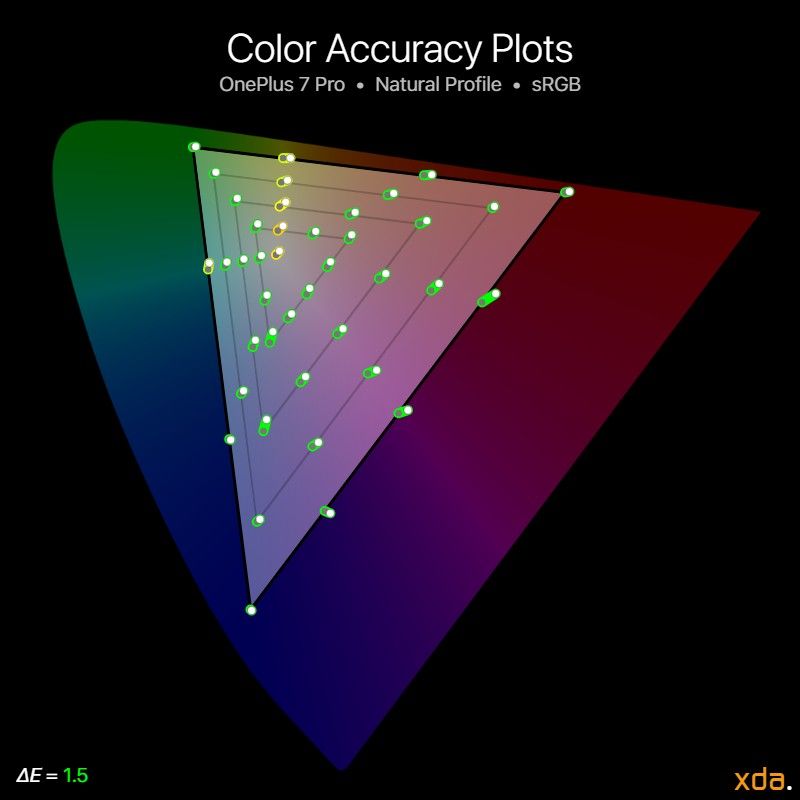
Color gamut for OnePlus 7 Pro
OnePlus revamped the screen calibration options with the 7 Pro, offering two primary calibrations, “Vivid” and “Natural”, and an “Advanced” option that reveals three gamut selections and a slider to adjust the color temperature of the display’s white point.
The OnePlus 7 Pro’s default display calibration is the Vivid profile, which has increased saturation and contrast. The white point is slightly colder than D65 (6504 K), but not too much so, and the white point can be considered accurate. The profile targets the P3 gamut, stretching out colors from sRGB to P3. The profile is also sort of color managed with Android’s CMS, so it takes embedded color profiles into account (for supported media/apps) and increases the saturation relative to the embedded color space. This is the first color saturation-expanding and color managed (with Android’s CMS) display profile I’ve seen on Android, and that’s the way color-stretching profiles should be. However, the color management is flawed and limits its gamut to P3, so high-saturation colors are clipped back into P3 even though the OnePlus 7 Pro’s display is capable of rendering colors wider than P3.
The Natural profile is the color-accurate display calibration following industry standards, targetting the sRGB color space for non-contexted color values and complies to rendering content with embedded color profiles in other color spaces. White point and contrast are also defined by certain standards, so neither of those are adjustable in this mode.
Brightness
Good, but outshined when compared to the brightest — B
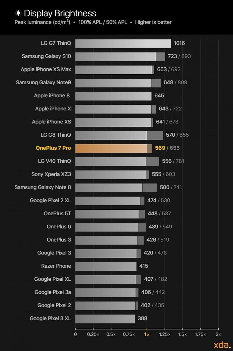
Brightness reference chart
Historically, the brightness on OnePlus’ displays was nothing to write home about, but they were acceptable for the price point. The displays weren’t meant to compete toe-to-toe with the likes of Samsung’s own, which have consistently been the brightest mobile OLEDs in the business, but the OnePlus 7 Pro has entered a price point where it needs to compete with the best in every device aspect. In the premium smartphone space, a bright display is crucial in standing out from the others for outdoor usability, and right now even the brightest smartphone displays today don’t hold up too well in direct sunlight. Boosting the display brightness costs a lot in battery life, so some smartphones usually only allow the display to reach its peak brightness when the phone detects a lot of light, such as when outdoors. This brightness boost is called High Brightness Mode, and it’s supported in most of Samsung’s OLED panels, including the ones that OnePlus uses. OnePlus has had High Brightness Mode supported in all their panels since the OnePlus 3, but they never utilized the brightness boost until the OnePlus 7 Pro. (I’ve seen reports of High Brightness Mode working on the OnePlus 6, but I cannot get it to naturally trigger on my unit.)
With the newly-implemented High Brightness Mode, the OnePlus 7 Pro finally breaks the 450-nit ceiling and measures at about 570 nits for a full-white screen (100% APL), ranking itself right beside the LG G8 ThinQ, and a small chunk behind Apple’s and Samsung’s latest flagships. When using display profiles besides Natural, the brightness of the screen scales inversely proportionate to the on-screen content APL, so in apps with a lot of pictures, like social media, the display can average about closer to 650 nits. In the Natural display profile, this varying brightness is minimized to maintain a consistent and accurate display gamma.
At minimum brightness, the OnePlus 7 Pro can go down to 1.95 nits, which is similar to Apple’s and Samsung’s typical minimum brightness (~1.8 nits), and noticeably dimmer than some others, like the Pixel 3 (2.35 nits), Pixel 3 XL (2.10 nits), or the LG G8 ThinQ (2.70 nits). However, OnePlus says that their minimum brightness can get even lower with the help of their new Night Mode, supposed as low as 0.27 nits. This is because the warmer tint of Night mode actually does lower screen brightness alongside the new “Lightness” slider, which darkens the display. This Lightness slider is essentially a black overlay atop the screen, and the slider controls the intensity of this black overlay. It is identical to the iPhones’ “Reduce White point” setting.
Just for fun, we cranked up the High Brightness Mode on the OnePlus 7 Pro panel to its highest setting, which boosts the display brightness past what it is capable of in auto-brightness mode. The screen was able to get about 80 nits brighter, reaching a display brightness of 640 nits for a full-white image (100% APL), which puts it at the same brightness level as the iPhone Xs. Testing its absolute highest output, the display was able to emit 908 nits at a tiny 1% window size, which doesn’t mean anything in regular usage, but it’s interesting to test out how much power the OnePlus 7 Pro’s display can draw out. The OnePlus 7 Pro is likely not rated to consistently output at these cranked-up brightness levels, which is why the High Brightness Mode boost in auto-brightness mode does not get as bright. However, if you root your OnePlus 7 Pro, feel free to enjoy these higher display brightnesses at your own risk:
With an elevated adb shell, run
echo 5 > /sys/class/backlight/panel0-backlight/device/drm/card0/card0-DSI-1/hbm
To make it trigger automatically, you can create a Tasker profile that triggers at high ambient lighting (%LIGHT > 20000) or when the system brightness is set to maximum (system screen_brightness = 1023).
Color Accuracy
Warm, but otherwise accurate — B+


The OnePlus 7 Pro in its Natural profile is decently accurate, but it’s not going to win any awards or honorable mentions from hobby colorists. We measured an average ΔE of 3.3 for the color error of white at a correlated color temperature of 6134 K. Only a ΔE of 2.3 is needed to notice a color error, and the standard color temperature for white is 6504 K, so the OnePlus 7 Pro display does appear overly warm relative to the industry standard. The warmness persists at all white levels, and this affects the appearance of light color mixtures. Yellow hues, which are a highly-luminous color mixture, are affected the most by the OnePlus 7 Pro’s warm white point.
We evaluated the color accuracy of the display with 41 target colors that are spaced roughly uniformly throughout the standard sRGB and P3 gamuts at varying white levels, and we measured an average ΔE of 1.5 to the sRGB gamut and an average ΔE of 1.4 to the wider P3 gamut. From those measurements, we calculated a standard deviation of 0.7, which suggests a slightly high variance in color accuracy readings; one standard deviation from the average (1.5 + 0.7 = 2.2) is nearly a just-noticeable difference (2.3). The maximum color error reported for sRGB is at the low-saturation light yellows, which measured a ΔE of 4.1, and for the P3 gamut, the maximum error is at the high-saturation red-yellows (a.k.a. orange) with a ΔE of 3.5. Compared to the Pixel 3 XL and iPhone Xs, of which have color errors so low that three standard deviations from their average are still below the just-noticeable 2.3 threshold, the OnePlus 7 Pro has a lot of room for improvement. That’s not to say that it has an inaccurate display, because it doesn’t — the display will be accurate enough for just about all non-professionals — but we’re comparing to the best of the best here, and we expected slightly better.
Contrast & Tone Response
Excellent, but contrast falls flat at lower brightness levels — A


The contrast and tone response of the display is the most important in calibrating accurately. Humans are more sensitive to the contrast and structure (or shape) of objects than their color, so it is essential to nail the tone response of a display so that fine details in images can be preserved and portrayed across other displays. Contrast also psychovisually affects the appearance of colors. A good case of this is the Pixel 2 XL display, which was often reported to have inaccurate colors even though it measured chromatically-accurate. This was because the Pixel 2 XL’s display gamma was ridiculously off the mark (2.46+ compared to the industry standard of 2.20), meaning the display had abnormally high display contrast and darker colors. Darker colors appear less colorful, and this is the real reason why the Pixel 2 XL appeared more “muted” than other displays that also targetted the sRGB color space.
OnePlus has also historically calibrated the tone response poorly for their smartphones. The resulting display gamma and contrast of all their previous smartphones were too high, resulting in calibrated display profiles that were unsatisfactory and unappealing to use. It’s not just Google and OnePlus, though — nearly all mobile OLEDs, including Samsung’s own, have had inaccurate tone response calibrations, because the OLED panel would vary the brightness of its pixels with the average luminance of the whole panel, making gamma readings inconsistent and the display non-calibratable. Samsung Display’s latest panels can disable this dynamic brightness mechanism for reference display modes, and the Samsung panel on the OnePlus 7 Pro brings this functionality (or rather the lack thereof) into its Natural display profile. Because of this, the display can be calibrated to much more accurately target the standard 2.20 gamma.
In its Natural profile, we measured the OnePlus 7 Pro display to average a display gamma of 2.22 throughout its available brightness range, which is very close to the standard of 2.20. This is a great improvement over last year’s OnePlus 6, which we measured to have a higher display gamma of 2.35. Colors no longer appear muddy or as muted like they were on previous OnePlus devices — they now appear with their proper “pop”, and accurately reproduce the original contrast in images and render faithful color tones in most circumstances. The gamma peaks out at 2.30 at medium-high brightness, which is fine for the viewing environments those brightness levels are associated with. But at the low end, from minimum-to-low brightness, we measured the display gamma at about 2.07, which is very low and not fit for dim environments. For low light surroundings, a higher display gamma is necessary because humans have higher sensitivity for contrast in low light, so a display gamma of about 2.40 is recommended at 0 lux (pitch black) ambient light to achieve a similar appearance of a 2.20 display gamma at 200 lux (typical office lighting). Because the display gamma is so low at low brightness levels, the display will appear washed out and lacking in contrast when viewing the display in dim environments at low brightness levels. This is true for all display profiles and not just the Natural profile.
In the Vivid profile, OnePlus normally employs the dynamic brightness mechanism in their panel to squeeze the most brightness out of the screen, but in doing so sacrifices the consistency of their gamma calibration. The display gamma ranges between 2.10 at low brightness to up to 2.40 at high brightness. As a result, the contrast of the display varies in an undesirable manner, increasing as the display gets brighter. While the baseline gamma of a display should ideally be consistent regardless of display brightness, if a dynamic gamma were to be employed, it should be the other way around: the display gamma should start high (2.40) at low ambient lighting and decrease as ambient lighting increases. Samsung has partially taken this into account in their smartphones, decreasing the display gamma and contrast to about 1.80 when it detects a lot of light. As it stands, the Vivid profile has a similar gamma to the Natural profile below medium brightness, and it only enjoys the increased contrast at higher brightnesses. The gamma variation of the OnePlus 7 Pro in its Vivid profile doesn’t seem to have any basis, and it just seems to be an oversight in their calibration job. Even though the profile isn’t meant to be accurate, display characteristics should remain consistent at various white levels, and if characteristics are to be dynamic, they should correctly follow psychovisual properties.
Drive Balance
Consistent calibration with a colder low-end — B+

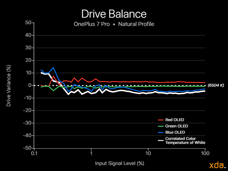
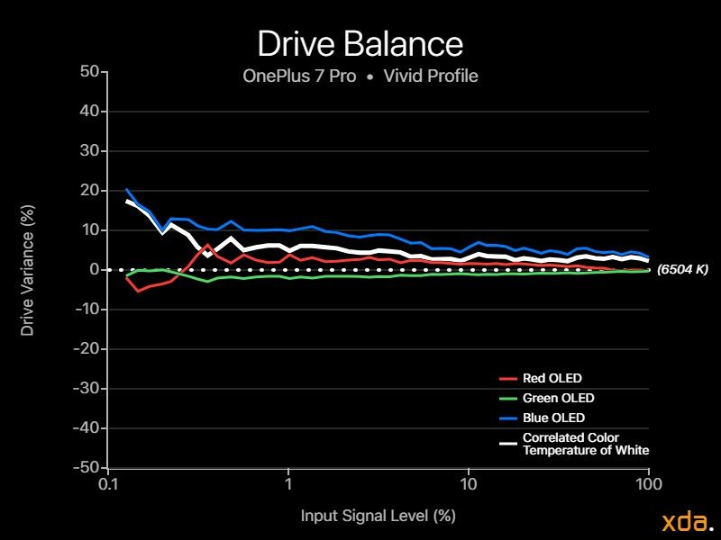
Average color temperature for OnePlus 7 Pro
Both the Natural and the Vivid profiles on the OnePlus 7 Pro are calibrated tightly and consistently at varying signal levels. The display does become colder as brightness drops, but the transition isn’t harsh and is only noticeable at very low signal levels below 1%, which correlates to very dark colors like dark grays at medium-low brightness.
Drive balance of Natural profile for OnePlus 7 Pro, 60Hz/90Hz
Drive balance of Vivid profile for OnePlus 7 Pro
I also measured the difference in drive balance of the display when rendering at 90Hz compared to 60Hz, and I was able to notice a subtle difference even before measuring. The panel at 90Hz has a slightly different blue OLED response — more specifically, it is boosted at very low signal levels for near-black colors. This may be an intentional tweak to compensate for the faster response time of the blue OLED, as to reduce the effects of ghosting/”smearing”. The response time of the OLEDs should be the same for both 60Hz and 90Hz, but the increased blue OLED intensity allows it to ramp up and fill a higher proportion of an element’s luminance contribution for blue, leaving less of a noticeable trail or “smear” when swiping through dark low-contrast content. This is at the expense of tinting very dark surfaces even colder, but from my testing, it does slightly work to reduce ghosting for affected surfaces.
Power Consumption
Battery life may be a concern when enjoying the super-smooth 90Hz refresh rate, but from my measurements, the panel itself in 60Hz has very similar power draw characteristics compared to other Samsung panels, including baseline power and luminous efficacy (with and without High Brightness Mode). The display itself in 60Hz consumes about 350-400mW of power, and at 90Hz, I measured an average increase of about 80mW of power over three hours on a static image (90Hz forced), which roughly correlates to consuming an additional 0.5% of the OnePlus 7 Pro’s total battery per hour for the display only. There should be additional power draw from the SoC and GPU to push 90 frames per second. Contrary to what I expected, there doesn’t seem to be any inherent or further drawbacks of the 90Hz display, besides the increased blue OLED intensity at low signal levels if you consider that a drawback.
OnePlus 7 Pro Display Overview
Good
|
Bad
|
|
XDA DISPLAY GRADE A |
The post OnePlus 7 Pro Display Review — Finally Flagship Quality appeared first on xda-developers.


0 comments:
Post a Comment