It’s time for another Android Q update. We first got to know Android Q right around the beginning of 2019 when we managed to get our hands on a very early, very unfinished, leaked alpha build. Back then, we got to know some of its most noteworthy features, including its system-wide dark mode, its desktop mode, and more. Fast forward 2 months and, following with their yearly beta programs, Google released its first official Android Q beta for the entire Pixel phone lineup as well as for the Android emulator. It was still very much unfinished, but it looked a lot more polished and definitely closer to the finished product.
Now, barely 3 weeks after this initial beta, Google has released the second beta build to the public, including the April security patches and a handful of improvements. It’s now rolling out over-the-air to Pixel owners enrolled in the beta program (Google Pixel, Pixel XL, Pixel 2, Pixel 2 XL, Pixel 3, Pixel 3 XL) and we now even have official GSIs for those that want to try out Android Q on their Project Treble-compliant device. But what exactly has changed since Beta 1? We’re rounding up everything that has changed in Android Q since the first beta was released—the good, the bad, the ugly and the weird.
Notification Bubbles
We’ve all been familiarized with the concept of chat heads and message bubbles for a long time. After all, Facebook first introduced its headlining “chat heads” feature to the Android version of Facebook Messenger in 2013, a whopping 6 years ago. It takes advantage of Android’s screen overlay feature to display a message bubble, allowing you to keep your conversations handy while using other apps. At any moment, you can just tap on a chat head, send something or answer to a message, tap it again, and carry on with whatever you were doing. You can easily dismiss them by dragging them to the bottom on the screen, too.
Since their initial inception, users have had mixed feelings regarding chat heads, with some users loving them and some users outright despising them. But throughout the years, a number of apps, including Google’s own Phone app, have implemented floating bubbles in a similar fashion to Messenger’s chat heads. All of these implementations still use screen overlays to display the floating bubble over whatever app you’re using, but with Android Q, it seems that floating bubbles will now be officially supported by the system as an Android feature.


Example of a messaging app and its respective bubble in Android Q Beta 2.
These bubbles are not necessarily exclusive to chat apps, though. Other existing examples of floating contextual bubbles include the Google Phone app’s bubble implementation, which gives you quick actions (such as hanging up) during a call. AZ Screen Recorder also gives you quick controls, such as start recording and settings buttons, within a floating bubble. Google’s blog post also cites examples of portable UI elements such as notes and translations. This feature will allow more apps to implement chat heads themselves, but how widespread it becomes will largely depend on developers implementing this feature.
Reworked Gestures
Back in Android Pie, we got our first taste of navigation gestures, but they weren’t all that great. The AOSP implementation was highly criticized by some enthusiasts and users. It replaced the home and recents button with a pill, which retained the functionality of a home button (tap to go home, long press to bring up Google Assistant) but also allowed you to quickly swipe to the right to switch to the previous app, swipe up to bring up the recents menu and drag to the right to switch to any given app in the recents menu. The back button was retained. This entire implementation seemed half-baked and provided no real advantages when compared to plain and simple software buttons since no screen real estate was regained by enabling gestures.
When we first got our hands on the leaked Android Q build some months back, we noticed that Google was working on revamping these pill gestures so they worked more similarly to iOS’ gestures. For this new implementation, the back button was killed off, leaving only the pill—which you could now swipe to the left to go back. Furthermore, some animations were also changed to make them look more iPhone-like.
This was hidden away back then as the Android Pie gestures were the default implementation, but with Android Q Beta 2, it seems that Google is planning big things for gesture controls. The vanilla gestures were reworked in a certain way: there’s still a back button, but pulling on the pill no longer allows you to switch between apps. Swiping left or right on the pill will now instead switch between your apps back and forth in chronological order, in a similar fashion to iOS.

Android Q’s elongated gesture handle.
We’ve also found that Google is planning on replacing this pill (and the contextual back button) for an elongated handle, pretty much identical to the one we’ve been seeing on the iPhone X/XS/XR. This one is not really working properly right now and it’s still taking the space of the notification bar. But it’s very clear Google is thinking big when it comes to their gesture implementation, and we’re more than excited to see this mature in the next few betas and up to the final version.
You can check out a deeper dive on these redesigned gestures here.
Expandable volume menu is back
Android Pie brought changes to the way you could turn up and down the volume. Previously, tapping on the volume keys while no media was being played would turn up/down the ringer volume, and you could expand the volume menu to bring up media/alarm volume rockers. This behavior was changed in Android Pie: now the media volume is changed by default instead of the ringer volume, and the redesigned volume menu was not expandable—you’d need to go to Settings to change the ringer/alarm volume. The volume menu does have a gear icon to quickly bring up Settings, but it’s still an extra step that can get annoying quickly.

With Android Q beta 2, the media volume is still changed by default just like with Android Pie and Android Q beta 1, but the volume menu can now be expanded once again: tapping the gear icon will now bring up a contextual menu, without getting you into Settings, with all the volume rockers you’d expect to find. I’d personally still prefer something more similar to what we had back in Android Oreo, but hey, we can’t have everything. This is way better than what we had in Pie.
Choosing notification dismiss swipe direction
The first beta of Android Q brought an unexpected change: notifications could now only be swiped away to the right. Swiping to the left would bring up the snooze and block options, but you couldn’t swipe it off that way. This change was not really well received, and Google did take this backlash into account: we recently reported that Google had confirmed that future versions of Android would allow the user to select the notification swipe direction.
Back then, we didn’t know whether Google was talking about a future Android Q beta or a future version of Android altogether. We’re glad to see Google following through with their promise so quickly, as the second beta of Android Q already allows you to select which side you preferred to swipe away your notifications.

I’d rather have the pre-Q notification behavior, but it’s still progress.
Screenshots no longer show rounded corners/notches
Rounded corners and notches are everywhere these days, but we all gotta agree on something: they definitely shouldn’t show up in screenshots. After all, not only does it look weird and ugly, but you probably don’t want to look at a massive notch when you receive a screenshot from someone. Nonetheless, notches and rounded corners showed up in Android Q beta 1 screenshots as black space, for some reason. The good news? As you can see in the screenshots on this page, the notches and corners are thankfully gone in Beta 2.
Seekbar for music notifications
Adding on to the list of actually useful features, starting on Android Q beta 2, music notifications for apps like Google Play Music and Spotify now have seek bars for scrolling through music tracks and podcasts. This way, you can jump through a track without needing to actually go into the app.

This is a feature that will probably be very well received by users, and one that actually makes me excited for Android Q. Little details like this go a long way into improving the entire user experience.
Further improved share menu
Since the Share menu was initially revamped with Android Marshmallow in 2015, it has introduced a series of issues of its own. Users have often complained about it being slow, clunky, and uncomfortable to use, and these complaints have dragged on for almost 4 years now, and have lingered into last year’s Android Pie as well. With Android Q, Google is adding some much-needed improvements in an attempt to make it faster and more comfortable to use. It still looks pretty much the same UI-wise, but it loads much, much faster thanks to Android’s new Sharing Shortcuts mechanism.

With beta 2, this Share menu can now show a title and a thumbnail for whatever you’re sharing, allowing you to make sure you’re sharing what you actually want to share. It’s a small change, but something that may come in handy sometimes.
Tweaks in the Settings
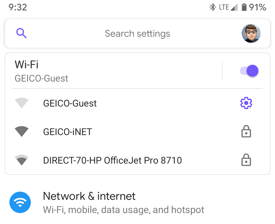
Google services are present in every part of our phones, even in our Settings app. But Android Q aims to tighten up that integration another notch. You’ll now see your Google profile picture on the right of the Settings search bar, in a similar fashion to Gmail’s new Material Theme account switcher. Tapping on it brings up a new menu with your device’s information, your emergency information, a “Payments” shortcut to manage your payment methods, and a Google account shortcut at the bottom.


The Settings app itself has also received a couple of minor tweaks. Tapping on the Android version in “About phone” now brings up a separate activity instead of a pop-up. The tips at the top of the Settings now include toggles for things like WiFi, and you can see available networks without going into the WiFi settings.
Miscellaneous Changes and Bug Fixes
The second beta of Android Q also brings over some smaller changes and fixes that are not really noteworthy of a section by themselves. These are:
- The battery icon has been slightly changed: it’s now boldly outlined instead of shaded.
- This might hint at further UI changes throughout the next few betas, but they seem to be rather minor things.
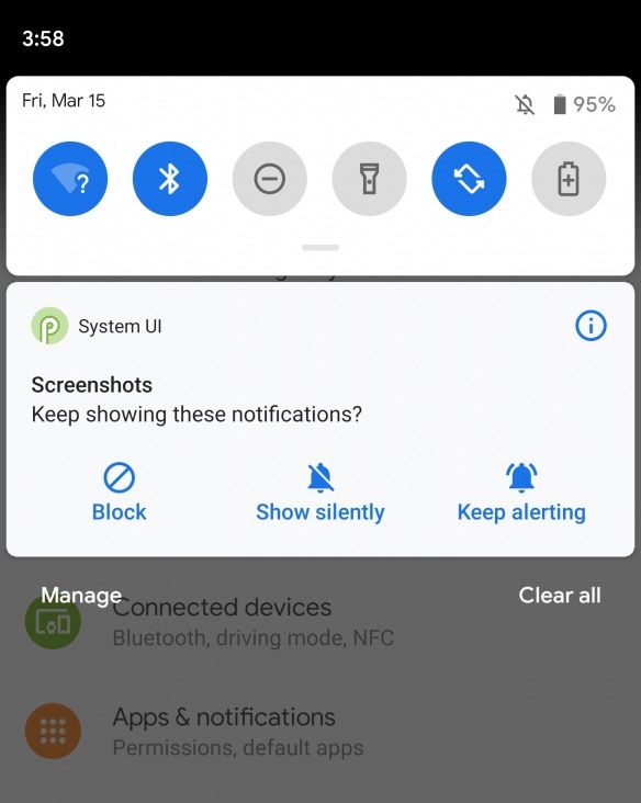
- There are now “done”, “deliver silently” and “block” buttons when dismissing notifications.
- For privacy’s sake, “Scoped Storage” limits the way apps can access files by creating isolated sandboxes for every app.
- This is currently breaking some file manager apps, including MiXplorer.
- The Google Camera now asks explicitly for permission to access photos and media files, in tandem with these privacy changes
- There is a “Contextual Cards” setting in the System section of Settings, but we’re not quite sure what it’s about as of now.
- Wireless charging is no longer shown as “slowly” or “rapidly” in the lock screen.
- The battery percentage in the notification shade, which was replaced with a “battery time remaining” in beta 1, is back to being an actual battery percentage.
- Music notifications are larger on the Ambient Display
- The Apps Permissions menu is now called “Permission Manager”
The post Everything New in Android Q Beta 2 appeared first on xda-developers.


0 comments:
Post a Comment