


It looks as if Google is testing a new bottom bar user interface for Google Assistant on smartphones. Bottom bar navigation has become more popular with tall displays, but Google Assistant has had a few actions in the bottom bar for a while already. However, a server-side update from at least one person shows that things may be changing in the future. It’s unclear if this is simply an A/B test or if it’s a permanent change, but the bottom bar of Google Assistant may be changing in the near future.
Currently, the bottom bar consists of three buttons which include the microphone, Google Lens, and keyboard. It’s obvious what these three options are for but the buttons are spread out far apart and there are two additional buttons sitting in the top right corner of the assistant pop-up window. Those two additional buttons may not be used that much but it made little sense to have them up there instead of down in the bottom bar.
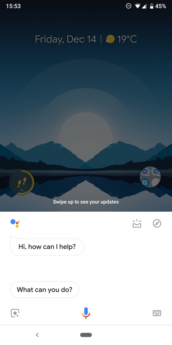
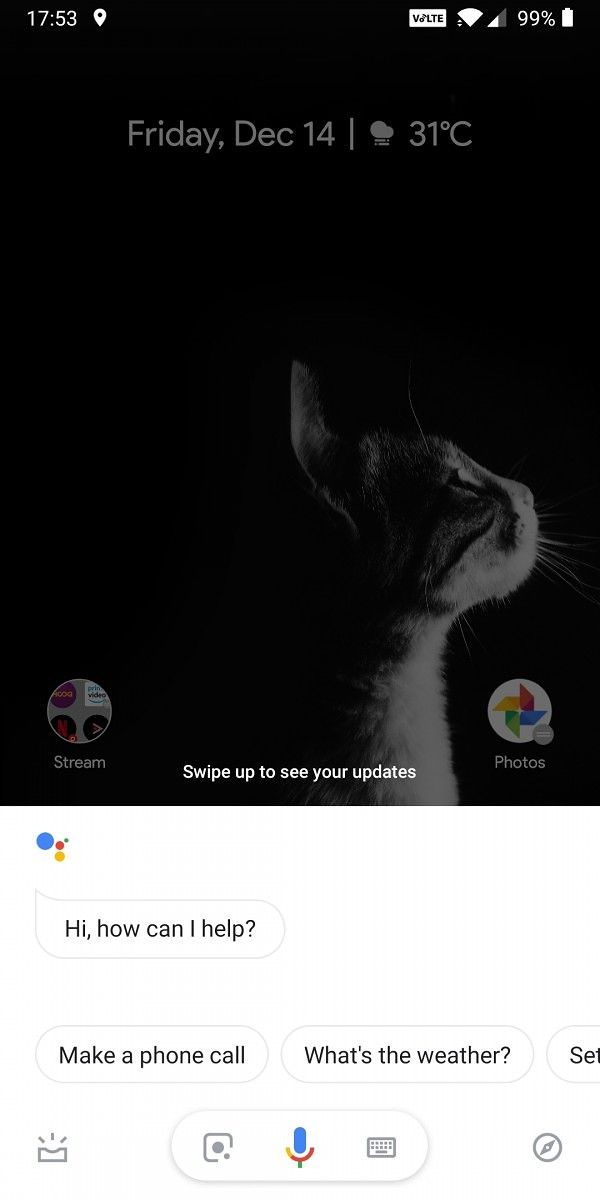
And that is exactly what this new redesign has done. So we can see the Google Lens and keyboard buttons have been brought closer to the microphone button. For those who are holding their phone naturally with one hand, this makes accessing that Google Lens button a lot easier on bigger phones. In place of those two empty corner spots, we can see that Google has dropped down the Visual Snapshot icon to the left side of the bottom bar while the Explore icon has been tucked in the right corner of the bottom bar.
Some may feel this make things a bit more crowded, which is definitely understandable, but it makes better use of space in my opinion. Even if you don’t use the Visual Snapshot or the Explore options often (or at all), having the three main buttons right in the middle makes them more accessible for those who are holding the phone with one hand.
Source: Android Police


0 comments:
Post a Comment