Friday, May 31, 2019

Honor 20 Pro Review – One Of The Best Smartphones That May Never Launch

It feels as if not a month goes by without Honor announcing a new model in its lineup. While it may seem like excessive market saturation, Honor is strategic in their marketing and release cycles. In particular they have a precise target for devices and it is this strategy that brings us the Honor 20 Pro – a phone you didn’t think they needed but nestles perfectly in their well stocked lineup. Until the ban that is.

It is hard to review a Honor or Huawei device right now without the disclaimer that these phones are essentially under a ban. A ban that could prevent future software updates and in the case of the Honor 20 Pro could derail the entire launch. This review cannot be a deep dive into the Honor 20 Pro because our review timeline was significantly shrunk at the requirement of the folks at Honor and as such will really touch on the build quality of the Honor 20 Pro and its unique quad camera array. For a deep dive into everything software, you should check out Mishaal’s deep dive into EMUI [Part 1 and Part 2] – the backbone of MagicUI – and his upcoming EMUI 9.1 article. Also, for an analysis on the Kirin 980’s performance, check out our benchmarks, Android gaming review, and retro gaming review.


The Honor 20 Pro’s Excellent Hardware

When you first pick up the Honor 20 Pro you immediately feel the build quality of the device no doubt due to its considerable 182g weight. You also feel the thicker than expected side-rails that blend from the front glass to the rear and are almost directly ripped off from an iPhone X series device — except that they are not stainless. There is no gimmick of a curved display or curved rear glass to be found on the Honor 20 Pro and while that does make the phone feel larger in your hand, it also instills a confidence I haven’t quite been able to attain with my Huawei P30 Pro thanks to its curves. Honor has really been picking up the build quality on their phones in recent years as well, with production tolerances, material choice, and craftsmanship that punch well above their weight class.

Much like the Honor View 20 we reviewed earlier this year, the Honor 20 Pro comes with their now signature left – and proper sided – punch hole display that goes from edge to edge. While the phone does have a chin on it, I have found that the chin size Honor went with is superior to the ultra-slim version you see on say the OnePlus 7 Pro. Those extra fractions of a millimeter go a long way to making gestures more reliable and raising the keyboard to a usable level – two things my OnePlus 7 Pro struggles with. The right side of the phone is where you will notice the first major change of the Honor 20 Pro, a side mounted fingerprint sensor. Unlike the Honor View 20 and other Huawei and Honor phones, the Honor 20 Pro follows the similar style to Sony and Samsung integrating the side mounted sensor and it is very reliable, but I am not without some gripes. The button itself is far too narrow making pressing it more of a dedicated thought then it should be. The phone will wake on its own without a press, but turning the display off isn’t quite as easy as I had found it on other devices with this setup. There is also the situation that side-mounted sensors are a little less comfortable than both front and rear mounts considering their awkward placement if the phone is sitting on a desk or table.

Fortunately though, you do get Honor’s face unlock but keep in mind this severely reduces security on your device so use that with caution. The top of the phone houses a microphone and IR blaster, something Honor and Huawei pretty much stand alone at still supporting. The left side has the SIM tray and little else, and the bottom has a microphone, USB-C 2.0 port, and speaker. Around back is where the star of the show is though, and despite being easily confused for its bigger cousin the Huawei P30 Pro, the Honor 20 Pro doesn’t quite pack the same punch. We will discuss this a bit later, but Honor and Huawei continue their tradition of excellence and this sensor does not disappoint. Also of note is the death of the poorly used TOF sensor found on the Honor View 20 and Huawei P30 Pro. Instead, it has been replaced with a dedicated 2MP Macro lens – that is hardly any better.

If there is one thing aside from the camera that Honor has really trumpeted lately it is their amazing choice of colors. My model is a turquoise deep sea color that goes from a deep teal on the top and bottom to a shimmery brighter color in the center. This color gives the phone an almost well-worn leather appeal in that the edges go almost totally black. I vastly prefer this to the Honor View 20 that was a little more flashy and almost felt like it was trying too hard. Here the Honor 20 Pro feels more grown up and executive, even if it might not have the same great crowd appeal.

Honor 20 Pro design Honor 20 Pro back bottom design

It is no stretch to say that Honor did a fantastic job on the overall hardware found on this device. It feels premium, looks premium, and packs the internals to match. Speaking of those internals, the Honor 20 Pro features a now well-worn Kirin 980 processor, 256GB of UFS 2.1 internal storage and 8GB of RAM – nothing we haven’t seen before and the story stays the same. The Kirin 980 processor is a great SOC choice and performs well enough up against the more well-known Qualcomm Snapdragon 855 but a successor hopefully this year will leapfrog them ahead in at least some areas. For most consumers, the only two real areas the Kirin 980 falls short is its GPU performance – which is still well above acceptable – and its ISP that locks Kirin 980 equipped devices to 4K30 as their maximum recording rate. EMUI has grown up lately as well, and although it still has too many gimmicks for the Android purist – along with locked bootloaders – performance is not one of the things you can say the Honor 20 Pro falls short on. While I have only had the Honor for a week or so now, I have used the Huawei P30 Pro for almost two months with no significant performance issues or bugs, something I couldn’t say about EMUI just a few years ago. As I mentioned in the beginning of the article, check out Mishaal’s articles for everything you need to know about EMUI and MagicUI. That said, I did want to go over some of my favorite features.


My Likes

As some of you may know, I use an iPhone regularly and one of my favorite features that nobody outside of EMUI has is lock-screen notification security. I like to have my phone wake when notifications come in, but often times my phone is sitting on a desk or table at work where others can see it. On iOS, when your phone wakes to this notification, the contents are hidden until FaceID or TouchID authenticates you as the owner, at which time the phone will show the notification contents.

As I mentioned, this is one of my favorite things about iOS and EMUI emulates (read: copies) this exactly, even mimicking the raise to wake functionality from iOS. Another thing I like about it is its battery controls. Now there are a lot of people complaining about how EMUI and MagicUI kill running tasks and push notifications in the background, and while that is true it is also very easily bypassed globally. Simply navigate to App Launch in Battery and turn off Manage All Automatically and you now have stock Android levels of app management. What I also enjoy about this is that for some apps like Instagram or Facebook, you can choose to manage automatically or you can just manually turn off things like running in the background or launching without the user interaction. This allows you to get unreal levels of battery by allowing apps you want to do their thing, while killing off those you don’t want draining your battery. Speaking of battery, I really cannot say a lot here about it due to my cut short time with the device and I wasn’t able to really get a good feel for how it performs routinely. That said, it has a 4,000mah battery mated to a 6.26” LCD and the Kirin 980: the battery is going to be very, very strong. My Honor 20 Pro had no troubles going well into the evening with 40% or more battery just about matching what my Huawei P30 Pro was capable of. Unfortunately though, the Honor 20 Pro does not have wireless charging so you will have to use a cable for your quick top offs.


My Gripes

Before going into the camera review, I felt it important to discuss some of the things I don’t like about the Honor 20 Pro and many of these trade-offs have me preferring my Huawei P30 Pro, despite its higher cost. The first is the display. The FHD+ LCD panel is fine by most respects, but has two glaring — future pun intended — faults. The first is the nature of LCD with a punch-hole and slim bezels. The Honor View 20 suffered from shadows and blooming around the bottom of the display and the camera cutout, and the Honor 20 Pro has the same issue. To be fair, the LG G7 ThinQ had this issue for me as well and can easily be seen while on a white background. The blooming and shadows look like a dingy purplish artifact along the top and bottom of the display and is far more noticeable than any OLED burn-in I have experienced. I think if Honor will continue with this style of device, their next models need OLED. The second issue with the display is its glare. Now, I am here in Florida which might as well be the surface of the sun this week, but while going out and taking photos with the Honor 20 Pro, I could hardly see it off angle due to the immense glare and reflections from the world around me. This isn’t something I have experienced terribly often, but the Honor View 20 has a similar issue and it is something I certainly hope Honor can fix because it really does detract from an otherwise nice display.

There are also some other issues I have with the phone, the vibration motor is really poor especially coming from devices like the Google Pixel 3a and OnePlus 7 Pro. While it doesn’t feel like it is going to rattle out of the device, it does feel like it is surrounded by insulating pillows causing a muffled but strong feel. The Honor 20 Pro also forgoes dual speakers and instead comes with a single firing unit that sounds very unbalanced and tinny; it is even a bit worse than the Huawei P30 Pro which forgoes a top mounted earpiece entirely for its screen vibration technology. There was an excuse there, there is none here. My final gripe about the phone as a whole is that it doesn’t quite feel like anything new here. The device is considerably more expensive — assuming it even launches — than the Honor View 20 and comes remarkably close to the Huawei P30 price tag and features the same camera as the former and processor as the latter. It feels like this operates in a weird middle-ground and as long as the LCD is as bad as it is it doesn’t feel like a terribly great value — however, we then get to the camera.

Honor 20 Pro bottom shadow Honor 20 Pro punch hole display

Honor 20 Pro Camera Quality

I am going to come right out and say it. Google has the best camera. Huawei and Honor have the best cameras. The star of the show is the Sony produced 48MP 1/2″ Quad-Bayer monster of a mobile camera sensor. While devices like the ASUS ZenFone 6, Xiaomi Mi 9, OnePlus 7, and OnePlus 7 Pro have used this sensor, it is really Honor who has harnessed its potential. I loved it on the Honor View 20, and I love it just as much here and in some aspects I even prefer it to the Huawei P30 Pro’s 40MP sensor. Before we get into camera samples, though, let’s go over the rest of the hardware which is…not quite as impressive. Compared to the Huawei P30 Pro, the Honor 20 Pro loses autofocus on its wide-angle sensor and instead has to use a 2MP dedicated macro sensor that delivers fine shots but is also not autofocusing — making shooting anything that moves in the slightest a chore. The telephoto lens is also downgraded from the amazing 5X optical zoom to a true 3X optical zoom with an 8MP sensor and 5X hybrid zoom option.

All together, the Honor 20 Pro is far more capable than the Honor View 20 but markedly less so than the larger and far more expensive Huawei P30 Pro which is likely exactly where Honor wants this device to fall. That said, Huawei has camera tuning down to an art and the device delivers stunning shots that have amazing detail and, most importantly, deliver natural feeling photos — even if the skin smoothing is a bit higher than I’d prefer and bright background highlights are exposed more than I’d like. I did notice I prefer the MasterAI mode a lot less on MagicUI and that is twofold. On the one hand, the tuning is very saturated and dynamic — a look I do not like. Also, the camera app lacks the automatic mode switching the Huawei P30 Pro offers where if you move close to a subject Super Macro will enable automatically, or if a face is seen Portrait mode is turned on. It is a small touch, but I did miss that small added functionality. That said, let’s get to the photos.

Honor 20 Pro


Conclusion

So that wraps up my review of the Honor 20 Pro. You will probably notice that we didn’t go over gaming performance or software and that is simply because the Honor 20 Pro doesn’t tread any new ground here – and the reduced review timeline didn’t help matters. The Honor 20 Pro will deliver the same excellent level of performance in gaming and day-to-day matters that the Honor View 20 or Huawei P30 will afford you and it does it at a price that strikes right between those two. The elephant in the room, though, is the current situation around Huawei’s use of American-made software and hardware. There is simply no getting around the situation that plagues Huawei and Honor now. While injunctions and legal workarounds are starting to be implemented, there is no denying that the brands are in serious trouble. Will the Honor 20 Pro ever make it to market? That is a question Honor never likely thought they would have to face but that is exactly where we are now.

Purchasing any Huawei or Honor device now comes with significant baggage and that is unfortunate. Honor and Huawei were, in my opinion, moving the market forward in camera features and versatility and market saturation of just downright good devices and the Honor 20 Pro continues this trend. True, you may be able to get a better OLED display around the same cost or find something with dual speakers, an IP rating, or water resistance, but the truth is none of those things really matter much. Coming to a conclusion is one of the most difficult parts of a review but is made even harder by the reality that the outstanding device I got to review may never hit store shelves. Even if it does, it might do so with remarkably different software. If reality were what we choose it to be and the situation were different, you could find one of the best and most versatile camera phones, true all-day battery life, excellent performance, and a premium look-and-feel that is right up there with $1,000 flagships in the Honor 20 Pro. Unfortunately though, reality is often disappointing.

Honor 20 Pro ForumsHonor 20 Pro Global Product Page

Note: Huawei/Honor have stopped providing official bootloader unlock codes for its devices. Therefore, the bootloaders of their devices cannot be unlocked, which means that users cannot root or install custom ROMs.

The post Honor 20 Pro Review – One Of The Best Smartphones That May Never Launch appeared first on xda-developers.

The Storage Access Framework is the only way for apps to work with all your files in Android Q. And it’s terrible.

Android Q is fundamentally changing the way storage works on your phone. In every version up to Pie, Android’s storage worked like a desktop computer: you can use any app you want to read or write any file (if you grant an app permission to do so). With Q, Google is introducing (and requiring) “Scoped Storage,” which makes Android work more like an iPhone, where storage is isolated to each app. An app can only access its own files, and if it’s uninstalled, all its files are deleted.

Thankfully Android Q does still retain some of Android’s original behavior of a central filesystem. Unfortunately, it’s now cumbersome for the user to set-up apps to access it and has significantly reduced performance and capability. And developers will have to substantially recode apps to support it.

Apps that need general filesystem access, e.g. an office suite, image editor, or file manager, will now need to use an Android API called the “Storage Access Framework” (SAF), for all file operations. SAF has been available since Android 5.0 Lollipop, but developers tend to not use it unless required, as it has a difficult and poorly documented API, a poor user experience, poor performance, and poor reliability (largely in the form of device vendor-specific implementation issues). As a result of the difficulty in transitioning to SAF, Google has decided to allow apps that don’t yet indicate Android Q support to work as they used to, but this will change when the Play Store requires all apps to support Q next year.

The most obvious user-facing change with SAF is the experience of granting an app access to storage. For an app to get access, it makes a request to the OS, which then displays a directory chooser screen. On this screen the user selects the root of a folder hierarchy in which that app will be able to read and write files. The user must go through this process for each app that requires access to local files, or twice-per-app if they need to also grant it access to an external SD card.

Google did at least improve this process for Q beta 3, as prior betas did not allow an app to even suggest a location for the user to select, which required the user to do quite a bit of work to actually find their device’s primary storage.

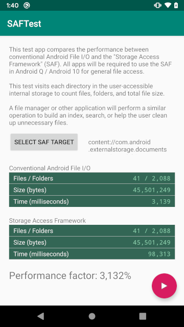
File I/O performance takes somewhat of a hit under SAF, but the most outstanding problem lies in file directory operations, where it’s ~25 to 50 times slower than the conventional file access possible in Pie. In the case of file managers, that means it will take orders of magnitude longer to perform searches and storage usage calculations. A bug report with a demonstration app is available here.

Sample test run of SAFTest showing the performance difference between the conventional file I/O API with SAF.

An even greater performance issue is that some apps will have to copy files to their local “scoped storage” area before they are able to work with them. This can be problematic when such files are multiple gigabytes in size, e.g. in the case of video files or compressed archives. Many Android apps take advantage of the amazing number of open-source Java libraries in the developer community, and these libraries commonly require direct filesystem access to work. They are not Android-specific and would require rewriting to work with SAF. Even worse, many of Android’s own internal libraries won’t work with it, such as the package manager or the zip API. As a for-instance, a file manager won’t even be able to display the icon for an APK file (using the standard Android API) without first copying the entire APK to its own scoped storage area. Bug report.

For technically inclined folks, it’s presently possible to disable Android Q’s “Scoped Storage” on a per-app basis via ADB using an appops command. Root users can execute the commands directly on their device without a desktop computer. Such commands are described in the documentation as developer features and thus may be removed at any time.

Enable general storage access for an app:

adb shell cmd appops set your-package-name android:legacy_storage allow && \

adb shell am force-stop your-package-name

Disable general storage access for an app:

adb shell cmd appops set your-package-name android:legacy_storage default && \

adb shell am force-stop your-package-name

Google touts the security and privacy benefits of this change, but technically speaking, there is no improvement. Apps have had the ability to privately store files since Android 1.0, and almost all apps make use of this capability. When you grant an app access to the root directory of your storage via SAF, it can read, write, and send any file it wants to its nefarious developer in the exact same fashion it could when you granted an app access to storage in Pie.

The only “security improvement” comes about because it’s now a more arduous process for a user to do this. Unless of course an app only wants to steal your most personal information, like photos and videos you’ve taken, for which Google has added an alternative access solution which uses a simple pop-up click-yes security dialog.

It is not known what benefits Google hopes to achieve with this change. The official stated reason in the Android Q beta documentation is to “give users more control over their files and to limit file clutter.”  Scoped storage, in its present form, is a new limitation of what the user is allowed to do, not an extension of their control. The claim of reducing clutter may be somewhat valid, but only because the change reduces the ability to use files at all. And “clutter” is increased when you consider the problem of some apps now having to duplicate files to work with them.

If Google is truly concerned about giving users more control over files and clutter, they should architect a solution that directly addresses that, rather than falsely branding the current Android Q design as such an improvement. The simplest answer would be to let users decide if they want an app to have scoped or general filesystem access, using the extant storage permission request dialog. If there is a particular concern for users making poor decisions here, it’s certainly possible to make that dialog more prominent and require additional user interaction to approve an app for full access.

The answer to how Android can give users more control of their files is to actually give users more control, not to take it away and fundamentally constrain the capabilities of the Android platform.


Editor’s Note: This is a guest article written by XDA Senior Member tliebeck, best known for his work on FX File Explorer. The contents of this article reflect his own opinion and analysis of Android Q’s Scoped Storage restrictions, with minimal input and editing from Mishaal Rahman, Editor-in-Chief of XDA-Developers. We reached out to Google to ask them about some of these concerns but have not heard back from the company by publication time.

The post The Storage Access Framework is the only way for apps to work with all your files in Android Q. And it’s terrible. appeared first on xda-developers.

LG made prototypes of the G6 with the Snapdragon 835. Here’s one of them.

Released back in March of 2017, the LG G6 was decently received by the smartphone community. It was a solid device that cost a fair amount less than other flagships of its generation such as the Samsung Galaxy S8. Beyond that, however, it didn’t receive much attention. That is, it didn’t receive much attention after launch. Before launch, however, was a different story.

At the end of 2016, Qualcomm announced the Snapdragon 835, its first 10nm chip. It naturally followed, therefore, that consumers were expecting flagship smartphones launched in 2017 to feature this latest chip. But for the first half of the year, only one flagship fulfilled that expectation: the Samsung Galaxy S8.

The reason was simple: Samsung was manufacturing the Snapdragon 835 and had first dibs on securing the chip. Samsung took advantage of this and bought up as many of them as they could. What was left after Samsung’s buying spree was not enough for LG – or any other company – to manufacture a suitable amount of devices for the market. LG could either wait until enough Snapdragon 835 chips became available – meaning they delay the LG G6 launch date – or they could go ahead and launch with whatever they already had access to.

Thus, to not delay the LG G6 launch, the company chose to use the Snapdragon 821, the previous generation processor. While this wasn’t inherently bad – the Snapdragon 821 was still a very capable processor – it was still somewhat of a letdown for smartphone enthusiasts who were expecting the latest and greatest. This wasn’t the first time that LG opted not to include the latest Snapdragon processor, though the last time they did so was more easily accepted by enthusiasts. The LG G4 opted for the Snapdragon 808 instead of the more recent Snapdragon 810 due to overheating concerns.

Rumors that LG would pack the Snapdragon 835 in the LG G6 were plentiful, yet we never saw any evidence that LG was planning to include the 835 beyond just whispers heard through the grapevine. Years later, we now have evidence that LG at least prototyped the LG G6 with the Qualcomm Snapdragon 835 processor. We managed to get our hands on one such prototype courtesy of a private collector. The device is undoubtedly one of very few in existence but is an exciting glimpse at what could have been. Below are photos and videos we captured of the device in action.

LG G6 Snapdragon 835 LG G6 Snapdragon 835 LG G6 Snapdragon 835 LG G6 Snapdragon 835 LG G6 Snapdragon 835

LG G6 Forums

The post LG made prototypes of the G6 with the Snapdragon 835. Here’s one of them. appeared first on xda-developers.

Spotify tests social listening to let you and your friends control music together

Spotify is one of the most popular music streaming services on the planet right now. They continue to add features to the platform and apps. The Android app recently got a sleep timer and now it appears a new “Social Listening” feature is in the works.

Discovered by app scooper Jane Manchun Wong, Spotify is in the early stages of testing a Social Listening feature. Users can scan a code generated from the app or visit a special link to join a shared queue. People can then add their own songs and control the music from their own devices. The UI seems pretty well-developed already.

If this sounds familiar, it’s certainly not a new concept. There have been a few popular apps that have attempted similar things, but they all lacked the user base and huge library of music that Spotify can offer. Chances are your friends already have Spotify accounts, which makes this a feature people are likely to actually use.

Currently, Social Listening is in the early stages and it can only be used by Spotify employees. Wong was able to get the screenshots from code hidden in the Android app. There’s no guarantee that this feature ever makes it to the big stage, though we really hope it does.


Source: Twitter

The post Spotify tests social listening to let you and your friends control music together appeared first on xda-developers.

Allow all app notifications to use Edge Lighting on curved Samsung phones with this app

Edge Lighting is one of the few features from Samsung that compliments the curved edge screens. It makes the sides of their curved phones glow when a notification comes in. It’s supposed to work with almost any app notification, but it’s specifically made for messaging apps. That’s why messaging apps typically are the most reliable to show up on the edges of your phone when the display is turned off.  The aptly named “Edge Lighting fix for all apps” makes it work for all apps by sending an Edge Lighting notification, essentially forcing the Edge Lighting to show up.

Without this app, only notifications from messaging apps will appear with the screen off. It’s been like that since Samsung first released Edge Lighting. Before this, if you wanted Edge Lighting for all apps, you would need one of those faux Always-on Display apps. These would leave the OLED displays completely black and light up small sections to show notifications, draining a lot of battery in the process. An app like this which just pushes the notification as an Edge Lighting notification is much better. This also works with Good Lock’s EdgeLighting+, which allows for you to have the Edge Lighting go around the hole punch on the Galaxy S10 and Galaxy A8 devices.

If you want to install and use this app yourself, it’s on the Google Play Store. It is fairly simple to set up, but make sure to read the full app description. It will help you make sure the app works as it is intended with no issues. After you install the app, it will ask for notification access and then ask which apps you want to light up the Edge Lighting with the display off.

Having issues with features on your phone is annoying. Luckily for us, we have great developers like Zunderstruck who fix these issues for us. If you want to check this app out, download it below.

Edge Lighting fix for all Apps (Free, Google Play) →

The post Allow all app notifications to use Edge Lighting on curved Samsung phones with this app appeared first on xda-developers.

No more Moto Z phones this year, claims Motorola USA’s Twitter account

The debate about how Lenovo handled Motorola after its acquisition from Google can get pretty heated. A lot of people had high hopes when they were being operated by Google and kept onto that optimism after they shifted to Lenovo’s control. Since then, it seems as if the company has lost focus as they attempt to keep up with the competition. The Moto Z series became the company’s flagship smartphone but this year it has been given a mid-range chip from Qualcomm (the Snapdragon 675). A few had held onto hope that a Force variant would be announced later but the official Motorola Twitter account says otherwise.

Moto Z4 XDA Forum

Motorola has a history of taking a popular device in their arsenal and breaking it into multiple variants for different segments of the market. Sometimes it’s to save the customer money while other times it’s a way to add a little extra to the current base model. We see this quite often from other OEMs too, but for Motorola, they were using terms such as Force, Play, Power, and others to distinguish the devices. Those who owned any of the previous Moto Z devices and were looking to upgrade to the Moto Z4 were quite let down after the official announcement this week.

As of right now, we don’t know what Motorola’s plan is (or Lenovo’s plan for Motorola). Both Sony and LG have pulled back their production of smartphones due to the increased competition. It’s currently unclear if Motorola will release a smartphone with the Snapdragon 855 chipset this year. As you can see from the tweet above, some people were hoping that a Force variant of the Moto Z4 would be announced this year so they could have a more powerful smartphone. But the current stance from the company comes to us, just like last year, from a response on Twitter which says they will not be announcing anymore Moto Z devices this year.

If a high-end Motorola phone with the Snapdragon 855 is released this year, it doesn’t look like it will bear the “Z” name.

The post No more Moto Z phones this year, claims Motorola USA’s Twitter account appeared first on xda-developers.

Digital Wellbeing can now enable Wind Down on specific days of the week

Google has been working quite actively on Digital Wellbeing as of late. The new service from Mountain View’s tech giant had a bit of bad press as it was blamed for the performance issues of some smartphones. Google is working on improving the performance of the Pixel 3 series but we’re told Digital Wellbeing isn’t to blame there. One of the latest new changes to be pushed out by Google adds some extended functionality to its Wind Down feature. Users are now able to turn this feature on during specific days of the week.

As I said, Google has been working on Digital Wellbeing frequently as of late. Beyond it being included in those performance issue headlines, Google had begun to add Digital Wellbeing-like features to third-party launchers in Android Q. A couple of weeks later the Pixel Launcher began testing the integration of the company’s Digital Wellbeing service so that you could pause an application or game directly from the home screen. Fans of the service’s Wind Down feature can now enjoy scheduling which day of the week the feature is active.

Digital Wellbeing

Credit: Android Police

Previously, you could set a single timer for the Wind Down feature and you could turn it on or off with a toggle. Now, those of you who are running the latest beta of the application will see something similar to the screenshot above. There’s still a single toggle that you can use to turn the feature on or off. And there’s still just one single timer that you can set for the feature. However, you are now able to very easily turn the Wind Down feature on or off for a particular day of the week by tapping on the corresponding blue dot.

Personally, I would like to see Google continue expanding upon this feature by letting you set individual timers for specific days of the week.


Via: Android Police

The post Digital Wellbeing can now enable Wind Down on specific days of the week appeared first on xda-developers.

Samsung Internet Beta 9.4 adds a built-in autoplay video blocker

Samsung’s web browser, simply named Samsung Internet, is one of the most feature-full web browsers there is. It has security features, ad blocker support, and even a download booster. Now, Samsung has added QR code scanning and a built-in autoplay video blocker natively into the latest beta of the app.

Many websites have autoplay videos when you open up a webpage. It could be an ad or just a video related to the content of the webpage. A lot of people find these to be very annoying. Luckily, this latest beta added a new toggle under the “Useful features” option in the browser settings. It will automatically disable autoplay videos on every website.

Along with the autoplay blocker, Samsung Internet has also added a QR code reader directly into the web browser. There is a QR symbol in the address bar that you can quickly press to scan a QR code. This will automatically bring you to the website that the QR code is linked to. This isn’t just for websites though, the QR scanner is a full-fledged scanner. It can scan QR codes for contacts or messages as well. Most phones have QR scanners built-in now, but for those who don’t have it built-in and don’t want some ad filled app, this new update has you covered.

The update also comes with a new notification manager. Some websites push way too many notifications, and it gets annoying quickly. The new update comes with a manager to quickly and easily check your notifications and disable ones that are used for more spam than useful information. They also optimized the tabs layout for larger mobile devices. It will now change depending on the screen size to help out those few Android tablet users.

The Samsung Internet web browser is becoming more feature rich with every update. This beta update is rolling out now on the Google Play Store. This app will work on Android devices running Android 5.0+.

Samsung Internet Browser Beta (Free, Google Play) →


Via: Android Police / Source: Samsung Internet Blog Medium

The post Samsung Internet Beta 9.4 adds a built-in autoplay video blocker appeared first on xda-developers.

[Update: 5G live today, Galaxy S10 coming soon] LG announces LG V50 pre-orders and 5G launch plans

Update 3 (5/31/19 @ 11:45 AM ET): The LG V50 ThinQ 5G is available today from Sprint and their 5G network has gone live in 4 cities. The carrier will also offer the Galaxy S10 5G this Summer.

Update 2 (5/16/19 @ 2:05 PM ET): While LG Korea has still not posted an updated launch date, Sprint has announced their LG V50 5G pre-order and launch plans.

Update 1 (5/1/19 @ 11:00 AM ET): Business Korea is reporting that the LG V50 ThinQ is now scheduled to launch on May 10th.

Whether carriers admit it or not, 5G is still a very experimental technology and not many users care about it. With that being said, OEMs are still speeding to get out as many 5G devices as possible. Samsung’s Galaxy S10 5G is the first commercial smartphone which supports 5G networks. The LG V50 ThinQ is the runner-up. Unfortunately for the company, Samsung’s launch didn’t go according to the plan. The buyers of the Galaxy S10 5G in South Korea are complaining about severe connectivity issues. Switching between 4G and 5G isn’t straightforward, which is surprising in 2019.

LG V50 XDA Forum

Coincidentally, LG is also facing issues with the 5G network. The LG V50 ThinQ was first announced at MWC and was planned to launch on April 19th. Unfortunately, LG has announced that they’re delaying the launch of the device due to the issues with 5G. The details behind the issues are not disclosed, but LG says it works closely with Qualcomm and local carriers to improve the quality of the 5G network. The company isn’t able to share the new release date just yet, so we don’t know how long the delay will last.

LG V50 ThinQ was supposed to be the direct competitor of Samsung’s Galaxy S10 5G. I was quite excited for the release as it is, in my opinion, a big step forward for LG’s V series of devices. With that being said, I think delaying the launch is a good idea. Releasing the flawed device (or a device which has flawed network capabilities) isn’t something LG can afford at this time. Fixing the 5G network with modem suppliers and carriers may also help Samsung in some ways. Whatever the case may be, I fully support LG to take as much time as needed to perfect the device and release a true, worthy competitor to the market.

Source: LG


Update 1: New launch date?

Business Korea reports that LG is ready to launch the LG V50 ThinQ on May 10th. The company apparently agreed on the new rollout schedule last week. According to the report, LG feels they can’t delay the device anymore in fear that public interest in 5G phones will fade. LG has not yet officially confirmed the new launch date. We will update this article as soon as they do.

Source: Business Korea


Update 2: Sprint launch

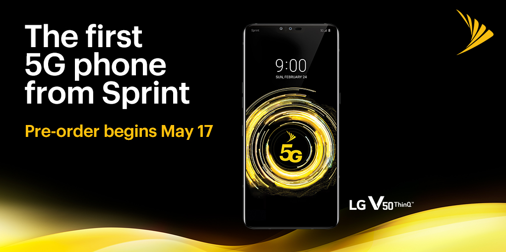
Sprint has announced that they will be opening up pre-orders for the LG V50 ThinQ 5G on May 17th. The device will be available on May 31st. Sprint is also launching the HTC 5G Hub. Both devices will be available in Sprint’s 5G markets, which includes AtlantaDallasHouston, and Kansas City right now, and Chicago, Los Angeles, New York City, Phoenix, and Washington, D.C. in the coming weeks.

  • LG V50 ThinQ 5G: $24 per month for 18 months with $0 down with Sprint Flex lease. Only available on the Sprint Unlimited Premium plan.
  • HTC 5G Hub: $12.50 per month for 24 months. Activate the HTC 5G Hub with 100GB of high-speed data for just $60 per month.

Source: Sprint


Update 3: 5G live today, Galaxy S10 coming soon

As mentioned in the previous update, the LG V50 ThinQ 5G is now available from Sprint and 5G has gone live in 4 cities: Atlanta, Dallas, Houston, and Kansas City. Unlike AT&T and Verizon’s mmWave 5G networks, Sprint’s 5G network is sub-6GHz. Their “split mode” approach allows devices to combine 5G NR and LTE Advanced for more consistent coverage.

You may have noticed that photos of Verizon speed tests in Chicago are all from the same street corners. That’s a limitation of the mmWave technology. Sprint is using the same cell towers that they already have around the country and adding new radios. The speeds may not be as head-turning as what we’ve seen from Verizon, but it will be more consistent and actually usable indoors. Sprint’s network can still hit very high speeds of 700 Mbps, but most of the time you’ll get around 300 Mbps. Sprint says customers can expect to consistently get over 100 Mbps. You can see 5G coverage (dark yellow) in the 4 cities below. Look up your own coverage here.

The LG V50 ThinQ 5G and HTC 5G Hub are both available now, but there is another device on the way. Sprint says the Samsung Galaxy S10 5G will be available on their 5G network “beginning this summer.” 5G devices require the Unlimited Premium plan, which includes unlimited data, talk, text, and Hulu, Amazon Prime, Twitch Prime, Tidal HiFi, and 100GB LTE mobile hotspot. One line with autopay costs $80 per month. Sprint 5G users will also get access to the Hatch game-streaming service.

Source: Sprint / Source 2: The Verge

The post [Update: 5G live today, Galaxy S10 coming soon] LG announces LG V50 pre-orders and 5G launch plans appeared first on xda-developers.

[Update 4: Amazon interested in Boost Mobile] Sprint and T-Mobile have agreed to merger, pending regulatory approval

Update 4 (5/31/19 @ 9:28 AM ET): New reports claims Sprint and T-Mobile could sell Boost Mobile for up to $3 Billion and Amazon is an interested buyer.

Update 3 (5/22/19 @ 9:25 AM ET): The Department of Justice will oppose the Sprint/T-Mobile merger, according to sources.

Update 2 (5/20/19 @ 3:55 PM ET): Bloomberg is reporting that the Department of Justice is leaning against approval of the Sprint/T-Mobile merger.

Update 1 (5/20/19 @ 11:10 AM ET): FCC chairman Ajit Pai released a statement today saying he would vote to approve the merger between T-Mobile and Sprint. More details below.

We could soon see the number of major mobile carriers in the United States decrease from four to three if things go according to plan. T-Mobile and Sprint have finally agreed to merge, so long as the merger is approved by anti-trust regulators, that is. The companies were reportedly in talks to merge in September last year, and it was then later reported that discussions had been dropped – largely due to how much control Deutsche Telekom would have over Sprint (not to mention the valuation of the company’s shares as well). But now, it seems that the merger talks have finally led to a deal between the two carriers as T-Mobile agrees to acquire Sprint for $26 billion.

Originally, the companies planned to merge in 2014 but felt that under the Obama administration the merger would be shut down. Both companies feel that they have a better shot of pulling it off under the Trump administration. If both companies merge, then that will create a new contender better capable of taking on AT&T and Verizon. It is unknown how U.S. regulators will view the merger, as the mobile telecommunications market in the U.S. has little competition. Reducing the number of companies active in the sector only strengthens that oligopoly. The first plan for the companies, if they are to merge, is to roll-out the first 5G network in the U.S. to what could potentially be 100 million customers.

As for the company’s structure, current T-Mobile CEO John Legere will run the company, with current COO Mike Sievert becoming COO and company President. Sprint CEO Marcelo Claure and SoftBank CEO Masayoshi Son will both sit on the company’s board. Deutsche Telekom will hold a 42% stake in the company, Sprint will hold 27%, and the rest is held by public shareholders. The combined company will have lower costs and greater economies of scale according to T-Mobile, and it will create thousands of American jobs. The company will be located in Bellevue, Washington.

While that’s all well and good, the deal will need to be approved by shareholders and cleared by regulators first. It’s unknown how exactly that will go down, but both companies are reasonably confident that it will go through.

Source: T-Mobile


Update 1: FCC chair approval

FCC chairman Ajit Pai says he will vote to approve the proposed merger between T-Mobile and Sprint after T-Mobile made new promises to speed up their 5G rollout.

Two of the FCC’s top priorities are closing the digital divide in rural America and advancing United States leadership in 5G, the next generation of wireless connectivity. The commitments made today by TMobile and Sprint would substantially advance each of these critical objectives.

Pajit goes on to say the merger would allow the companies to deploy 5G coverage to 97% of the US population within 3 years of closing the merger. 90% of the country would have access to speeds of “at least 100 Mbps” and 99% would have access to speeds greater than 50 Mbps.

Rural coverage is a big part of Pai’s statement. The 3-year plan mentioned above would cover “85% of rural Americans” and 90% within six years.

T-Mobile and Sprint have promised that their network would cover at least two-thirds of our nation’s rural population with highspeed, mid-band 5G, which could improve the economy and quality of life in many small towns across the country.

Pai also claims the companies have committed to offering in-home broadband products that will give “many American’s another option for home broadband service.”

In regards to the many concerns people have had about this merger, Pai says the companies have committed to not raise prices for at least 3-years and Sprint will sell off Boost Mobile to a 3rd-party if the merger is approved.

Now, a lot of commitments are being made to get this merger approved, and T-Mobile will be held to them.

It’s also important that the companies would suffer serious consequences if they fail to follow through on their commitments to the FCC. These consequences, which could include total payments to the U.S. Treasury of billions of dollars, create a powerful incentive for the companies to meet their commitments on time.

Voting will take place on June 15th for approval of the merger. It still needs approval from the Justice Department before it can finally close.

Source 1: FCC / Source 2: T-Mobile


Update 2: DOJ may disapprove

After the FCC’s chairman released a statement of approval, the Department of Justice is now said to be leaning against the merger. The FCC and DOJ rarely disagree on merger cases, but the DOJ considers a different standard. They are concerned with how the deal hurts competition and whether it would raise prices for consumers. It’s also worth noting that the Department of Justice rejected the previous Sprint/T-mobile merger attempt.

Source: Bloomberg


Update 3: DOJ against

It was widely reported on Monday that the Department of Justice was leaning against the Sprint/T-Mobile merger. The department has now recommended blocking the merger, according to sources at CNBC. The decision is reportedly expected in a month and it will likely put an end to the merger plans, at least this time.

Source: CNBC


Update 4: Amazon interested in Boost Mobile

Boost Mobile was a part of T-Mobile and Sprint’s proposed plan to the FCC. If approved, they would be required to sell Boost to a 3rd-party as part of their agreement. The Department of Justice was reportedly against the merger. The companies are continuing to meet with the department and potential bidders are preparing offers for Boost. The carrier is reportedly valued at up to $3 Billion.

One name that has popped up as a potential buyer is Amazon. They are reportedly interested in Boost because it would allow them to use “New T-Mobile’s” network for 6 years. Amazon has not commented on the story, but this would certainly be an interesting development.

Source 1: Yahoo Finance/ Source 2: Reuters / Source 3: Reuters

The post [Update 4: Amazon interested in Boost Mobile] Sprint and T-Mobile have agreed to merger, pending regulatory approval appeared first on xda-developers.

The Google Pixel 3a will get Playground support in the front camera in a few weeks

The Google Pixel 3a hosts a camera performance equivalent to the flagship Pixel 3 but with a few compromises in areas such as the material of construction, a duller display, a lower-powered processor, and a single front camera. We’ve seen in our initial impressions of the Pixel 3a that the while the smartphone matches up to the Pixel 3 in almost all respects when it comes to the rear camera – in spite of its lack of the Pixel Visual Core chipset, it falls behind significantly in terms of the front camera.

Pixel 3a XDA ForumsPixel 3a XL XDA Forums

One of the features that the Pixel 3a borrows from the more premium Pixel 3/3XL is Playground inside the Camera app. In this mode, you can drop animated AR characters – called Playmoji – from popular franchises like Star Wars, Marvel Avengers, or Stranger Things onto the canvas and make them perform certain actions so they look realistic. The feature is currently limited to the Google Pixel devices but there’s a catch in the case of the Pixel 3a. On the smartphone, the button to switch from the rear camera to the selfie camera in the Playground features is not available, which simply means that the feature is currently restricted to the rear camera.

While the exact season for this missing feature is not clear, it may be attributed to the mediocre front camera on the Pixel 3a, especially the lack of autofocus capabilities on this module. This single-camera also produces lower details and captures lesser light compared to the Pixel 3. Despite this, Google’s Product Manager Soniya Jobanputra reportedly said during an interview after the Google I/O 2019 keynote that the product team has “optimized every last aspect of the camera features to get to work” on the affordable Pixel.

In line with this, 9to5Google reports that we will get to play with Playmoji using the Pixel 3a’s front camera as Google is working to bring it in the “coming weeks.” We don’t know exactly when but we’ll be sure to update you when the feature arrives.

The post The Google Pixel 3a will get Playground support in the front camera in a few weeks appeared first on xda-developers.

Land 1TB of Ultra-Secure Cloud Backup with Degoo Premium

If you’re still relying on physical, external hard drives to backup your data, you’re missing out. Cloud backup services have come a long way since their humble inception, and it’s now possible to lock down massive amounts of secure online backup space on the cheap.

Degoo Premium is an award-winning cloud backup service that provides next-level access and security, and right now a lifetime 1TB backup plan is available for over 90% off at just $49.99.

Whether you’re interested in backing up your entire hard drive or you simply want a place to secure a handful of files, Degoo Premium has you covered.

This lifetime subscription grants you unlimited access to a massive amount of space that can be used for any type of backup. You’ll be able to backup up to 1TB of data in an ultra-secure server, and you’ll never have to worry about losing your files to theft—thanks to 256-bit AES encryption technology.

You’ll also enjoy high-speed transfers between all of your devices, and you even have the option of replicating your backups as you perform them—giving you extra peace of mind.

Ditch the expensive and unreliable hard drives and land 1TB of cloud backup with Degoo Premium for just $49.99—over 90% off its usual price for a limited time.

Like this deal? Check out Vault — you’ll get four premium tools, including NordVPN and Dashlane, to supercharge your online security. Enter code VAULTONE to try it out for just $1!

The post Land 1TB of Ultra-Secure Cloud Backup with Degoo Premium appeared first on xda-developers.

Google Play Store’s Material Theme redesign is rolling out

Slowly and steadily, Google has been refreshing its Android app with the Material Theme design philosophy which includes rounder Google Sans font, whiter background with ample spacing, and use of vibrant colors over flat icons to make content discovery easier. We’ve come across refurbished versions of Google Calendar, Google Photos, Google Drive, Google Keep, Google Opinion Rewards, Google Home, and a bunch of other Android apps by the tech giant. Now, another major refresh comes to one of the most vital apps in the ecosystem – the Google Play Store.

The Play Store’s redesign was spotted at the beginning of this month and we were able to get our hands on with the new interface with the help of XDA Recognized Developer Quinny899. The update is now rolling out to all users with the version 15.1.24 of the Google Play Store and brings many visual and practical changes.

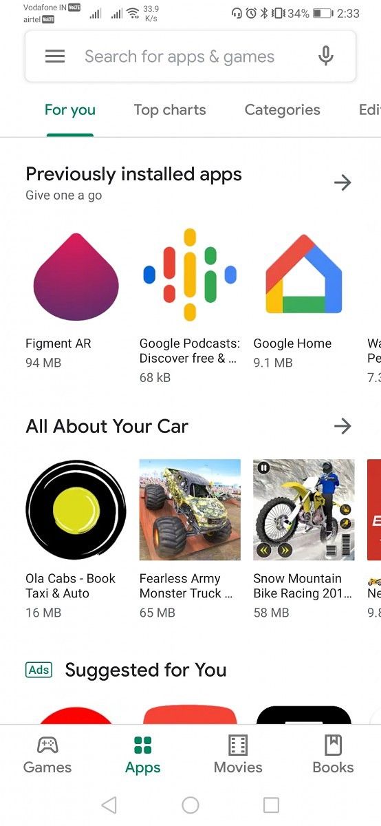
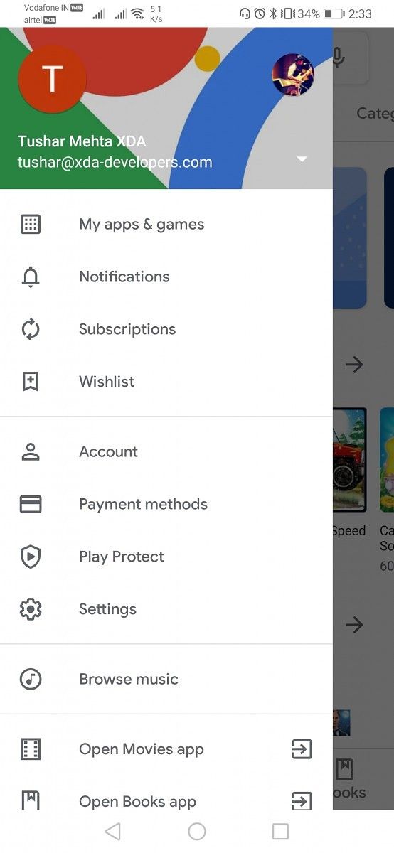
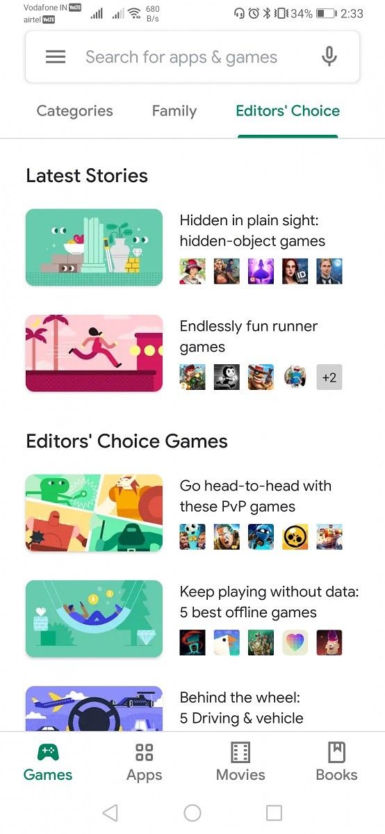
First off, the top bar has been replaced with one at the bottom and it includes dedicated tabs for Games, Apps, Movies & TV, and Books. Noticeably, the Music tab has been removed from this bar as Google looks to replace Google Play Music with YouTube Music. The icons in the bottom bar change colors themselves instead of forcing the palette on the upper part of the background.

Google Play Store material design Google Play Store material design Google Play Store material design

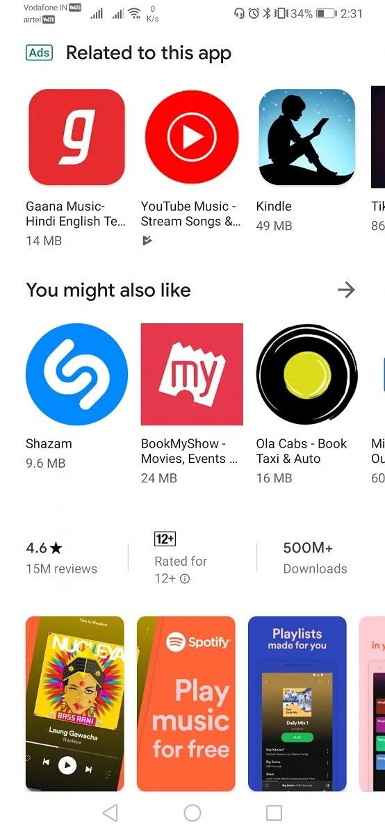
Then, the padding between carousels for app groups has been removed and so have the groups of apps collected under “Recommended for you,” “Previously installed,” and “Suggested for you” to launder the front page of the app of any redundant or unneeded items. Further, the cards for the suggested games now have rounded corners. Thumbnails also have rounded corners but for now, there seems to be some inconsistency and we expect Google to straighten them up before the wider release. Further, “More” buttons are now replaced by arrow-shaped icons.
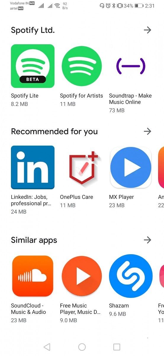
Google Play Store material design Google Play Store material design Google Play Store material design

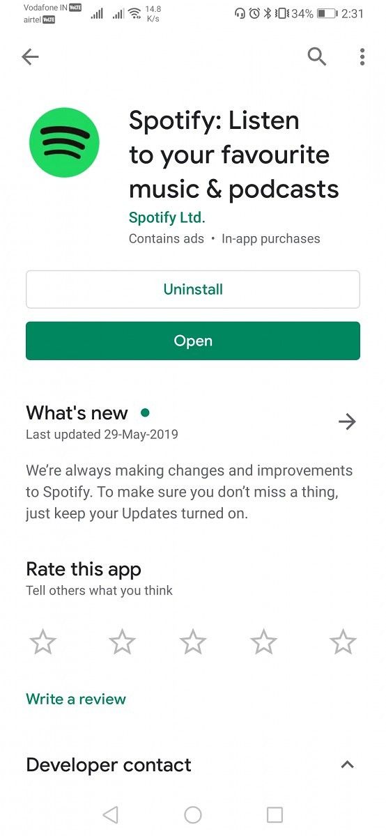
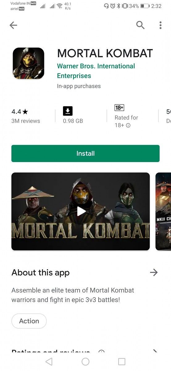
Inside individual app listing, the buttons for “Install,” “Uninstall,” or “Open” now occupy the full width of the display while the separating lines have been eliminated. The different categories for suggested apps have been reorganized while there’s a new tab that suggests you apps “Based on your recent activity.” I can’t sense if these are based on your activity inside the Google Play Store or on other Google apps and services like Search and YouTube since my recommendations are really erratic for now. Hopefully, this will be clearer with time.
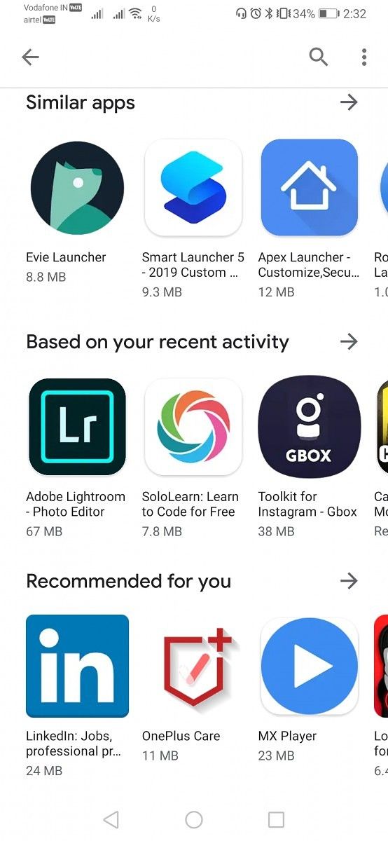
The new Material Theme design may take a while before it reaches you but you can download the latest APK for the Google Play Store from the link below and side-load it. If it doesn’t seem to work at first, clear cache and force stop the app once and then restart it again.

Download Google Play Store 15.1.24 from APK Mirror


Via: Reddit (u/rodrgoswz) 

The post Google Play Store’s Material Theme redesign is rolling out appeared first on xda-developers.