

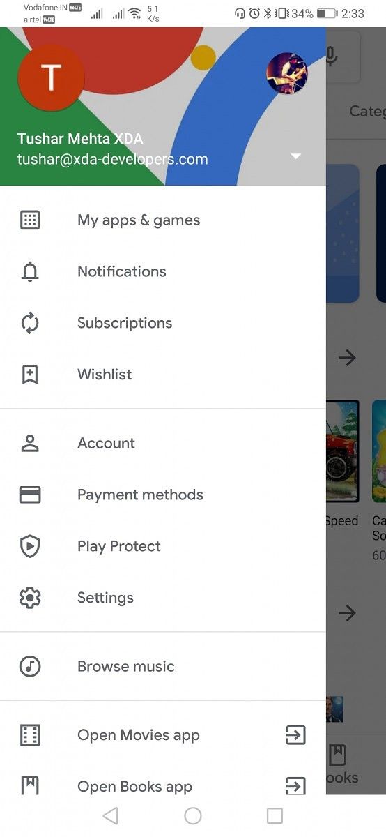
Slowly and steadily, Google has been refreshing its Android app with the Material Theme design philosophy which includes rounder Google Sans font, whiter background with ample spacing, and use of vibrant colors over flat icons to make content discovery easier. We’ve come across refurbished versions of Google Calendar, Google Photos, Google Drive, Google Keep, Google Opinion Rewards, Google Home, and a bunch of other Android apps by the tech giant. Now, another major refresh comes to one of the most vital apps in the ecosystem – the Google Play Store.
The Play Store’s redesign was spotted at the beginning of this month and we were able to get our hands on with the new interface with the help of XDA Recognized Developer Quinny899. The update is now rolling out to all users with the version 15.1.24 of the Google Play Store and brings many visual and practical changes.
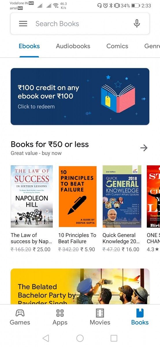
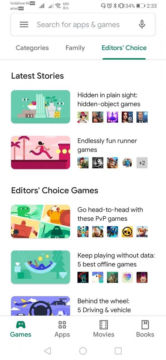
First off, the top bar has been replaced with one at the bottom and it includes dedicated tabs for Games, Apps, Movies & TV, and Books. Noticeably, the Music tab has been removed from this bar as Google looks to replace Google Play Music with YouTube Music. The icons in the bottom bar change colors themselves instead of forcing the palette on the upper part of the background.

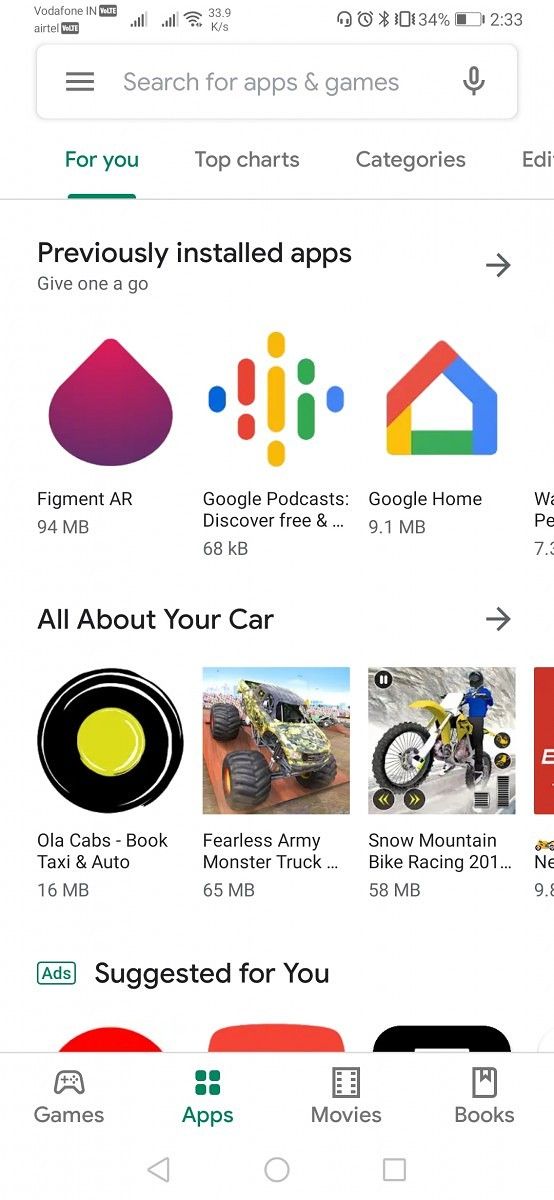

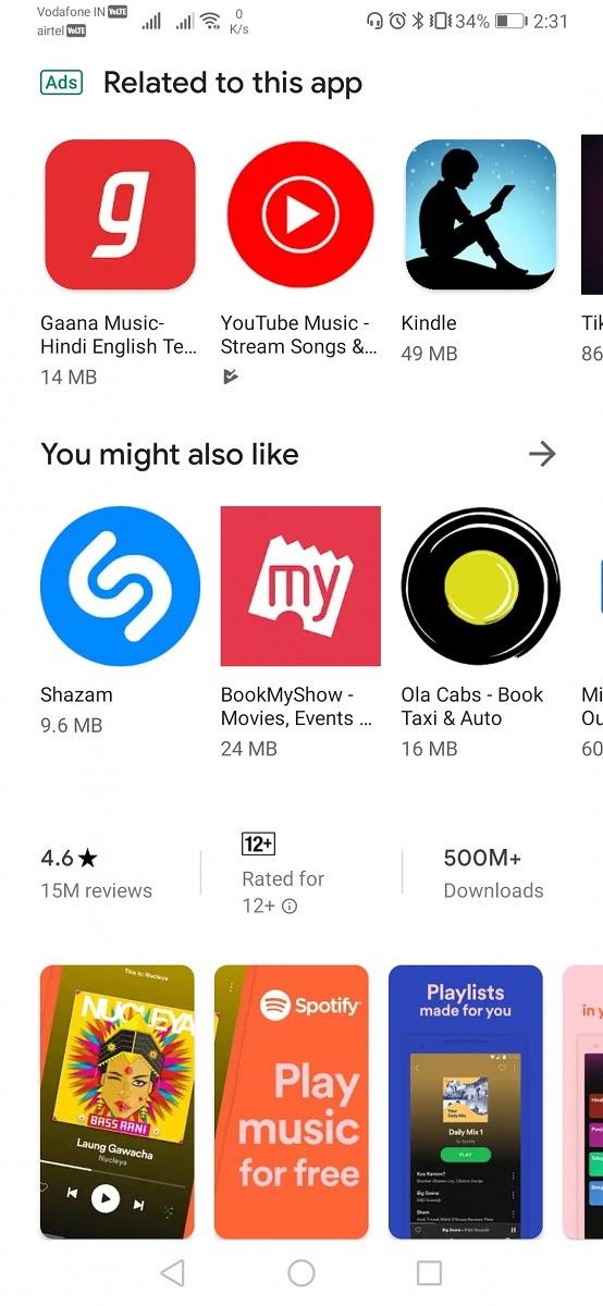
Then, the padding between carousels for app groups has been removed and so have the groups of apps collected under “Recommended for you,” “Previously installed,” and “Suggested for you” to launder the front page of the app of any redundant or unneeded items. Further, the cards for the suggested games now have rounded corners. Thumbnails also have rounded corners but for now, there seems to be some inconsistency and we expect Google to straighten them up before the wider release. Further, “More” buttons are now replaced by arrow-shaped icons.
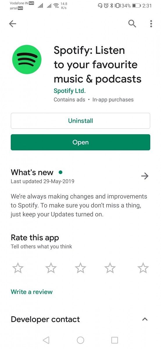
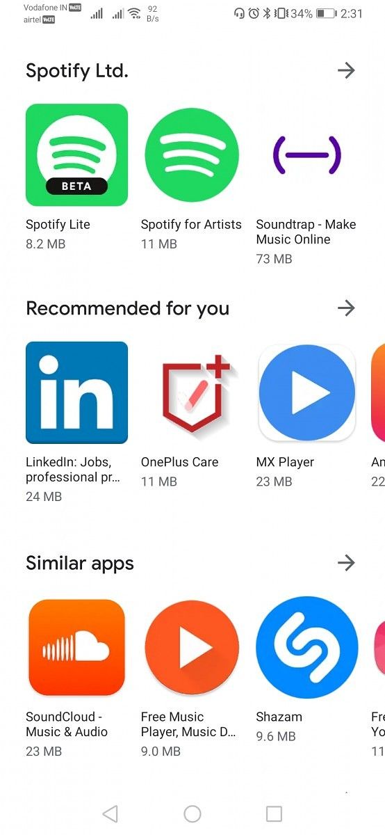
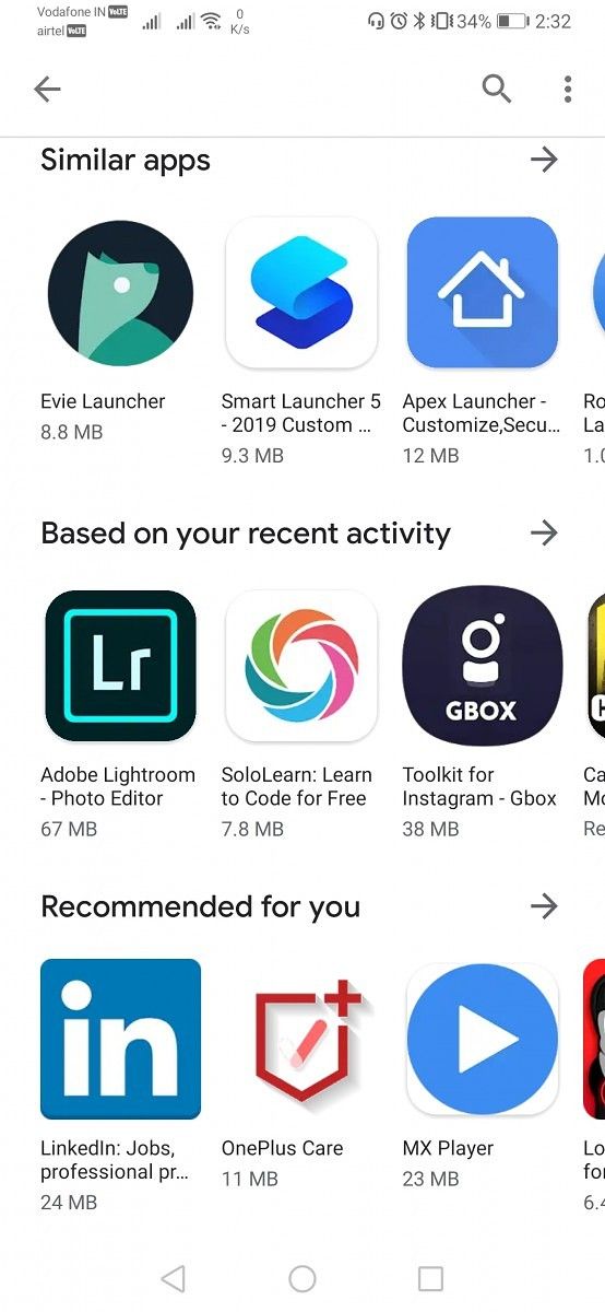
Inside individual app listing, the buttons for “Install,” “Uninstall,” or “Open” now occupy the full width of the display while the separating lines have been eliminated. The different categories for suggested apps have been reorganized while there’s a new tab that suggests you apps “Based on your recent activity.” I can’t sense if these are based on your activity inside the Google Play Store or on other Google apps and services like Search and YouTube since my recommendations are really erratic for now. Hopefully, this will be clearer with time.
The new Material Theme design may take a while before it reaches you but you can download the latest APK for the Google Play Store from the link below and side-load it. If it doesn’t seem to work at first, clear cache and force stop the app once and then restart it again.
Download Google Play Store 15.1.24 from APK Mirror
Via: Reddit (u/rodrgoswz)
The post Google Play Store’s Material Theme redesign is rolling out appeared first on xda-developers.

0 comments:
Post a Comment